Responsive Images with srcset and sizes
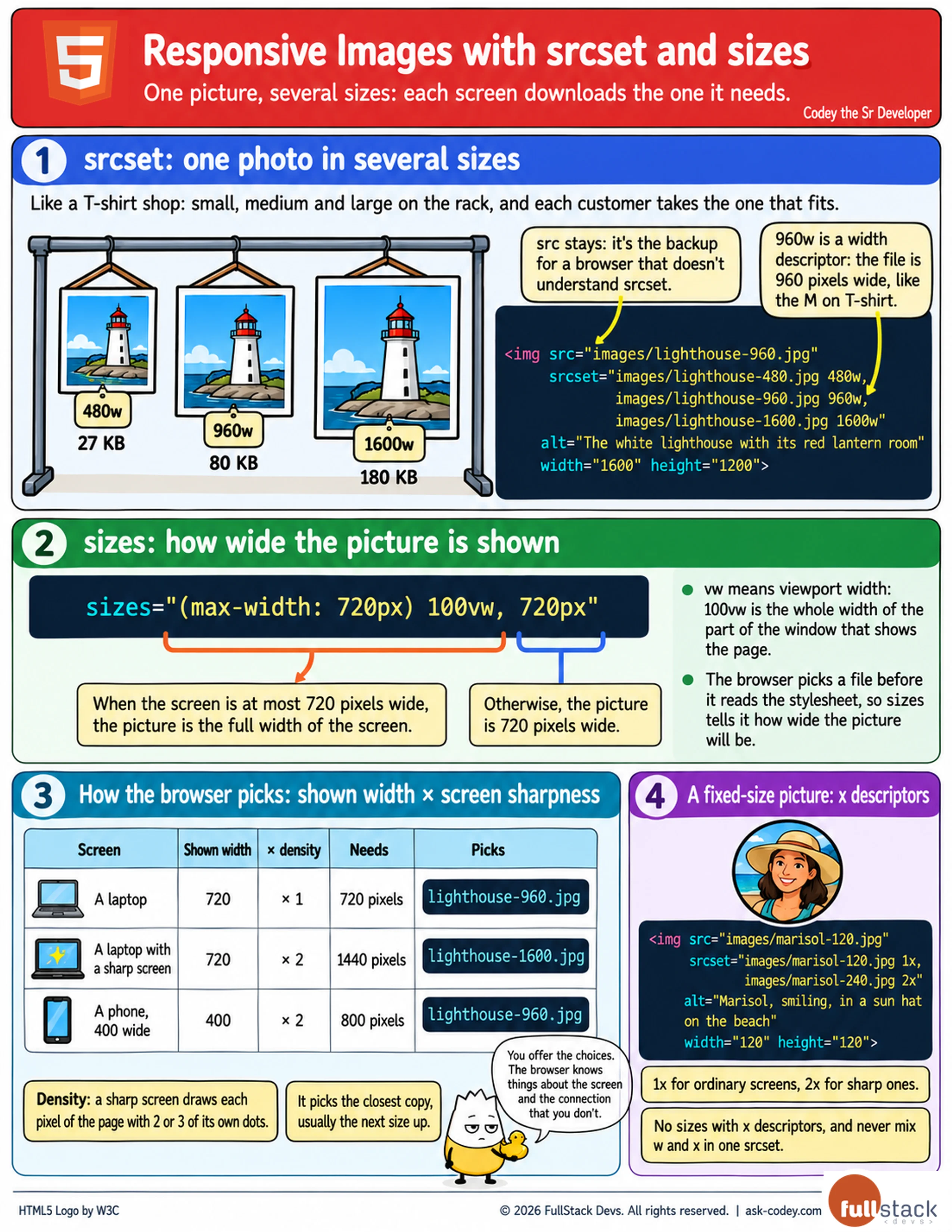
Offer the same photo in several widths with srcset, tell the browser how wide it will be shown with sizes, and let each phone, laptop and sharp screen download the file it needs.
Updated
- Category
- HTML
- Level
- Journeyman
- Tags
- html, Pixel density descriptor, Responsive image, sizes, srcset, web-development, Width descriptor