Container Queries: Components That Fit Their Space
A container query changes a component's style by the width of the box it sits in instead of the width of the screen, so one product card can be stacked in a narrow sidebar and side by side in a wide spot on the same page.
Freelancer · CSS · Updated
After this lesson you can
- Make an element a container and write an @container rule that restyles what's inside it
- Work out which @container rules apply to a component for its container's width
- Choose between a media query, a container query and clamp() for a responsive change
Key takeaways
- A media query asks how wide the screen is. A container query asks how wide the component's own box is.
- Make a box a container with
container-type: inline-size, then restyle what's inside it with a rule such as@container (min-width: 30rem). - A container query styles the elements inside the container, never the container itself, so the container is usually a wrapper.
- container-name lets a query say which container it means, and a cqi unit is 1% of the container's width.
- Media queries still fit the page's own layout and the reader's settings. Container queries fit components that move around.
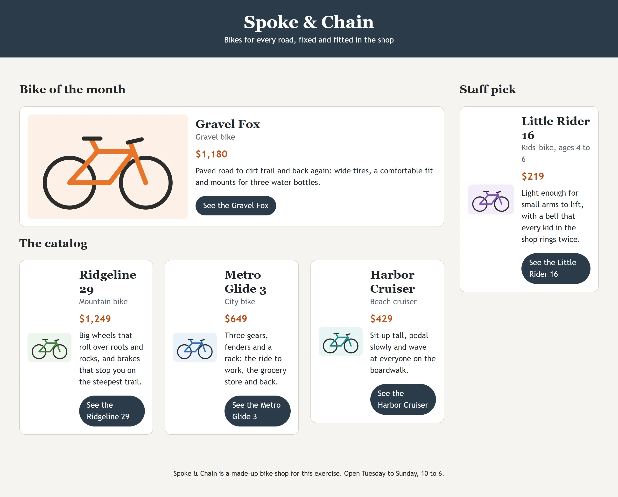
Spoke & Chain's catalog page shows the same bike card in three places: in a narrow "Staff pick" sidebar, in a three-column grid of bikes, and in a wide "Bike of the month" spot at the top. In the wide spot, the card looks best side by side, with the photo on the left and the words on the right. In the sidebar, it has to stack, or the photo shrinks to a sliver. A media query can't tell those two apart: they're on the same screen. Any site that reuses a piece of the page in different places (a shop's product cards, a news site's story previews, a music app's album tiles) runs into this, and container queries are the answer.
The problem with asking the screen
Here is how the card was first made side by side, with a media query:
.bike-card {
  display: grid;
  gap: 1rem;
}

@media (min-width: 60rem) {
  .bike-card {
    grid-template-columns: 2fr 3fr;
  }
}
On a screen 60rem wide or more, every card goes side by side. The bike of the month looks great. But the staff pick, squeezed into a sidebar 18rem wide, goes side by side too: a photo the width of a thumb next to a column of words broken one per line. The media query asked the right question about the wrong thing. It asked how wide the screen is, when what matters is how wide the card's own space is.
Asking the box instead: container-type
Think of a sofa bed. It doesn't fold out because the house is big; it folds out when the room it's in has space for it. The same sofa bed sits folded in a small study and opens up in a big living room.
A container query (read "container query") is that idea in CSS: a rule that checks the size of the box a component sits in. First you tell the browser which box to measure, with container-type:
.card-spot {
  container-type: inline-size;
}
That makes every .card-spot a query container: a box whose width the elements inside it can ask about. inline-size means the size along the line of text, which for English, running left to right, is the width. (There's also size, which measures the height as well, but it only works on a box with a set height, so inline-size is the one you'll use nearly every time.)
One thing changes when a box becomes a container: it can no longer take its width from what's inside it. In a grid cell, a sidebar or a section, that's fine, because those already get their width from the page. But a container that sits in a flex row with no width of its own can shrink to nothing. If a container seems to vanish, give it a width or let it fill its space.
Writing the query: @container
With a container in place, @container (read "at container") asks about it, in the same shape as a media query:
@container (min-width: 30rem) {
  .bike-card {
    grid-template-columns: 2fr 3fr;
    align-items: center;
  }
}
Read it aloud: "when the container is at least 30rem wide, put the card's photo and words in two columns". The browser measures the nearest container around each card: the bike-of-the-month spot, about 45rem wide, matches, and its card goes side by side. The sidebar's spot, 18rem wide, doesn't, so its card stays stacked. Same card, same page, two looks. The newer range form works here too: @container (width >= 30rem), read "width at least 30rem".
There's one rule to remember: a container query styles what's inside the container, never the container itself. A box can't change based on its own width, because changing it could change that width. That's why the card sits inside a wrapper:
<div class="card-spot">
  <article class="bike-card">
    <img class="bike-card-photo" src="images/gravel-fox.svg" alt="The Gravel Fox, an orange gravel bike with wide tires">
    <div class="bike-card-body">
      <h3 class="bike-card-title">Gravel Fox</h3>
      <p class="bike-card-price">$1,180</p>
    </div>
  </article>
</div>
The .card-spot is measured, and the .bike-card inside it changes.
Naming containers
A page can have containers inside containers: a card spot inside a sidebar that's a container too. Without a name, @container measures the nearest container around the element. A container name lets the query say exactly which one it means:
.card-spot {
  container-type: inline-size;
  container-name: bike-spot;
}

@container bike-spot (min-width: 30rem) {
  .bike-card {
    grid-template-columns: 2fr 3fr;
  }
}
Now the rule only ever measures a container named bike-spot, wherever the card ends up. The name is yours to choose. Many people write both lines at once with the container shorthand: container: bike-spot / inline-size;, read "named bike-spot, measuring the inline size". The name comes first, then a slash, then the type.
Container rules follow the same cascade as everything else. If you write a second rule for wider spots, such as @container bike-spot (min-width: 45rem), put it after the 30rem one: in a 50rem spot both match, and the later one wins where they disagree. That's mobile first again, for a component: small first, then more room.
Sizes measured from the container: cqi
You've met vw, 1% of the window's width. A container query unit does the same for the container: 1cqi (read "container query inline") is 1% of the container's inline size, its width.
.bike-card-title {
  font-size: clamp(1.125rem, 0.75rem + 3cqi, 2rem);
}
It's a fluid heading, as in Fluid Type and Spacing with clamp(), but it grows with the card's space instead of the window. In the 18rem sidebar spot (288 pixels), the title is 12 + 8.64 = 20.64 pixels. In a 45rem bike-of-the-month spot (720 pixels), 12 + 21.6 = 33.6 pixels is more than the maximum, so it's 32. The rem part keeps zoom working, as before. There's a cqw unit too (container width); cqi is the one that matches inline-size.
Try it. Make a file cards.html with two .card-spot wrappers, one style="width: 18rem" and one style="width: 45rem", each holding the same card. Add the rules from this lesson. The two cards should look different, side by side on the same page. Then inspect a card spot: the Elements panel shows a container badge beside it.
Media query, container query or clamp()?
Container queries don't replace media queries; they answer a different question. A short way to choose:
| The change depends on… | Use | For example |
|---|---|---|
| the whole page's width, for the page's own layout | a media query | the sidebar moves beside the main area at 60rem |
| the reader or their device | a media query | dark mode with prefers-color-scheme, less motion with prefers-reduced-motion, hover |
| the space one component has | a container query | a card that's stacked in a sidebar and side by side in a wide spot |
| nothing switching: a size that should grow smoothly | clamp() |
a heading that grows from 28 to 48 pixels |
Many pages use all three: a media query for the page layout, container queries for the cards inside it, and clamp() for the headings.
Container size queries (container-type, container-name, @container and the cqi units) work in every current browser: Chrome and Edge since version 105, Safari since 16 and Firefox since 110, and they've been Baseline widely available since August 2025 (checked on web.dev in October 2026). You can use them on any site you build today.
Check yourself
3 questions to try on the lesson page.
So what
A component that adapts to its own space can go anywhere: a sidebar, a grid, a feature spot, a page that doesn't exist yet. That's how big sites keep hundreds of pages consistent, by building each piece once and letting it fit wherever it's placed.