# Flexbox: Lining Things Up in a Row or a Column
One line of CSS, display: flex, lines up an element's children in a row, flex-direction turns the row into a column, and the main and cross axes name the two directions every other flexbox property works along.
Apprentice · CSS · Updated November 1, 2026
## After this lesson you can
- Make a flex container with display: flex and set its direction with flex-direction
- Name the main axis and the cross axis of a flex container in a row or a column
## Key takeaways
- display: flex goes on the parent. The parent becomes a flex container, and only its direct children become flex items.
- Flex items line up in a row by default, each as wide as its content and stretched to the height of the row.
- flex-direction: column stacks the items top to bottom. Without display: flex, flex-direction does nothing.
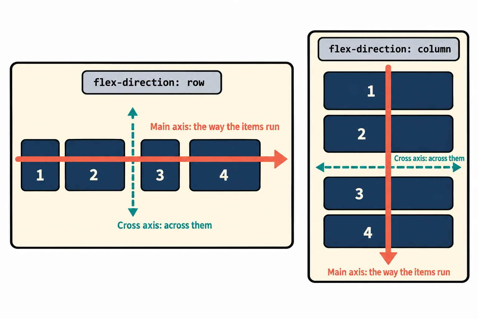
- The main axis is the direction the items run in. The cross axis runs across it. In a column the two swap.
Look at the top of almost any website: a logo, then a row of links, all on one line. Under a video there's a row of buttons. On a phone, the menu opens as a column of links. Every one of those is a set of boxes lined up in one direction, and the tool that lines them up is **flexbox**. You'll use it on nearly every page you build, and "make these sit side by side" is one of the first layout jobs anyone gets.
This chapter builds the website for *Summer Sound*, a made-up three-day music festival in a riverside park: a nav bar across the top, a big welcome in the middle of the screen, and a row of cards for the bands that rearranges itself on a phone. This lesson starts with the nav bar.
## Without flexbox, boxes stack
Here's the festival's menu: a list of links, as most sites write their menus.
```html
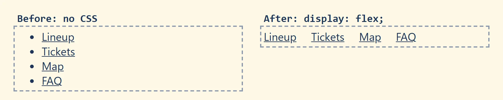
` (a list item) is a **block**: it takes the whole width of the page, and the next one starts underneath it. So the four links come out as a bulleted column, one per line, which is fine for a shopping list and wrong for a nav bar. That stacking is the browser's normal flow, and *Normal Flow and the display Property* goes into it. To change it, you change how the list lays out its children.
## display: flex turns a parent into a shelf
Think of a bookshelf. The shelf decides how the books line up: side by side, left to right. The books don't arrange themselves; they stand where the shelf puts them.
Flexbox works the same way. You put one line on the **parent**, and it lines up its children:
```css
.nav-links {
display: flex;
list-style: none;
padding: 0;
}
```
- **`display: flex`** makes `.nav-links` a **flex container**: the shelf.
- Its **direct children**, the four `
` elements, become **flex items**: the books. They now sit side by side in one row, in the order they're written in the HTML.
- **Only direct children** become flex items. The `` inside each `
```
Open it with Live Server: four bulleted links, one per line. Now put the `.nav-links` rule above in `styles.css`, plus `.nav-links li { margin-right: 1.5rem; }` to give the links some room, and save. The links jump into a row.
## A row or a column: flex-direction
A shelf can also stand on its end, like a tall, narrow bookcase where the books are stacked one above the other. The property that turns the shelf is **`flex-direction`**:
```css
.phone-menu {
display: flex;
flex-direction: column;
}
```
| Value | The items run | Use it for |
|---|---|---|
| `row` | left to right (the default) | nav bars, toolbars, a row of buttons |
| `column` | top to bottom | a phone menu, a sidebar of links, a card's title, picture and text |
| `row-reverse` | right to left | rarely: see the note below |
| `column-reverse` | bottom to top | rarely |
Two things to know:
- **`flex-direction` only works on a flex container.** On an element without `display: flex`, the browser ignores it, and the children keep stacking the normal way.
- **The reverse values only change what the eye sees.** A screen reader and the Tab key still go through the items in the HTML's order, so reversing a menu makes the keyboard jump backward through it. *Flexbox Wrapping and gap* explains this when it covers `order`. If you want the items the other way round, change the order in the HTML instead.
**Try it.** Add `flex-direction: column;` to your `.nav-links` rule and save: the links stack again, this time as flex items with no bullets. Change it to `row-reverse`: FAQ jumps to the front. Put it back to `row` when you're done.
## The main axis and the cross axis
Back to the shelf. There's the direction the books run along the shelf, and the direction across it, from the bottom of a book to its top. Flexbox gives those two directions names, and every other flexbox property is named for one of them:
- The **main axis** is the direction the items run in. `flex-direction` sets it.
- The **cross axis** runs across the main axis, at a right angle to it.
| `flex-direction` | Main axis (the way items run) | Cross axis (across them) |
|---|---|---|
| `row` | left to right: horizontal | top to bottom: vertical |
| `column` | top to bottom: vertical | left to right: horizontal |
The second row is the one that catches people out: in a column, the main axis is **vertical**. When you turn the shelf, both axes turn with it.
Here's where the axes already show. By default, flex items **stretch along the cross axis** to fill the container:
```css
.phone-menu {
display: flex;
flex-direction: column;
width: 300px;
}
```
In this column the cross axis is horizontal, so each item stretches to the full 300 pixels of the menu, however short its text. In the row nav bar from before, the cross axis is vertical, so the items stretched to the height of the tallest one. Same rule, different direction.
The next lesson, *Flexbox Alignment: justify-content and align-items*, puts the axes to work: one property spaces the items along the main axis, and another lines them up across it.
## See it in the developer tools
Right-click the nav bar and choose **Inspect**. In Chrome and Edge, the Elements panel shows a small **flex** badge next to `
`: it marks a flex container. Click the badge, and the page draws an outline around each flex item, with the space between them shaded. Firefox shows the same kind of badge in its Inspector, and its **Layout** panel has a Flexbox section that names each flex item.
**Try it.** With the overlay on, switch `flex-direction` between `row` and `column` in the Styles pane (Firefox: Rules) and watch the outlines turn. The badge only appears on elements with `display: flex`, so it's also a quick way to check whether your rule took effect.
## Try it in Flex Freight
[Flex Freight, puzzles 1 to 4](https://www.ask-codey.com/games/flex-freight/1): played right on the lesson page.
Now move some real crates. In Flex Freight the loading dock is a flex container and the crates are its flex items, so `display: flex` and `flex-direction` line them up on the spots painted on the dock. The dock changes as you type, and the first puzzle opens with a guide that shows every value before you start.
## Check yourself
2 questions to try on the lesson page.
## So what
Nav bars, toolbars, button rows, phone menus and card layouts all start as a row or a column of boxes, and two lines on the parent, `display: flex` and `flex-direction`, give you either one. Knowing which way the main axis runs is what makes the rest of flexbox make sense.
## Key terms
- [Flexbox](https://www.ask-codey.com/glossary/flexbox)
- [Flex container](https://www.ask-codey.com/glossary/flex-container)
- [Flex item](https://www.ask-codey.com/glossary/flex-item)
- [Flex direction](https://www.ask-codey.com/glossary/flex-direction)
- [Main axis](https://www.ask-codey.com/glossary/main-axis)
- [Cross axis](https://www.ask-codey.com/glossary/cross-axis)
## Cheat sheets
- [Flexbox: Lining Things Up in a Row or a Column](https://www.ask-codey.com/cheat-sheets/css-flexbox-basics-cheat-sheet)
## Related
- [Flexbox Alignment: justify-content and align-items](https://www.ask-codey.com/lessons/css-flexbox-alignment)
- [Normal Flow and the display Property](https://www.ask-codey.com/lessons/css-normal-flow-and-display)
Source: https://www.ask-codey.com/lessons/css-flexbox-basics