CSS Grid: Rows and Columns
CSS Grid turns a box into an ice cube tray of rows and columns, so a photo gallery, a product page or a calendar lines up both ways at once with a few lines of CSS.
Apprentice · CSS · Updated
After this lesson you can
- Make a grid with display: grid and grid-template-columns, sizing columns in fr, px and %
- Space a grid's cells with gap and predict which cell each item fills
Key takeaways
- display: grid makes an element a grid container, and its direct children become grid items that fill the cells.
- grid-template-columns sets how many columns there are and how wide each is. Each width you list is one column.
- An fr (read "fraction") is one share of the space that's left, so 1fr 2fr 1fr gives the middle column half the width.
- gap puts space between the cells, never around the outside. Items fill the cells left to right, a row at a time.
- The developer tools draw the grid on the page: click the grid badge in the Elements panel to see its lines and tracks.
Trail Photo Club, a hiking club, has forty trail photos and wants them on its site in neat rows: three across, every photo the same width, an even space between them. You'll meet this job again and again: a photo gallery, a page of products, a calendar month, a dashboard of numbers, a class assignment that says "make a gallery page". Rows and columns at the same time is what CSS Grid was made for, and it takes three lines of CSS.
An ice cube tray for your page
Think of an ice cube tray. The tray decides the shape: how many pockets across, how many down. You pour the water in, and it fills the pockets one after another. You never tell each cube where to go.
CSS Grid works the same way. You give one element display: grid, and it becomes the tray: a grid container. Its children become grid items, the cubes, and they fill the pockets in order. Here is the club's gallery, a <div> holding <figure> elements (a <figure> is a box for a picture and its caption):
<div class="gallery">
  <figure><img src="images/eagle-peak.jpg" alt="The summit of Eagle Peak above a sea of clouds"></figure>
  <figure><img src="images/long-lake.jpg" alt="Long Lake reflecting pine trees at sunrise"></figure>
  <figure><img src="images/fern-gully.jpg" alt="A narrow trail through tall ferns"></figure>
  <figure><img src="images/cedar-falls.jpg" alt="Cedar Falls splashing into a green pool"></figure>
</div>
.gallery {
  display: grid;
}
Only the direct children of the container are grid items: the <figure> elements here. The <img> inside each figure isn't a grid item; it goes along inside its figure.
With display: grid and nothing else, the grid has one column, so the photos still stack one under another. The tray needs a shape.
Columns: grid-template-columns
grid-template-columns (read "grid template columns") draws the columns. Every width you list is one column, from left to right:
.gallery {
  display: grid;
  grid-template-columns: 200px 200px 200px;
}
Three widths, three columns, each 200 pixels wide. The fourth photo has no column left in the first row, so it starts a second row.
A whole column, top to bottom, is a grid track. So is a whole row, left to right. You'll meet the word again when grids get more interesting: "a track" means one column or one row.
Fixed pixel widths have a problem: on a laptop the three columns might fill only half the screen, and on a phone they don't fit. The next section fixes that.
The fr unit: shares of the space
Picture three friends splitting a pizza. If each gets one share, each gets a third. If the middle friend gets two shares and the others one each, there are four shares, and the middle friend gets half the pizza.
The fraction unit, written fr and read "fraction", is a share of the space the grid has left over:
.gallery {
  display: grid;
  grid-template-columns: 1fr 2fr 1fr;
}
That's 1 + 2 + 1 = 4 shares. In a gallery 800 pixels wide, the side columns get one share each (200px) and the middle column gets two (400px). Make the gallery wider and every column grows, keeping the same shares.
You can mix units. The browser gives the fixed widths their space first, then shares out what's left among the fr columns:
grid-template-columns |
In a grid 1000px wide |
|---|---|
1fr 1fr 1fr 1fr |
four columns of 250px |
200px 1fr |
200px, then 800px |
20% 1fr 1fr |
200px, then two columns of 400px |
300px 2fr 1fr |
300px, then 466.67px and 233.33px |
Try it. Make an index.html with a <div class="gallery"> and six <div> boxes inside it, each with a word in it and a background color. Give the gallery display: grid and try each row of the table. Drag the browser window narrower: which columns change size, and which stay put?
gap: space between the cells
Ice cube trays have a ridge between the pockets. A grid's ridges are its gap:
.gallery {
  display: grid;
  grid-template-columns: 1fr 1fr 1fr;
  gap: 20px;
}
gap puts space between the columns and between the rows, never around the outside edge. (For space around the outside, give the container padding.) To set the two directions separately, write two values, gap: 2rem 1rem (rows first, then columns), or use row-gap and column-gap.
The gaps come out of the space before the fr columns share it. A gallery 640 pixels wide with three 1fr columns has two gaps of 20 pixels between them, so the columns share 600 pixels: 200 pixels each.
How items fill the cells
Where a row and a column cross is a cell: one pocket of the tray. Items fill the cells in the order they appear in the HTML, left to right along the first row, then on to the next row, like reading a book:
.gallery {
  display: grid;
  grid-template-columns: 1fr 1fr 1fr;
  gap: 1rem;
}
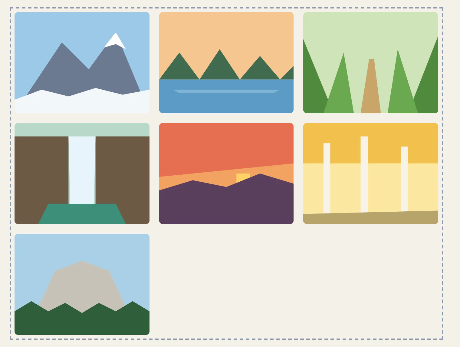
With seven photos in this three-column gallery:
- photos 1, 2 and 3 fill row 1;
- photos 4, 5 and 6 fill row 2;
- photo 7 starts row 3, in the first column, and the rest of that row stays empty.
You never wrote a single row. The browser adds as many rows as the items need, and each row is as tall as the tallest thing in it. Each item also stretches to fill its cell, so the cards in a row are the same height even when one has more text.
See the grid in the developer tools
A grid is invisible: no lines are drawn on the page. The developer tools can draw them for you. Right-click the gallery and choose Inspect. In the Elements panel (Firefox: Inspector), the gallery's tag has a small grid badge beside it. Click the badge, and the page shows the grid on top of itself: dashed lines between the tracks, the gaps shaded, and numbers along the edges.
The Layout pane (in the Styles sidebar in Chrome and Edge; Firefox: Layout) lists every grid on the page, with checkboxes to show line numbers, track sizes and area names. Those numbers are the grid's lines, and the next lesson puts them to work.
Try it. Open your gallery page, turn on the grid overlay, and tick Show track sizes. Change 1fr 1fr 1fr to 1fr 2fr 1fr in the Styles pane and watch the sizes change.
Try it in Grid Town
Grid Town, puzzles 1 to 7: played right on the lesson page.
Now build a town. In Grid Town the town is a grid container and the houses are its grid items, so display: grid, grid-template-columns, grid-template-rows and gap put each house on the lot staked out for it. The grid lines are drawn over the town with their numbers, as the developer tools draw them, and the first puzzle opens with a guide that shows every value before you start.
Check yourself
2 questions to try on the lesson page.
So what
Most of what you'll lay out is a set of things in rows and columns. With CSS Grid you draw the tray once, and every item you add, the seventh photo or the seven-hundredth product, finds its own pocket.