# Subgrid: Lining Up Cards
With grid-template-rows: subgrid, cards in a row share their parent grid's rows, so every card's title, text and button line up across the row however long each card's text is.
Freelancer · CSS · Updated November 1, 2026
## After this lesson you can
- Line up the parts of cards across a row with grid-row span and grid-template-rows set to subgrid
## Key takeaways
- A card's own grid can't see its neighbors, so titles and buttons in a row of cards end up at different heights.
- grid-template-rows: subgrid makes a nested grid use its parent's rows instead of its own, so parts in the same row line up.
- The card spans as many parent rows as it has parts: grid-row: span 4 for a photo, a title, some text and a button.
- Subgrid works in every current major browser, Baseline widely available since March 2026.
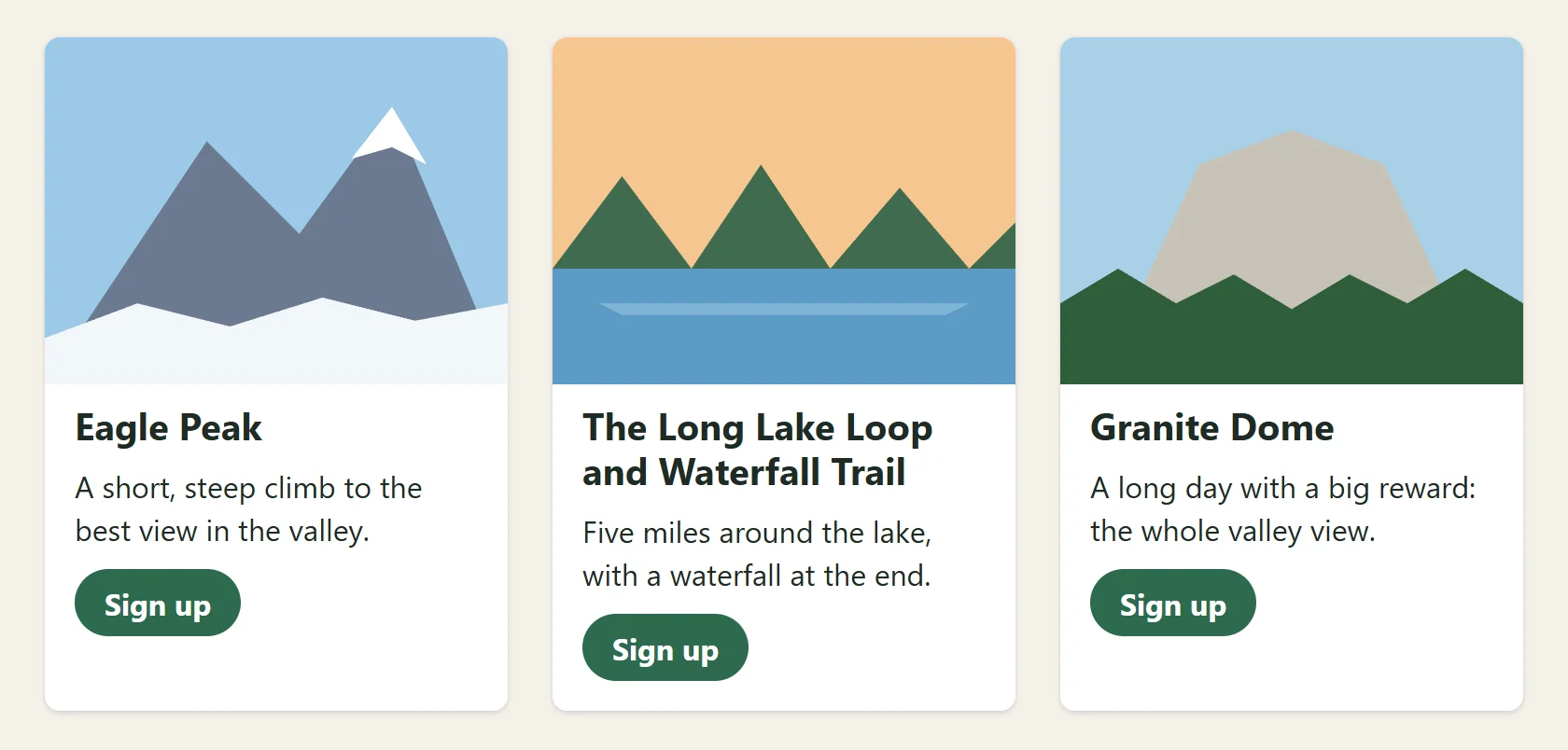
Trail Photo Club shows its upcoming hikes as a row of cards: a photo, the hike's name, a few lines about it, and a **Sign up** button. Eagle Peak has a short name and one line of text. The Long Lake Loop and Waterfall Trail has a name that wraps onto two lines and a whole paragraph. The result looks messy: the descriptions start at different heights, and the buttons sit at three different levels. Designers notice this straight away, and you'll be asked to fix it on product cards, pricing tables and blog previews. Subgrid is the fix.
## The problem: cards that can't see each other
Here's one card. Each card in the row is the same: a photo, a heading, a paragraph and a link.
```html

Eagle Peak
A short, steep climb to the best view in the valley.
Sign up
```
The `.hikes` container is a grid, so the three cards sit side by side and stretch to the same height. But inside each card, its parts stack by their own sizes. A card has no idea how tall its neighbor's title is. When one title takes two lines, only that card's text moves down.
## The idea: shelves that run across the row
Think of a bookcase with three sections side by side. If each section has its own shelves, set at whatever height suits its books, the shelves don't line up across the bookcase. If the shelves are long boards that run across all three sections, everything sits on the same shelves.
A **subgrid** is a grid inside a grid that uses its parent's tracks instead of making its own. The parent's rows are the long boards, and every card puts its parts on the same rows. Each row is as tall as the tallest part in it, across all the cards, so the two-line title makes the title row taller for every card, and the descriptions all start on the same line.
## The three lines that do it
First the parent: the row of cards. It's an ordinary grid, here one that fits as many 14rem columns as there's room for:
```css
.hikes {
display: grid;
grid-template-columns: repeat(auto-fit, minmax(14rem, 1fr));
gap: 1.5rem;
}
```
Then each card. Three declarations make it a subgrid:
```css
.hike {
display: grid;
grid-row: span 4;
grid-template-rows: subgrid;
gap: 0.5rem;
}
```
1. `display: grid` makes the card a grid, so it can lay out its four parts.
2. `grid-row: span 4` makes the card cover four of the parent's rows: one for each of its parts.
3. `grid-template-rows: subgrid` (read "sub-grid") says "don't make rows of your own; use the four rows of the parent that you cover".
A subgrid uses the parent's `gap` too, unless it sets its own. Here the parent's `1.5rem` keeps the cards apart, and the card's own `0.5rem` keeps its parts closer together.
**Try it.** Build three hike cards with different-length titles and text. Style the row of cards first, without the three subgrid lines, and look at the buttons. Then add the three lines to `.hike`. In the developer tools, the card now has a `subgrid` badge in the Elements panel; turn it on to see the parent's row lines running through every card.
## Counting the rows
The number after `span` must match the number of parts in the card. Count the card's direct children: here a photo, a heading, a paragraph and a link, so `span 4`.
| The card holds | `grid-row` |
|---|---|
| a photo, a title, some text and a button | `span 4` |
| a title, a price and a button | `span 3` |
| a photo, a title, a date, some text and a button | `span 5` |
Get it wrong and the layout breaks in a way you can see at a glance. With too few rows, `span 3` for four parts, a subgrid can't add rows of its own, so the extra part is squeezed into the last row and sits on top of the part already there. With too many rows, the extra rows are empty and leave a gap at the bottom of every card. A card whose parts change from card to card (one with a date, one without) won't line up with subgrid alone; give every card the same parts, even if one is empty.
## Rows, columns, and where it works
Subgrid works for columns too: `grid-template-columns: subgrid` makes a nested grid use its parent's columns. That's handy for a form where every label and every input box should line up in two columns, even though each label and input sits inside its own ``. Cards are the common case, though, and rows are what they need.
Subgrid works in every current major browser: Chrome and Edge since version 117, Firefox since 71 and Safari since 16. It became **Baseline widely available** in March 2026, which means it has worked in all of them for at least two and a half years. In a much older browser, `subgrid` is ignored and the cards fall back to the messy look you started with: still readable, not lined up.
## Try it in Grid Town
[Grid Town, puzzle 26](https://www.ask-codey.com/games/grid-town/26): played right on the lesson page.
Three shops on Main Street, each a stack of three buildings at its own heights, so nothing lines up across the street. Use `grid-row: span 3` and `subgrid` so every row lines up from shop to shop, just like the cards in this lesson.
## Check yourself
2 questions to try on the lesson page.
## So what
Lined-up cards are one of those details that make a page look designed rather than thrown together. Before subgrid, people set fixed heights on titles and hoped the text was never longer; now three lines of CSS let the content be any length and the layout still holds.
## Key terms
- [Subgrid](https://www.ask-codey.com/glossary/subgrid)
- [Grid track](https://www.ask-codey.com/glossary/grid-track)
## Cheat sheets
- [Subgrid: Lining Up Cards](https://www.ask-codey.com/cheat-sheets/css-subgrid-cheat-sheet)
## Related
- [Grids That Fill the Space: repeat(), minmax() and auto-fit](https://www.ask-codey.com/lessons/css-grid-auto-fit-minmax)
- [Placing Items: Lines, Spans and Named Areas](https://www.ask-codey.com/lessons/css-grid-placement-and-areas)
Source: https://www.ask-codey.com/lessons/css-subgrid