FlexBox: an overview
Setting display to flex on an element lines up its children side by side in a row, and flex-direction can turn that row into a column.
Apprentice · CSS · Updated
After this lesson you can
- Line up a container's children in a row or a column with display: flex and flex-direction
Key takeaways
- display: flex goes on the parent. The parent becomes a flex container, and its direct children become flex items.
- Flex items line up in a row by default, each only as wide as its content.
- flex-direction: column stacks the items top to bottom instead. Without display: flex, flex-direction does nothing.
CSS3 introduced two new tools that are used to assist in page layout: FlexBox and Grid. Unlike the other layout options we discussed, FlexBox is not a CSS position. Rather, it is a new display option.
An element with display set to flex controls the display of all child elements. The child elements' default display mode no longer applies.
#parent-div {
    display: flex;
}

The width of the above divs is not set. Notice that the child elements do not take up the full width of the container.
The element with display: flex is called the flex container, and its direct children are its flex items. A flex container lines its items up in one line: either side by side, or one above the other.
Direction
The default direction of a flexbox is row. This means that child elements are lined up side by side, from left to right. The direction can be changed by setting the flex-direction property. flex-direction only works on an element that also has display: flex.
#parent-div {
    display: flex;
    flex-direction: column;
}
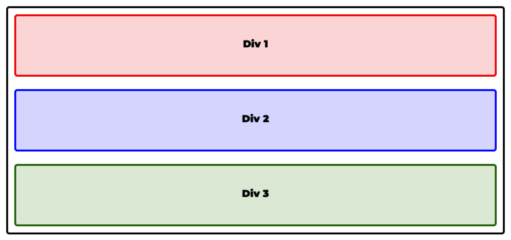
Try it in Flex Freight
Flex Freight, puzzles 1 to 4: played right on the lesson page.
Now move some real crates. In Flex Freight the loading dock is a flex container and the crates are its flex items, so display: flex and flex-direction line them up on the spots painted on the dock. The dock changes as you type, and the first puzzle opens with a guide that shows every value before you start.
Check yourself
2 questions to try on the lesson page.
So what
Navigation bars, toolbars and card layouts all start as a row or a column of items, and two lines of CSS give you either one.