Justify Content
The justify-content property on a flex container decides where the extra space goes, so its items can sit at the start, the end, the center or spread out.
Apprentice · CSS · Updated
After this lesson you can
- Choose the justify-content value that spaces flex items the way a layout needs
Key takeaways
- justify-content goes on the flex container and spreads the items along its direction, left to right in a row and top to bottom in a column.
- The default, flex-start, packs the items at the start. flex-end packs them at the end, and center packs them in the middle.
- space-between puts all the extra space between the items. space-around gives every item the same space on both sides.
- A column only has extra space to spread when the container is taller than its items.
Once the FlexBox has been established you have the ability to adjust how the child elements are distributed. The justify-content property is used to manage the distribution. It goes on the flex container, not on the items.
When the items don't fill the container, the space that's left over is the extra space. justify-content decides where that extra space goes. Its default value is flex-start: the items sit together at the start, and all the extra space is after them.
Row distribution
If flex-direction is set to row, justify-content affects the left-to-right distribution.
#parent-div {
    display: flex;
    flex-direction: row;
    justify-content: space-between;
}

Column distribution
If flex-direction is set to column, justify-content affects the top-to-bottom distribution.
Without a height, a column container is only as tall as its items, so there's no extra space to spread. That's why this example sets one:
#parent-div {
    display: flex;
    flex-direction: column;
    justify-content: space-between;
    height: 400px;
}
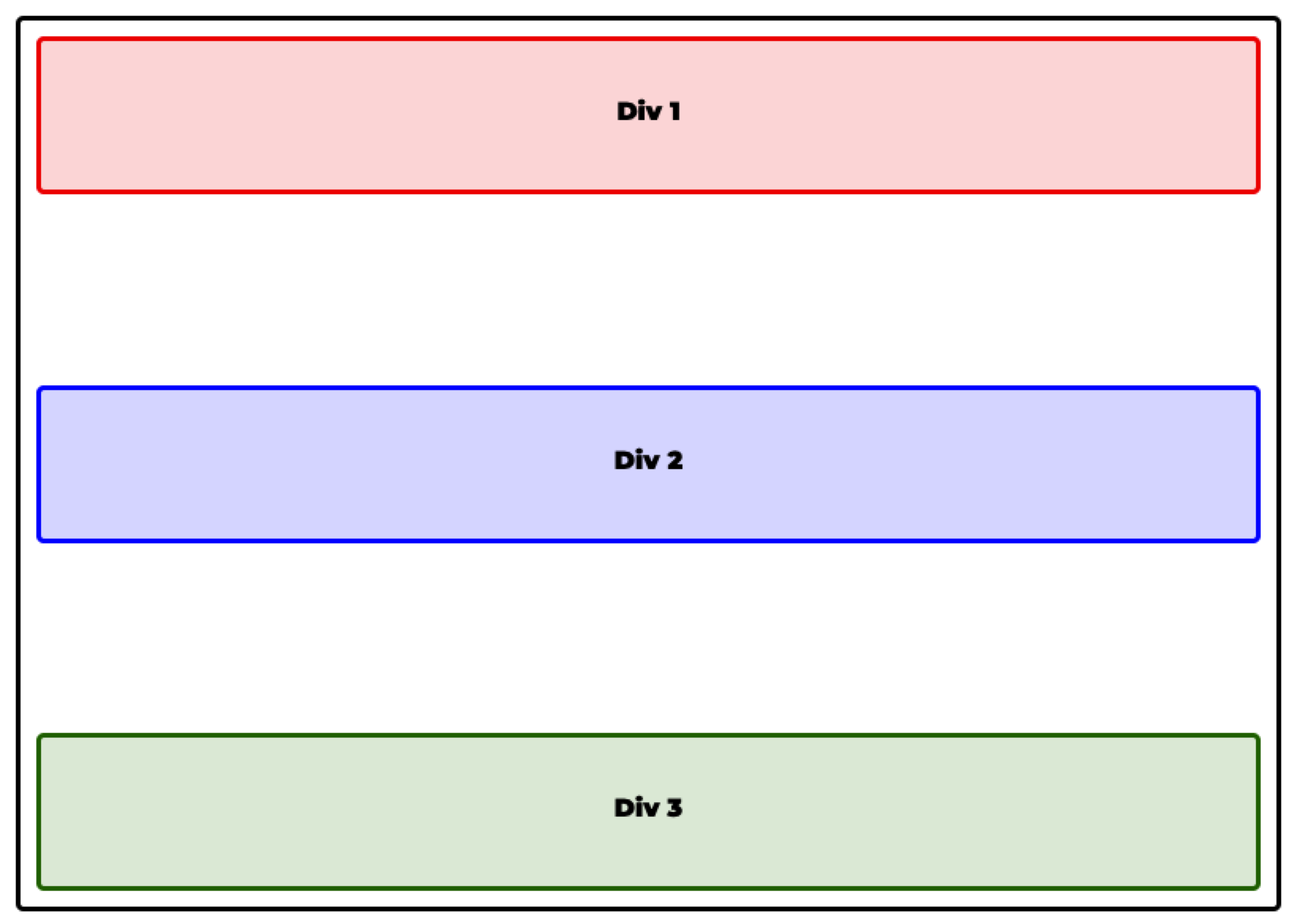
justify-content: space-between
All extra space is evenly distributed between the elements. No extra space is added outside the first and last elements.
#parent-div {
    display: flex;
    flex-direction: row;
    justify-content: space-between;
}

justify-content: space-around
All extra space is evenly distributed to the left and right of each element. Each item gets the same space on both sides, so the space between two items is twice the space at the ends.
#parent-div {
    display: flex;
    flex-direction: row;
    justify-content: space-around;
}

justify-content: center
The items sit together in the middle. The extra space is split evenly before the first element and after the last one.
#parent-div {
    display: flex;
    flex-direction: row;
    justify-content: center;
}

justify-content: flex-end
All extra space is placed at the beginning of the flexbox, so the items sit together at the end.
#parent-div {
    display: flex;
    flex-direction: row;
    justify-content: flex-end;
}

FlexBox Summary
There are several other properties that can be used to define page layout using FlexBox. A great resource is available at https://css-tricks.com/snippets/css/a-guide-to-flexbox/.
Try it in Flex Freight
Flex Freight, puzzles 5 to 9: played right on the lesson page.
Five puzzles to practice justify-content on a loading dock: push the crates to the door at the end of the row, gather them in the middle, and spread them out with space-between, space-around and one more value, space-evenly, which gives every gap the same width. The first puzzle opens with a guide where you can try each value before you start.
Check yourself
2 questions to try on the lesson page.
So what
A site header with the logo on the left and the links on the right, a row of centered buttons, a footer pushed to the end: each one is a single justify-content line.