calc(), min() and max(): Math in CSS
calc() does arithmetic with sizes, even mixing units such as 100% and 2rem, and min() and max() pick the smaller or the larger of two sizes, so a box fits a phone and a wide screen with no media query at all.
Journeyman · CSS · Updated
After this lesson you can
- Work out the size that a calc(), min() or max() value gives
- Write a size with calc(), min() or max() that fits a box to its space
Key takeaways
- calc() does arithmetic with sizes and can mix units.
calc(100% - 2rem)is the full width minus 2rem, worked out again for every screen. - Inside calc(), a plus or a minus sign needs a space on each side. Without the spaces, the browser skips the whole declaration.
- min() uses the smaller of its sizes, so it sets a ceiling.
width: min(60rem, 100%)is 60rem on a wide screen and the full width on a phone. - max() uses the larger of its sizes, so it sets a floor.
padding: max(1rem, 4vw)grows with the window but never gets smaller than 1rem. - 1ch is the width of the zero character in the current font, so
width: min(65ch, 100%)gives lines of about 65 characters that still fit a phone.
Spoke & Chain, a neighborhood bike shop, has a product page for every bike it sells. The page should be the full width of a phone, minus a little breathing room at the edges. On a laptop it should stop at a comfortable width instead of stretching across the screen. And the padding should grow on a big screen, but never shrink to nothing on a small one. You could write a media query for each of those. Or you could write one line each, with a little math. Every time a design says "the full width minus the sidebar", "as wide as possible, up to a limit" or "at least this much", these three functions are how you write it.
Math in a size: calc()
Think of framing a poster. The mat inside the frame is the frame's width, minus a border on each side. You don't measure the mat again for every frame: you know the rule, "the whole width minus the border".
calc() (read "calc", short for calculate) writes that rule in CSS. Inside its brackets goes a sum, and the browser works out the answer:
.sale-banner {
  width: calc(100% - 2rem);
  margin: 0 auto;
}
The sale banner is the full width of its parent, minus 2rem (32 pixels with the usual font size setting), and margin: 0 auto centers it, leaving 16 pixels on each side. On a phone 375 pixels wide, it's 343 pixels. On a laptop window 1200 pixels wide, it's 1168. You wrote it once; the browser does the math again for every screen.
That's the power of calc(): it mixes units. Nobody knows what 100% is in pixels until the page is on a screen, and 2rem depends on the reader's font size setting. calc() waits until both are known, then subtracts.
The four operators
calc() takes the four everyday operators: + (plus), - (minus), * (read "times") and / (read "divided by").
.site-header {
  height: 4rem;
}

.welcome {
  min-height: calc(100vh - 4rem);
}

.price-column {
  width: calc(100% / 3);
}
The welcome banner fills the window below the 4rem header: in a window 800 pixels tall, that's 800 minus 64, or 736 pixels. The price column is a third of its parent.
Two rules trip people up:
- A plus or a minus needs a space on each side.
calc(100% - 2rem)works.calc(100%-2rem)doesn't: with no space, the browser reads-2remas a negative number, so it sees two sizes side by side with nothing between them. The declaration is skipped without a word, like any CSS it can't read. *and/need a plain number on one side.calc(2rem * 3)is 6rem.calc(2rem * 3rem)is a size times a size, which isn't a size at all, so it's skipped too. With/, the plain number goes after it:calc(100% / 3).
Try it. Make a file math.html with a <div> that has a background color and width: calc(100% - 4rem). Open it with Live Server, then drag the browser window narrower and wider. The gap at the right edge stays 4rem the whole time.
The smaller of the two: min()
A friend says, "Spend $40 on my birthday present, or whatever you have in your wallet, whichever is less." That's a limit with a fallback: $40 when you can afford it, less when you can't.
min() (read "the smaller of") gives the browser two or more sizes and uses the smallest:
.bike-page {
  width: min(60rem, 100%);
}
Read it aloud: "the width is the smaller of 60rem and 100%". On a laptop window 1440 pixels wide, 60rem (960 pixels) is smaller, so the page is 960 pixels. On a phone 375 pixels wide, 100% (375 pixels) is smaller, so the page fits the phone. One line does the work of width: 100% plus max-width: 60rem.
The name confuses almost everyone at first, so here's the trick: min() sets a ceiling. The page can be smaller than 60rem, but never bigger.
You can do math inside min() with no calc() needed: min(60rem, 100% - 2rem) is 60rem, or the full width minus 2rem, whichever is smaller.
The ch unit and readable lines
Lines of about 50 to 75 characters are the most comfortable to read, and a max-width in rem is one way to get them. The ch unit (read "character") says it in the words a writer uses: 1ch is the width of the zero character, 0, in the element's own font.
.bike-story {
  width: min(65ch, 100%);
  margin: 0 auto;
}
Read it aloud: "the width is the smaller of 65 characters and the full width". The story of how the Gravel Fox was designed runs in centered lines of about 65 characters on a laptop, whatever font and size it's in, and on a phone it fits the screen. Most letters are a little narrower than a zero, so a line usually holds a few more characters than the number says. That's fine: 65ch is a good target, not an exact count.
The larger of the two: max()
A tip rule many people use at a restaurant: "20% of the bill, but at least $2." On a $40 dinner that's $8. On a $5 coffee, 20% is only $1, so you leave the $2. The rule always picks the larger amount.
max() (read "the larger of") does the same with sizes:
.bike-page {
  padding: max(1rem, 4vw);
}
4vw is 4% of the window's width. On a laptop window 1440 pixels wide, 4vw is 57.6 pixels, which is larger than 1rem (16 pixels), so the padding is 57.6 pixels: roomy. On a phone 375 pixels wide, 4vw is only 15 pixels, so 1rem wins and the padding is 16. The words never touch the edge of the screen.
So max() sets a floor. The padding can grow as big as the window makes it, but never smaller than 1rem.
| Function | Read it as | It sets | Example |
|---|---|---|---|
min(60rem, 100%) |
"the smaller of" | a ceiling: never more than 60rem | a page that stops growing on a wide screen |
max(1rem, 4vw) |
"the larger of" | a floor: never less than 1rem | padding that never shrinks to nothing |
Putting it together
Here is the Spoke & Chain product page with all three ideas. It needs no media query:
.bike-page {
  width: min(60rem, 100% - 2rem);
  margin: 0 auto;
  padding: max(1rem, 3vw);
}

.bike-story {
  width: min(65ch, 100%);
  margin: 0 auto;
}
These are the sizes the browser works out (with the usual 16-pixel font size, and box-sizing: border-box):
| Window width | .bike-page width |
.bike-page padding |
|---|---|---|
| 320 pixels (a small phone) | 288 pixels: the full width minus 2rem | 16 pixels: 1rem wins |
| 800 pixels (a tablet) | 768 pixels: still the full width minus 2rem | 24 pixels: 3vw wins |
| 1440 pixels (a laptop) | 960 pixels: 60rem wins | 43.2 pixels: 3vw wins |
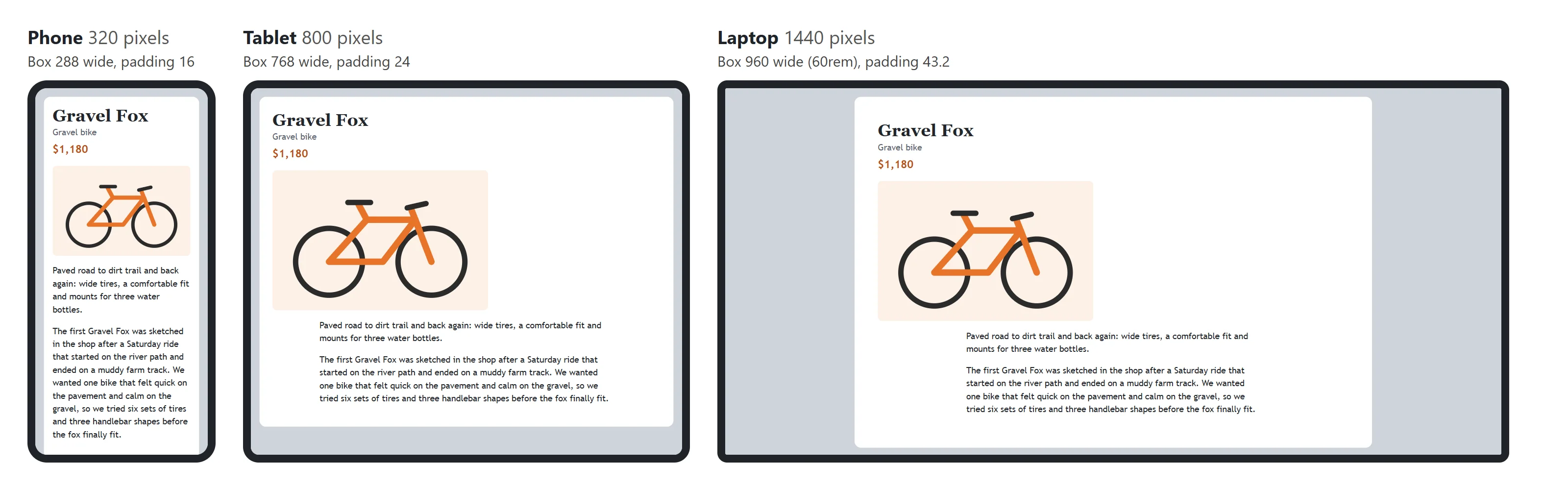
Try it. Give a page of your own a .bike-page box like this one. In the developer tools, open device mode and try 320, 800 and 1440 pixels wide. Then, in the Computed pane, compare the width and padding the browser shows with the table.
Check yourself
2 questions to try on the lesson page.
So what
Most "make it fit" problems have the same shape: the full width minus something, as big as possible up to a limit, or at least a minimum. calc(), min() and max() write those rules once, in the stylesheet, and the browser applies them to every screen there is, including ones that haven't been made yet.