Units: px, rem, em, % and Viewport Units
Every size in CSS needs a unit, and choosing the right one, px, rem, em, %, vw or vh, decides whether your page grows with the reader's text, fits its space and stays readable.
Apprentice · CSS · Web Development · Updated
After this lesson you can
- Work out the size in pixels that a rem, em, % or vw value gives
- Choose the right property and unit for a size or a space on the page
Key takeaways
- px is a fixed size. Use it for small details such as borders.
- 1rem is the root font size, 16px unless the reader changes it in their browser, so sizes in rem grow with the text the reader asked for.
- 1em is the element's own font size, so em sizes grow with their text, and an em font size inside another one multiplies.
- A percentage is a share of the parent's width, and 1vw or 1vh is 1% of the browser window's width or height.
- max-width stops a box growing past a size, which keeps lines of text short enough to read and lets the box shrink on a phone.
Plenty of people make the text bigger in their browser's settings: someone whose eyes are tired at the end of the day, a grandparent reading on a tablet, anyone on a small, bright phone. A page sized in the right units grows with them. A page sized in the wrong ones ignores them, or overflows a phone screen, or stretches a paragraph across a whole wide monitor until nobody can read it. Every number you've written so far in this chapter had a unit after it. This lesson is about choosing it.
Pixels: px
A pixel is one of the tiny dots a screen is made of, and px (read "pixels") is CSS's fixed-size unit. border: 2px solid; is a thin line, and it stays that thin.
.card {
  border: 2px solid #2f6b3a;
  border-radius: 12px;
}
A CSS pixel isn't always exactly one dot on the screen. A sharp phone screen packs two or three dots into every CSS pixel, so a 12px corner looks the same size on it as on a laptop. And when someone zooms the page with Ctrl and + (Cmd and + on a Mac), everything grows, pixels included.
What px doesn't follow is the reader's font size setting. That's where the next unit comes in.
rem: sizes that follow the reader
Every browser has a setting for the size of text, and it starts at 16 pixels. In Chrome it's Settings > Appearance > Font size: Medium is 16 pixels, Large is 20. That setting becomes the font size of the page's root element, <html>, and rem (read "rem", short for root em) is a size measured in it:
h1 {
  font-size: 2rem;
}

.card {
  padding: 1rem 1.5rem;
  margin-bottom: 2rem;
}
With the usual setting, 1rem is 16 pixels, so the heading is 32 pixels, the card's padding is 16 pixels top and bottom and 24 at the sides, and its bottom margin is 32. When a reader switches to Large, 1rem becomes 20 pixels and all of it grows to match: a 40-pixel heading and 20 and 30 pixels of padding. The page stays in proportion, at the size they asked for.
That's why rem is the usual unit for font sizes and spacing. One warning: never set the root size in pixels (html { font-size: 16px; }). It replaces the reader's own setting, and rem stops following them.
Try it. Size your card's padding and margin in rem. Then change the browser's font size setting to Large or Very large, and watch the card and its spacing grow. Put the setting back afterward.
em: sizes that follow their own text
An em (read "em") is the font size of the element it's used on. A badge with font-size: 0.75rem; (12 pixels) and padding: 0.25em 0.75em; gets 3 pixels of padding top and bottom and 9 at the sides. Make the badge's text bigger, and its padding grows to match:
.badge {
  font-size: 0.75rem;
  padding: 0.25em 0.75em;
  border-radius: 1em;
}
That's what em is good for: the space around a button's or a badge's words, which should stay in proportion to the words.
Used for font-size itself, an em is the parent's font size, and that's where em surprises people. A card set to font-size: 1.25em; inside a section that's also 1.25em gets 1.25 times 1.25:
- the page: 16 pixels
- the section: 1.25 × 16 = 20 pixels
- the card inside it: 1.25 × 20 = 25 pixels
Each em font size multiplies the one around it. This is called compounding, and it's why text in nested lists or nested cards can grow, or shrink, out of control. A rem is always measured from the root, so 1.25rem is 20 pixels wherever it is. Use rem for font sizes, and save em for the space around a component's own text.
Percentages and viewport units
A percentage (%) is a share of the box's parent. width: 50%; makes a box half as wide as the content of the box it's in. The most useful percentage in CSS keeps pictures inside their cards:
.card-picture {
  max-width: 100%;
}

.welcome-banner {
  min-height: 100vh;
}
max-width: 100%; means "never wider than my parent": a big photo shrinks to fit the card, and a small one keeps its own size.
The viewport is the part of the browser window that shows the page. vw and vh (read "viewport width" and "viewport height") are 1% of its width and its height. On a window 1200 pixels wide and 800 tall, 50vw is 600 pixels and 100vh is 800. min-height: 100vh; makes a welcome banner at least as tall as the window, whatever its size: the full-screen opening you see on many game and music sites.
One thing to know: on phones, 100vh can be a little taller than what's on screen, because the address bar comes and goes. Module 6's Common Layout Bugs and How to Fix Them shows the fix.
Readable lines with max-width
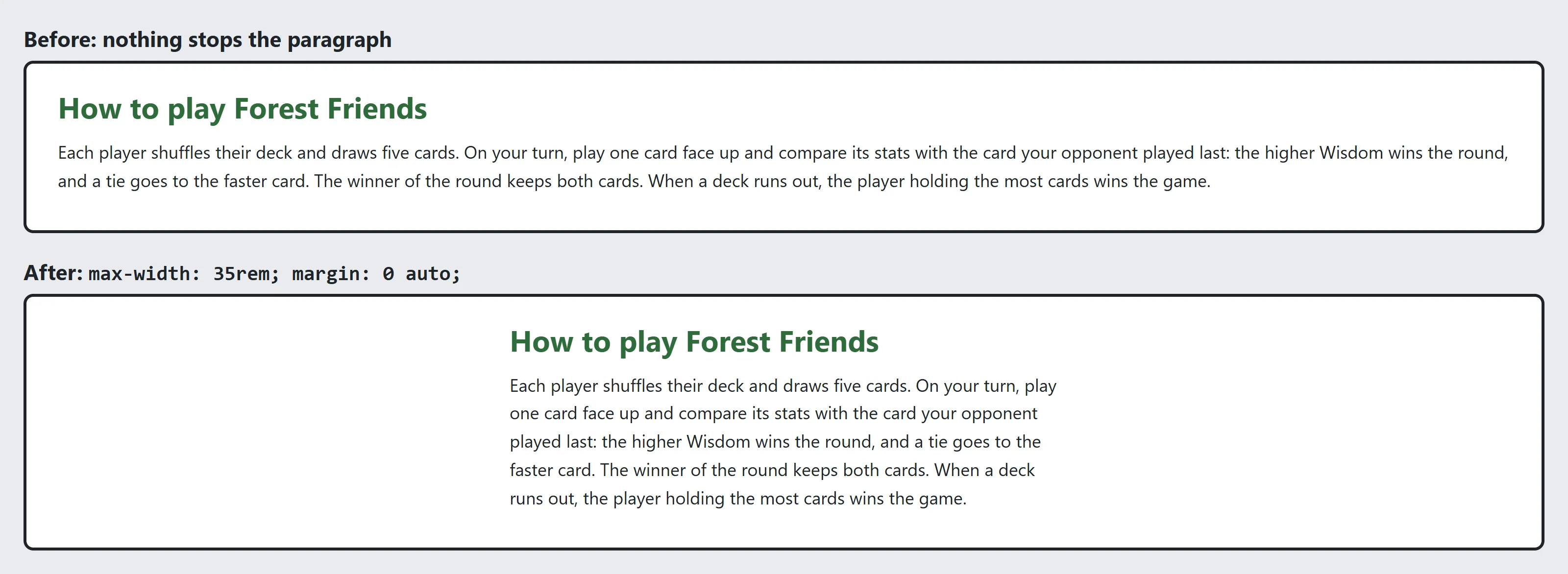
Lines of about 50 to 75 characters are the most comfortable to read. On a wide monitor, a paragraph with nothing to stop it stretches across the whole window, and the eye loses its place going back to the start of each line. A maximum size, max-width, stops a box from growing past a size:
.rules {
  max-width: 35rem;
  margin: 0 auto;
}
The Forest Friends rules page is now never wider than 35rem (560 pixels with the usual setting), roughly 70 characters of its text, and margin: 0 auto centers it. On a phone narrower than that, the box shrinks with the screen.
That's the difference from width. width: 35rem; is 35rem even on a phone 375 pixels wide, so the page scrolls sideways. max-width: 35rem; means "up to 35rem, and less when there isn't room".
Which one, when
| What you're sizing | A good choice | Why |
|---|---|---|
| Text | rem |
It follows the reader's font size setting, with no compounding |
| Padding and margins | rem |
The spacing grows with the text |
| The padding inside a button or a badge | em |
It stays in proportion to that button's own text |
| Borders and other thin lines | px |
A thin line should stay thin |
| A picture inside a card | max-width: 100% |
It never spills out of its parent |
| A column of text | max-width in rem |
Lines stay readable, and it shrinks on a phone |
| A banner that fills the window | vh |
It's measured from the window, not the parent |
These are good defaults, not laws. Plenty of sites mix them, and you'll meet more units and ways to combine them in Module 4.
Try it. Look at your Forest Friends stylesheet and find every number. For each one, ask: what is it sizing, and does the table agree with the unit you chose?
Check yourself
2 questions to try on the lesson page.
So what
Units decide whether your page respects its reader. Text and spacing in rem, thin lines in px, pictures that fit with a percentage, and paragraphs held to a readable width with max-width: that's a page that works for someone with big text on a small phone as well as it does on your screen.