Light and Dark Themes with prefers-color-scheme
A dark theme is the same page with new token values: you redefine the color tokens in a prefers-color-scheme media query, set color-scheme, and every component follows the reader's light or dark setting.
Journeyman · CSS · Updated
After this lesson you can
- Add a dark theme by redefining the color tokens in a prefers-color-scheme media query, and set color-scheme
- Write one color for both themes with light-dark(), and tell when it needs color-scheme to pick the right one
- Build a theme switch from a checkbox and :has(), with no JavaScript, and check text contrast in both themes
Key takeaways
- @media (prefers-color-scheme: dark) holds rules that apply only when the reader's device is set to dark.
- With design tokens, a dark theme redefines only the color tokens, and the component rules don't change at all.
- color-scheme: light dark tells the browser the page handles both, so form fields and scrollbars switch too.
- light-dark(), with the light color first and the dark one second, writes both colors in one place. It needs color-scheme to pick the dark one.
- A checkbox and :has() make a theme switch with no JavaScript. Check text contrast in both themes, since a color that reads well on cream can vanish on dark.
It's 11 at night and someone is lying in bed, phone in dark mode, deciding whether The Daily Grind opens early enough for a coffee before work. They tap the link, and the page blasts them with bright cream and white, like someone switching on the kitchen light. Phones, laptops and most apps (your phone's settings, YouTube, GitHub, VS Code) let people choose light or dark, and a page that respects the choice feels made for them.
You'll build dark themes for clients who ask for one, for a portfolio that should look sharp at night, and for class projects where it's the feature that stands out. If your colors are design tokens, the whole job is a second set of values for the same names. This lesson shows how to give the page those values when the reader asks for dark, how to tell the browser, a shortcut called light-dark(), a switch the reader can flip, and how to check that both themes can be read.
The reader's setting: prefers-color-scheme
A car that remembers each driver's seat position adjusts itself to whoever gets in. The browser knows which way each reader set their device, light or dark, and CSS can ask. The question is a media query, a rule that applies only when something is true, with the media feature prefers-color-scheme:
@media (prefers-color-scheme: dark) {
  /* Rules here apply only when the reader's device is set to dark. */
}
Read it as "at media, prefers color scheme dark". It's the same @media that checks a screen's width (Media Queries and Breakpoints covers those), but this one asks about the reader's setting. Its two values are light and dark. A device with no setting counts as light.
A dark theme is new token values
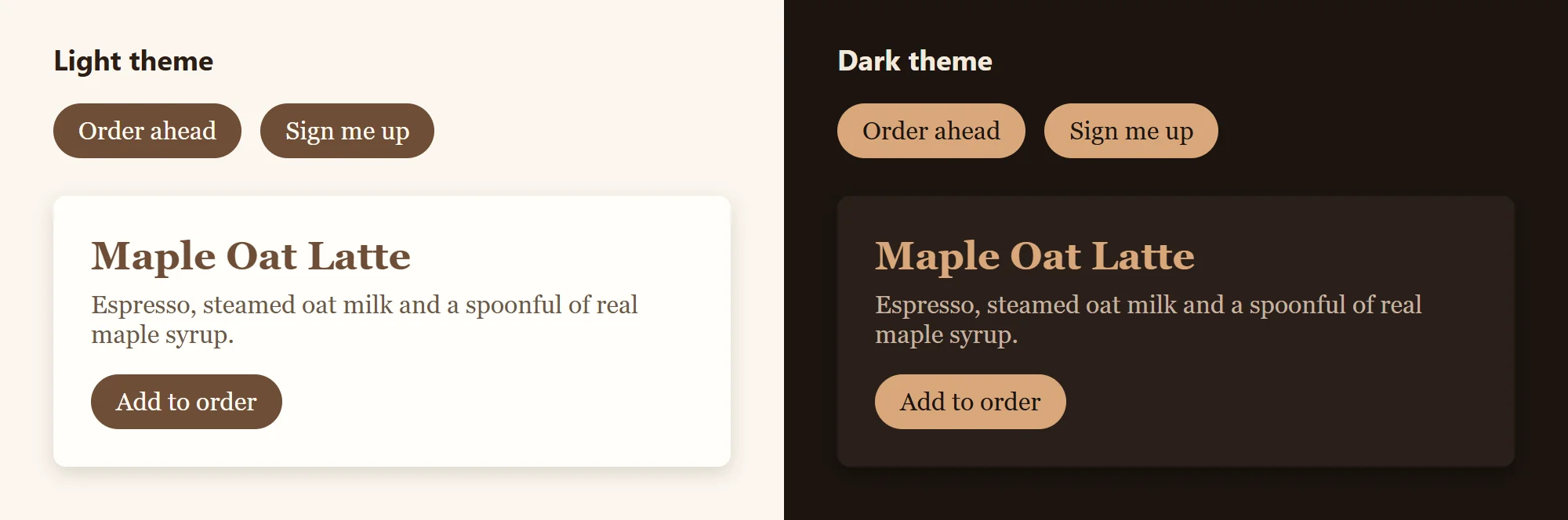
Here's where design tokens pay off. The Daily Grind's components read only tokens, so a dark theme doesn't touch a single component rule. It gives the same tokens new values:
:root {
  --color-bg: #fbf6ee;
  --color-text: #2b1d14;
  --color-brand: #6f4e37;
  --color-on-brand: #fffaf2;
}

@media (prefers-color-scheme: dark) {
  :root {
    --color-bg: #1c1410;
    --color-text: #f3e9dc;
    --color-brand: #d9a77a;
    --color-on-brand: #1c1410;
  }
}
On a device set to dark, the second :root rule applies too, and because it comes later with the same selector, its values win. Every button, card and field follows, with no other change. Put the dark block after the light tokens: placed first, the light values would come later and win in both themes.
Notice that the brand color changes too. Coffee brown on a nearly black page almost disappears, so the dark theme's brand is a lighter latte color. A few habits make dark themes comfortable:
- Not pure black. A very dark brown (
#1c1410) glares less than#000000and keeps the brand's warmth. - Off-white text, such as
#f3e9dc, is easier on the eyes than pure white at night. - Lighter means closer. Shadows barely show on a dark page, so a card stands out by being a little lighter than the page instead.
color-scheme: tell the browser too
Dimming the lights in a room doesn't help if the TV is still blasting a bright screen. Some parts of a page are drawn by the browser, not by your CSS: the inside of text fields and dropdowns, checkboxes, scrollbars, and the page's default background. They stay light until you tell the browser your page handles dark.
:root {
  color-scheme: light dark;
}
Read it as "color scheme light dark": the page supports both, so the browser uses the reader's choice for its own parts too. With only light (or nothing), they stay light even in your dark theme, and a bright white text field sits in the middle of your dark page. You can also put <meta name="color-scheme" content="light dark"> in the <head> of the HTML, which tells the browser before the stylesheet arrives and avoids a white flash as a dark page loads.
light-dark(): both colors in one place
Writing every color twice, once in each :root block, works well. light-dark() is a shortcut that keeps the pair together:
:root {
  color-scheme: light dark;
  --color-bg: light-dark(#fbf6ee, #1c1410);
  --color-text: light-dark(#2b1d14, #f3e9dc);
  --color-brand: light-dark(#6f4e37, #d9a77a);
}
Read it as "light dark of cream, comma, dark brown". The first color is for the light theme and the second for the dark one. The catch: light-dark() picks by the page's color-scheme, not by the device's setting. Without color-scheme: light dark, the page counts as light-only, and light-dark() always gives the first color. It works for colors, and since September 2026 for background images such as gradients, but not for sizes: light-dark(1rem, 2rem) is not allowed.
light-dark() works in every current browser: it reached the last of Chrome, Edge, Firefox and Safari in May 2024. Checked on 2026-10-28, it's still marked newly available on Baseline, the web's list of features that work in every major browser, and is due to become widely available in November 2026. A browser older than mid-2024 (Safari before 17.5) doesn't know it: written in a token, every color that reads the token is lost, so if your readers might have older phones, the media query from the section before is the safer choice.
A theme switch with a checkbox and :has()
Some people want dark for one site only, whatever their device says. A switch on the page lets them choose. It starts as an ordinary checkbox with a label, so it works with a keyboard and a screen reader:
<label class="theme-switch">
  <input type="checkbox" id="dark-mode">
  Dark theme
</label>
Then :has() (read "has") asks whether the page contains a checked box, and :checked is true for a checkbox that's ticked:
:root:has(#dark-mode:checked) {
  --color-bg: #1c1410;
  --color-text: #f3e9dc;
  --color-brand: #d9a77a;
  --color-on-brand: #1c1410;
}
Read the selector as "root, when it has a dark-mode box that's checked". Tick the box, and the page's root gets the dark tokens; untick it, and it goes back. If your tokens use light-dark(), the switch is even shorter: :root:has(#dark-mode:checked) { color-scheme: dark; } makes every light-dark() pick its dark color. :has() works in every current browser and has been Baseline widely available since June 2026 (Modern Selectors: :is(), :where() and :has() covers more of what it can do).
Two honest limits. The page doesn't remember the choice: reload it and the box is unticked again, because remembering needs JavaScript. And a reader whose device is already dark sees the dark theme with the box unticked. Three radio buttons (Light, Dark, Match my device) fix that second one, with one :has() rule for each choice.
Try both themes, and check the contrast
You don't need to change your computer's setting to see the dark theme. The developer tools can pretend:
- Chrome and Edge: open the developer tools, press Ctrl+Shift+P (Cmd+Shift+P on a Mac) to open the Command Menu, type
dark, and choose Emulate CSS prefers-color-scheme: dark. The same choice is in the Rendering panel. Chooselightto switch back. - Firefox: in the Inspector's Rules view, the sun and moon buttons at the top switch between a light and a dark simulation.
Then check that every piece of text can still be read. Contrast is how far apart a text color and its background are, as a ratio: body text needs at least 4.5 to 1 (read "four point five to one"), the WCAG AA level a class may name (Color That Works: Palettes and Contrast explains it). Select an element, click the small color square beside its color in the Styles pane, and the color picker shows its Contrast ratio with a check mark when it passes. Do it in both themes. The light theme's brown #6f4e37 scores 6.92 on cream, but only 2.44 on the dark page, which is why the dark theme needs its own brand color.
Check yourself
2 questions to try on the lesson page.
So what
A dark theme is a second set of values for the names you already have. Build on tokens, ask the reader's setting with prefers-color-scheme, tell the browser with color-scheme, and check the contrast in both: every component you make from then on comes in light and dark for free.
Key terms
- prefers-color-scheme
- color-scheme
- light-dark()
- :has()
- :checked