Hierarchy, Alignment and Whitespace
A page looks designed when the most important thing is seen first, everything lines up on a few shared edges, and space groups the things that belong together, and CSS sets all three with size, weight, color, text-align, padding and margin.
Apprentice · CSS · Web Development · Updated
After this lesson you can
- Use the squint test to find what a page shows first, and set size, weight and color so the most important thing leads
- Line things up on shared edges and use whitespace to group related things
Key takeaways
- Squint at a page until the words blur. What you still see first is its visual hierarchy, and it should be the thing that matters most.
- Show what matters with size, weight and color, and keep the loudest look for one or two things. When everything shouts, nothing gets heard.
- Line things up on a few shared edges. Left-aligned paragraphs give the eye one straight edge to come back to.
- Space groups things. Keep a heading closer to the text it introduces than to the section before it.
Picture a hand-painted sign on a fence: SWEET CORN, in letters a foot tall, and under it, smaller, $5 a dozen, next driveway. You read it at 40 miles an hour, in the order the painter chose. Now picture a flyer stapled to a telephone pole, where every line is bold, every line is a different size, and you give up halfway through. Both have the same facts. One was arranged. Every page you build is one or the other, and a class project graded on "visual design", a manager who says the page "looks off", or a client who says "make it pop" is usually asking for the arranging. This lesson shows the three rules a designer checks first, and the CSS that sets each one.
The market's page, before
The Saturday Farmers Market has a page for its weekly event: when and where, a notice about bags, the vendors and the schedule. Everything is on it. Here's its HTML. Save it as index.html in a new folder named farmers-market:
<!DOCTYPE html>
<html lang="en">
<head>
  <meta charset="utf-8">
  <meta name="viewport" content="width=device-width, initial-scale=1">
  <title>Saturday Farmers Market</title>
  <link rel="stylesheet" href="market.css">
</head>
<body>
  <header>
    <h1>Saturday Farmers Market</h1>
    <p class="when">Every Saturday, 8 a.m. to 1 p.m., in the Elm Street parking lot</p>
  </header>
  <main>
    <p class="notice">Bring your own bag! Vendors no longer hand out plastic bags.</p>
    <section class="vendors">
      <h2>This week's vendors</h2>
      <article class="vendor">
        <h3>Hilltop Honey</h3>
        <p>Raw wildflower honey and beeswax candles. Booth 4.</p>
      </article>
      <article class="vendor">
        <h3>Green Thumb Farm</h3>
        <p>Tomatoes, sweet corn and the first peaches of the year. Booth 7.</p>
      </article>
    </section>
    <section class="schedule">
      <h2>Schedule</h2>
      <p>9:00 Cooking demo: summer salsa. 10:30 Seed planting for kids. 12:00 Live bluegrass.</p>
    </section>
  </main>
</body>
</html>
And here's the stylesheet it came with. Save it beside the page as market.css:
body { font-family: Arial, sans-serif; font-size: 14px; text-align: center; }
h1 { font-size: 20px; }
h2 { font-size: 22px; margin: 4px; }
h3 { font-size: 21px; color: red; }
.when { font-size: 20px; font-weight: bold; color: red; }
.notice { font-size: 22px; font-weight: bold; color: red; }
.vendor { border: 2px solid black; margin: 3px; padding: 4px; }
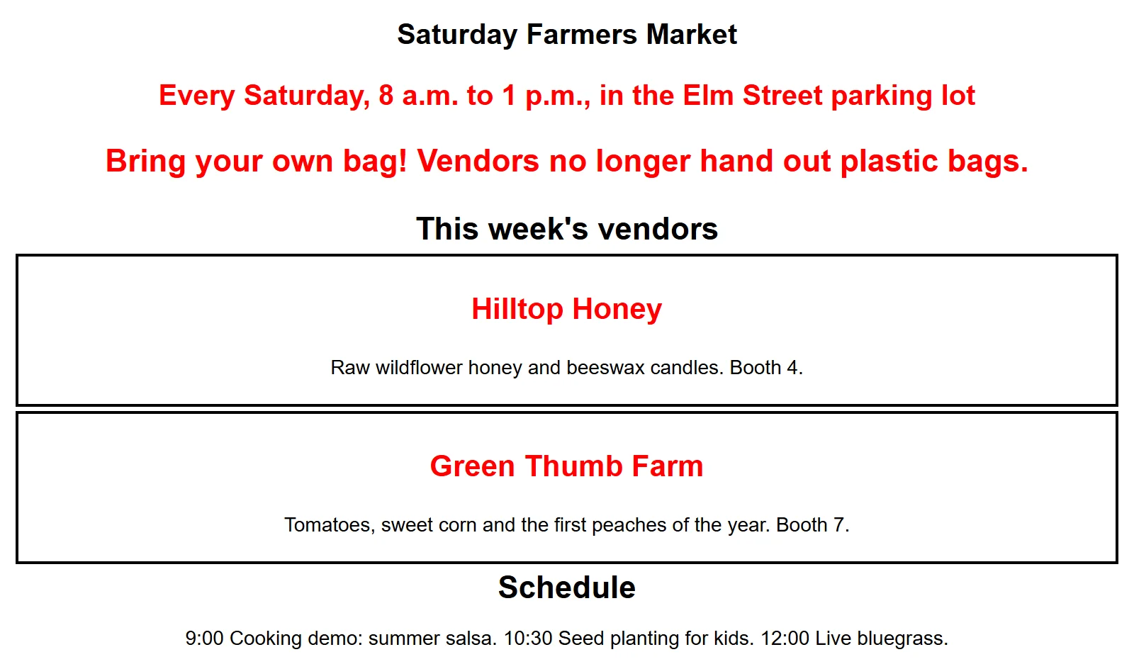
Open the page with Live Server. Nothing is broken, and yet it looks like the flyer on the pole. The rest of this lesson finds out why.
The squint test
Stand back from a poster, or squint until the words go blurry. You can't read anything anymore, but you can still see shapes: a big dark block here, a bright spot there. Whatever your eye lands on first, then second, then third, is the poster's visual hierarchy: the order in which a page gets seen. Designers do this on purpose, and it's called the squint test.
Squint at the market's page. The first thing you see is a tie between three red lines and two headings that are bigger than the market's name. Nothing leads, so your eye jumps around. A good page has one clear first stop (here, the market's name), a clear second (when and where), and then the sections in order.
Try it. Open a site you use every day, such as your bank, a news site or a shopping app, and squint at it. Write down the first three things you see. Then squint at the market's page and do the same. The site you use was arranged so the first thing you see is the thing its makers most want you to see.
Size, weight and color: the three volume knobs
A good speaker raises their voice for the one line that matters, not for every sentence. A page has three volume knobs:
- Size: bigger text gets seen first. Set it with
font-size. - Weight: how thick the letters are, from thin to heavy. Bold text stands out from regular text around it. Set it with
font-weight:400is normal and700is bold. - Color: a strong color against calm ones grabs the eye. Set it with
color.
Turn up one knob for the most important thing, and leave the rest at a normal volume. Here are the market's sizes put in order, with the name biggest, the sections next and the vendor names after them:
h1 { font-size: 2.5rem; }
h2 { font-size: 1.75rem; }
h3 { font-size: 1.25rem; color: #2f6b3a; }
.when { font-size: 1.25rem; font-weight: 400; }
.notice { font-size: 1rem; font-weight: 700; }
The headings now step down in size, so the market's name leads. The vendor names are green instead of red, which says "this is a name" without shouting. The time and place lost their bold, and the notice kept it: it's the one line in the main text a shopper must not miss. (rem is the reader's normal text size, usually 16 pixels: 2.5rem is two and a half times that.)
A rule of thumb from sign painters: if you make everything bold, you've made nothing bold. Pick one or two things to turn up, at most.
Lining things up on shared edges
Walk into a well-kept shop and the shelves line up: every can's left edge on the same line, row after row. A messy shop has the same cans, at slightly different spots, and it feels cluttered before you can say why. Your eye notices the edges things share, and alignment is putting things on as few edges as you can.
The market's page centers everything with text-align: center. A centered line is fine for a short heading, but a centered paragraph has a ragged edge on both sides, so after each line your eye has to hunt for where the next one starts. Left-aligned text gives the eye one straight edge to come back to:
body {
  font-family: Arial, sans-serif;
  text-align: left;
}

header,
main {
  padding: 0 1.5rem;
}
Now the name, the time, the notice, every heading and every vendor box start on the same left edge, 1.5rem in from the side of the window. Changing text-align doesn't move boxes, only the lines of text inside them, and since left is where text starts anyway, you could also delete the old center and get the same result.
Try it. In market.css, change text-align: center to left, and add the header, main rule. Save, then hold a ruler, or the edge of a sheet of paper, against the screen. How many different left edges does the page have now?
Whitespace groups things
At a family picnic, you can tell who came together by how close they sit. Space does the same on a page: things that sit close together read as a group, and a bigger gap says "something new starts here". The empty space between and around things is called whitespace (designers also call it negative space). It doesn't have to be white: it's any space with nothing in it.
On the market's page, every gap is about the same tiny size, so the vendors run into each other and a heading sits as close to the section above it as to its own text. Two fixes, both with margin and padding:
h2 {
  margin: 2.5rem 0 0.75rem;
}

.vendor {
  border: 1px solid #d8d2c4;
  margin: 0 0 1rem;
  padding: 1rem 1.25rem;
}
- A heading stays close to its own section.
margin: 2.5rem 0 0.75remgives eachh2a big gap above (2.5rem) and a small gap below (0.75rem), so it's clear which text it belongs to. - Room inside, room between.
padding: 1rem 1.25remgives each vendor's words room inside its box, andmargin: 0 0 1remputs a gap between one box and the next. With room around them, a thin, light border is enough to show where each box ends.
Whitespace can feel like wasted space when you're new to design. It isn't: it's how the reader knows what goes with what, without a single extra line or box.
The market's page, after
Put the three rules together and the same HTML becomes a page you can take in at a glance:
body { font-family: Arial, sans-serif; font-size: 1rem; }
header, main { padding: 0 1.5rem; }
h1 { font-size: 2.5rem; margin: 1.5rem 0 0.25rem; }
h2 { font-size: 1.75rem; margin: 2.5rem 0 0.75rem; }
h3 { font-size: 1.25rem; color: #2f6b3a; margin: 0 0 0.25rem; }
.when { font-size: 1.25rem; margin: 0; }
.notice { font-weight: 700; padding: 0.75rem 1rem; background-color: #fdeccf; }
.vendor { border: 1px solid #d8d2c4; margin: 0 0 1rem; padding: 1rem 1.25rem; }
Squint again. The market's name comes first, then when and where, then the notice in its pale yellow band, then the sections in order. Nothing in the HTML changed.
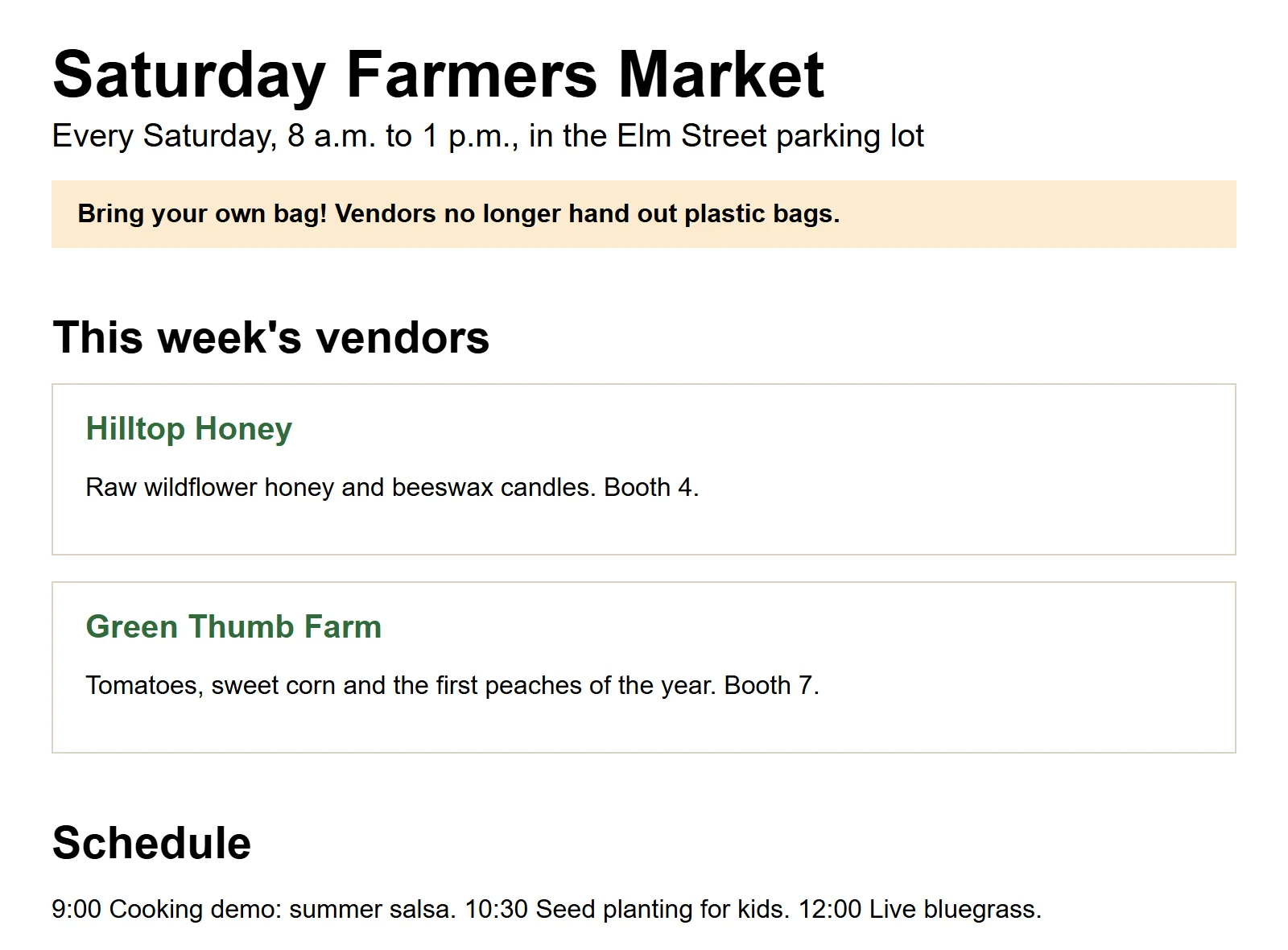
Try it. Replace your market.css with the rules above, save, and put the two versions side by side (open the old one from your editor's undo, or keep a copy named market-before.css). Squint at each. Then change one thing at a time, such as the h2 margin, and watch how the grouping changes.
Check yourself
2 questions to try on the lesson page.
So what
Hierarchy, alignment and whitespace are the first things a designer checks, and none of them needs a new property: they're the size, weight, color, margin and padding you already have, used on purpose. The next lessons add type, color and finishing touches, and if you want to go further into design itself, the Design for Developers course covers it in depth.
Key terms
- Visual hierarchy
- Negative space
- Font weight
- Text alignment