Margin, Padding and Border in Practice
Write padding and margin in one line with the clockwise shorthands, frame a box with border and border-radius, center it with auto margins, and know why two margins can turn into one.
Apprentice · CSS · Web Development · Updated
After this lesson you can
- Write padding and margin with the one-, two- and four-value shorthands
- Add a border and rounded corners with border and border-radius
- Center a box with auto margins and predict when vertical margins collapse
Key takeaways
- The shorthands go clockwise from the top. One value sets all four sides, two set top and bottom then left and right, four set top, right, bottom and left.
- The border shorthand takes a width, a style and a color. Without a style, such as solid, no border shows.
- border-radius rounds a box's corners, and 50% on a square box makes a circle.
- To center a box that has a width, write
margin: 0 auto. It splits the leftover space equally between the left and the right. - When two block boxes stack, their top and bottom margins collapse into one, the size of the larger margin.
Open almost any stylesheet at work and you'll find lines like padding: 8px 16px; and margin: 0 auto;. They're the shorthands: one line that sets all four sides of a box. A designer's mockup that says "12 above and below, 24 on the sides" turns into exactly one of them. This lesson teaches you to write them, read them, and fix the one spacing surprise that catches everyone sooner or later.
The examples style Forest Friends' cards, like this one for Fern the Fox:
<article class="card">
  <h2 class="card-name">Fern the Fox</h2>
  <p class="card-type">Clever trickster</p>
  <p class="card-quote">"Why run, when you can outsmart?"</p>
</article>
One side at a time
Padding and margin each have a property for every side of the box:
.card {
  padding-top: 12px;
  padding-right: 24px;
  padding-bottom: 12px;
  padding-left: 24px;
  margin-bottom: 32px;
}
These are called longhand properties: one side each. They're clear, and the right choice when you want to change one side only, like margin-bottom here, which puts 32 pixels of space under the card and leaves the other three sides alone. But four lines for the padding is a lot to type and read.
The shorthands: clockwise from the top
A shorthand sets all four sides in one line. The values go around the box like the hands of a clock, starting at 12 o'clock: top, right, bottom, left. (Some people remember it as TRouBLe: T, R, B, L.)
| You write | Top | Right | Bottom | Left |
|---|---|---|---|---|
padding: 16px; |
16px | 16px | 16px | 16px |
padding: 12px 24px; |
12px | 24px | 12px | 24px |
padding: 12px 24px 8px; |
12px | 24px | 8px | 24px |
padding: 4px 8px 12px 16px; |
4px | 8px | 12px | 16px |
- One value sets all four sides.
- Two values: the first is the top and bottom, the second the left and right. This is the one you'll use most.
- Three values: the top, then the left and right, then the bottom.
- Four values: top, right, bottom, left, clockwise.
margin works the same way, so the four lines from the last section shrink to two:
.card {
  padding: 12px 24px;
  margin: 0 0 32px;
}
Try it. In your forest-friends folder, give the card padding: 12px 24px;, then open the developer tools' box model diagram (The Box Model: Content, Padding, Border and Margin shows where it is). Check that the top and bottom say 12 and the sides say 24. Then try three values and four.
Borders
The border shorthand takes three values, usually written in this order:
.card {
  border: 4px solid #c8642a;
}

.card-name {
  border-bottom: 2px dashed #c8642a;
}
- The width: how thick the line is, here
4px. - The style: what kind of line.
solid,dashed,dottedanddoubleare the ones you'll use most. A border needs a style: leave it out and nothing shows, because the style starts asnone. - The color: here a fox orange,
#c8642a. Leave it out and the border takes the text's color.
border-top, border-right, border-bottom and border-left draw one side only, like the dashed line under Fern's name. And border-width, border-style and border-color set one part on all four sides, so border-color: gold; recolors a border without touching its width or style.
Rounded corners with border-radius
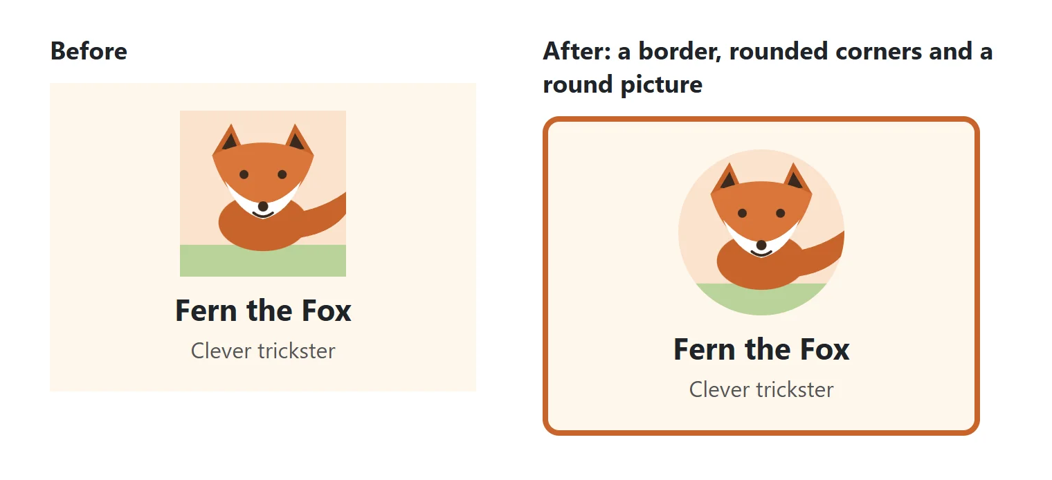
Pick up a real trading card, or look at the app icons on a phone: the corners are rounded. border-radius rounds a box's corners, and the bigger the value, the rounder the corner:
.card {
  border: 4px solid #c8642a;
  border-radius: 12px;
}

.card-picture {
  width: 120px;
  height: 120px;
  border-radius: 50%;
}
- One value rounds all four corners the same.
- Four values go clockwise from the top-left corner: top-left, top-right, bottom-right, bottom-left.
border-radius: 12px 12px 0 0;rounds only the top two corners, like a tab. 50%on a square box makes a circle, the usual way to make a round profile picture. On a box that isn't square it makes an oval.
A box doesn't need a border to have rounded corners: its background color is rounded too.
Centering a box with auto margins
A block box stretches across all the width it has. Give a card a width, and it sits at the left with empty space to its right. To center it:
.card {
  width: 300px;
  margin: 0 auto;
}
Read it "margin zero auto": the top and bottom margins are 0, and the left and right are auto. auto tells the browser to work out the margin itself: it takes the space left over beside the card and splits it equally between the left and the right, so the card sits in the middle. If the card sits in a space 1000 pixels wide, each side gets 350 pixels.
Two things to know:
- The box needs a width. Without one, a block box fills the whole line, there's no space left over, and
autoworks out to 0. - It centers the box, not what's inside it. To center the text inside the card, use
text-align: center;. And it doesn't center up and down: that comes with flexbox in Module 3.
Margin collapsing: the surprise everyone meets
Two people in a line each like their personal space: one wants a meter, the other half a meter. They stand a meter apart, not a meter and a half: the bigger need covers the smaller one. Margins between stacked boxes work the same way.
.card-name {
  margin-bottom: 24px;
}

.card-type {
  margin-top: 16px;
}
You might expect 40 pixels between Fern's name and the line under it. There are 24. When the bottom margin of one block box meets the top margin of the next, the two collapse into one margin, the size of the larger of the two. This is called margin collapsing.
- It happens only to top and bottom margins, and only between block boxes. Left and right margins never collapse, and padding never does.
- It also happens between a box and its first or last child. If a card has no padding or border at its top, its heading's top margin pokes out through the top of the card and pushes the whole card down. Give the card some padding, or a border, and the heading's margin stays inside.
- It doesn't happen inside the flexbox and grid layouts you'll meet in Module 3.
The habit that avoids most surprises: space things in one direction. Give elements a bottom margin and no top margin (or the other way round), so two margins never meet.
Try it. Give Fern's name margin-bottom: 24px; and the type line margin-top: 16px;. Open the box model diagram for each one: both margins are there, but the gap between them is 24 pixels. Change the 16 to 40 and watch the gap grow to 40.
Check yourself
2 questions to try on the lesson page.
So what
The shorthands, borders, rounded corners and centering in this lesson are the spacing work behind every card, button and section you'll style. And the next time a gap comes out smaller than you added up, you'll know two margins have collapsed into one.