Flexbox Sizing: flex-grow, flex-shrink and flex-basis
Each flex item starts from its flex-basis, flex-grow shares out the leftover space like splitting a bill, flex-shrink decides who gives up room when it's tight, flex: 1 sets all three at once, and min-width: 0 lets a long line of text shrink.
Journeyman · CSS · Updated
After this lesson you can
- Work out how flex-grow shares a flex container's leftover space among its items
- Size flex items with flex-basis, flex-shrink and the flex shorthand, such as flex: 1
- Fix a flex item that won't shrink below its content with min-width: 0
Key takeaways
- flex-basis is an item's starting size along the main axis. The leftover space is what remains after every item's basis is taken out of the container.
- flex-grow shares out the leftover space by shares. An item with flex-grow 2 gets twice as much extra as one with 1, and the default, 0, takes none.
- flex-shrink shares out the cut when the items don't fit. The default, 1, lets every item shrink; flex-shrink 0 keeps an item at its basis.
- flex: 1 is short for flex: 1 1 0%, so items with flex: 1 come out the same size. The default for every item is flex: 0 1 auto.
- A flex item won't shrink below its content's smallest size, such as a line that can't wrap, until you give it min-width: 0.
A search bar where the text box stretches to fill the row and the Search button stays its own size. A sidebar that stays 250 pixels wide while the main content takes the rest of the screen. Three ticket options that come out exactly the same width, however long their names are. Those are sizing jobs, and they're the next thing you'll be asked for once your items sit in a row. Flexbox handles them with three properties on the items, and one shorthand that sets all three at once.
The lesson uses words from the two before it: a flex container is the parent with display: flex, its children are flex items, and the main axis is the direction they run in (left to right in a row).
The starting size: flex-basis
Three friends go out to dinner. Before anyone talks about splitting anything, each one pays for their own meal. Then comes the shared part (the nachos, the tip), and that's split up by agreement.
Flexbox sizes items the same way, in two steps. First, every item gets its starting size along the main axis, its flex-basis:
.ticket {
  flex-basis: 150px;
}
In a row, flex-basis is a width (in a column, it's a height). Its default is auto, which means "use the item's width if it has one, and the size of its content if it doesn't". If an item has both a width and a flex-basis, the flex-basis wins.
Then the browser adds up the bases and compares them with the container. A 600-pixel row holding three 150-pixel tickets has 150 pixels left: the leftover space. What happens to it is up to flex-grow.
Sharing the leftover space: flex-grow
Back to the dinner. The friends agree to split the shared part by shares: two of them take one share each, and the third, who ate most of the nachos, takes two. Four shares in all, so a share is a quarter of the total.
flex-grow is an item's number of shares of the leftover space:
.lineup {
  display: flex;
  width: 600px;
}

.lineup .friday   { flex-basis: 100px; flex-grow: 1; }
.lineup .saturday { flex-basis: 200px; flex-grow: 2; }
.lineup .sunday   { flex-basis: 100px; flex-grow: 1; }
Work it out the way the browser does:
- Add up the bases: 100 + 200 + 100 = 400 pixels.
- Find the leftover space: 600 − 400 = 200 pixels.
- Count the shares: 1 + 2 + 1 = 4, so one share is 200 ÷ 4 = 50 pixels.
- Add each item's shares to its basis: Friday 100 + 50 = 150, Saturday 200 + 100 = 300, Sunday 100 + 50 = 150.
The default is flex-grow: 0: no shares, so the item stays at its basis and the leftover space stays empty (for justify-content to place). An item with flex-grow: 1 while the others have 0 takes all the leftover space. That's the search bar:
.search {
  display: flex;
}

.search input {
  flex-grow: 1;
}
The text box takes every pixel the Search button doesn't need, on a phone or on a wide screen.
A common mix-up: flex-grow: 2 doesn't make an item twice as wide as one with flex-grow: 1. It gets twice as much of the leftover space, on top of its own basis. Saturday above is twice as wide as Friday only because its basis is twice as big too.
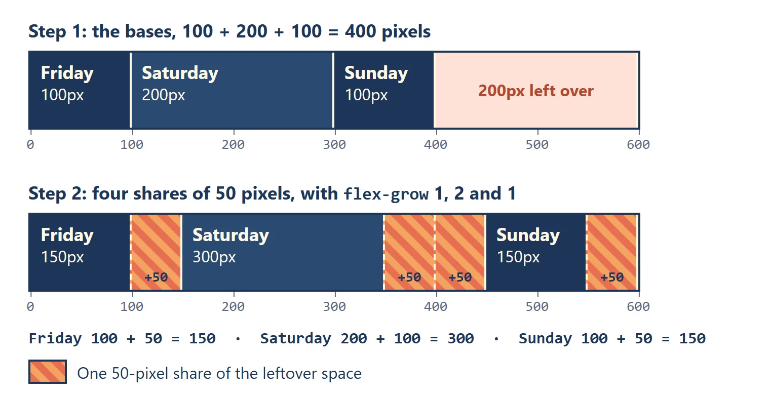
Try it. In a summer-sound folder, make a page with <div class="lineup"> holding three <div>s with the classes friday, saturday and sunday, give each a background color, and use the rules above. Inspect each day: the width in the box model diagram should match the math. Then change Saturday's flex-grow to 0 and work out the new widths before you save.
Giving up room: flex-shrink
Now the opposite problem: the bases add up to more than the container, and something has to give. flex-shrink decides who gives up room, and how much:
.tickets {
  display: flex;
  width: 500px;
}

.tickets .day     { flex-basis: 300px; }
.tickets .weekend { flex-basis: 300px; }
The two bases need 600 pixels and the row has 500, so 100 pixels have to go. The default is flex-shrink: 1 for every item, so they share the cut: each gives up 50 and comes out 250 pixels wide.
flex-shrink: 0means "never shrink me". Give it to.day, and it stays at 300 while.weekendgives up all 100 pixels and ends at 200. Use it for things that must keep their size: a logo, an icon, a time stamp.- Bigger items give up more. Shrinking is shared in proportion to each item's shrink number and its size, so a 400-pixel item gives up twice as much as a 200-pixel one. In a 450-pixel row they'd need to lose 150, and come out at 300 and 150.
There's a floor, though: an item won't shrink smaller than its content's smallest size, its longest word or anything that can't wrap. That floor is behind the bug at the end of this lesson.
All three at once: the flex shorthand
Most of the time you won't write the three properties separately. The flex shorthand sets them in one line, in this order:
.ticket {
  /* flex: grow shrink basis */
  flex: 1 1 0%;
}
| You write | It means | Use it for |
|---|---|---|
flex: 0 1 auto |
don't grow, may shrink, start from the width or the content | nothing: it's every item's default |
flex: 1 |
flex: 1 1 0%: start from nothing and share all the space |
items that should come out the same size |
flex: auto |
flex: 1 1 auto: start from the content, then share the extra |
items that grow, but stay bigger when they have more to say |
flex: none |
flex: 0 0 auto: keep your size, never grow or shrink |
a logo, an icon, a button |
flex: 0 0 250px |
exactly 250 pixels, never grow or shrink | a sidebar beside the main content |
The difference between flex: 1 and flex: auto shows with the festival's three ticket buttons, Day, Weekend pass with camping and VIP, in a 600-pixel row. With flex: 1, every basis is 0, so all 600 pixels are leftover space, shared equally: three buttons of 200 pixels. With flex: auto, each starts from the width of its text, and only the extra is shared, so the long one stays the widest.
The sidebar layout is two items:
.sidebar { flex: 0 0 250px; }
.main    { flex: 1; }
In a 1000-pixel row, the sidebar is 250 and the main content takes the other 750; on a 1400-pixel screen, the main content gets 1150 and the sidebar is still 250.
When long text won't shrink: min-width: 0
Here's a bug almost everyone meets. The festival's schedule shows one row per set: the start time, the set's title, and an Add button. Long titles should be cut off with "…" so every row stays on one line:
.set { display: flex; }
.set-time { flex: none; }
.set-info { flex: 1; }

.set-title {
  white-space: nowrap;
  overflow: hidden;
  text-overflow: ellipsis;
}
white-space: nowrap keeps the title on one line, overflow: hidden hides whatever doesn't fit, and text-overflow: ellipsis shows "…" where it's cut. The title is a <p class="set-title"> inside the flex item <div class="set-info">.
It doesn't work. A title such as The Midnight Pancakes: the whole Sunrise album, live from start to finish pushes the Add button off the right edge of the screen, and the page scrolls sideways.
The reason is the floor from the shrink section. A flex item's smallest size, its minimum size, is by default the smallest its content can be, and a line that can't wrap can't get any smaller than the whole line. So .set-info refuses to shrink, and the title never gets the chance to cut itself off. The fix lifts the floor:
.set-info {
  flex: 1;
  min-width: 0;
}
min-width: 0 tells the item it may shrink as small as it needs to. Now it fits the space that's left, the title is cut off with "…", and the Add button is back where it belongs. A long web address or a very long word can push a flex item too wide in the same way. There, min-width: 0 lets the item shrink, and overflow-wrap: anywhere lets the address break onto the next line. In a column, the floor is a height, and the fix is min-height: 0.
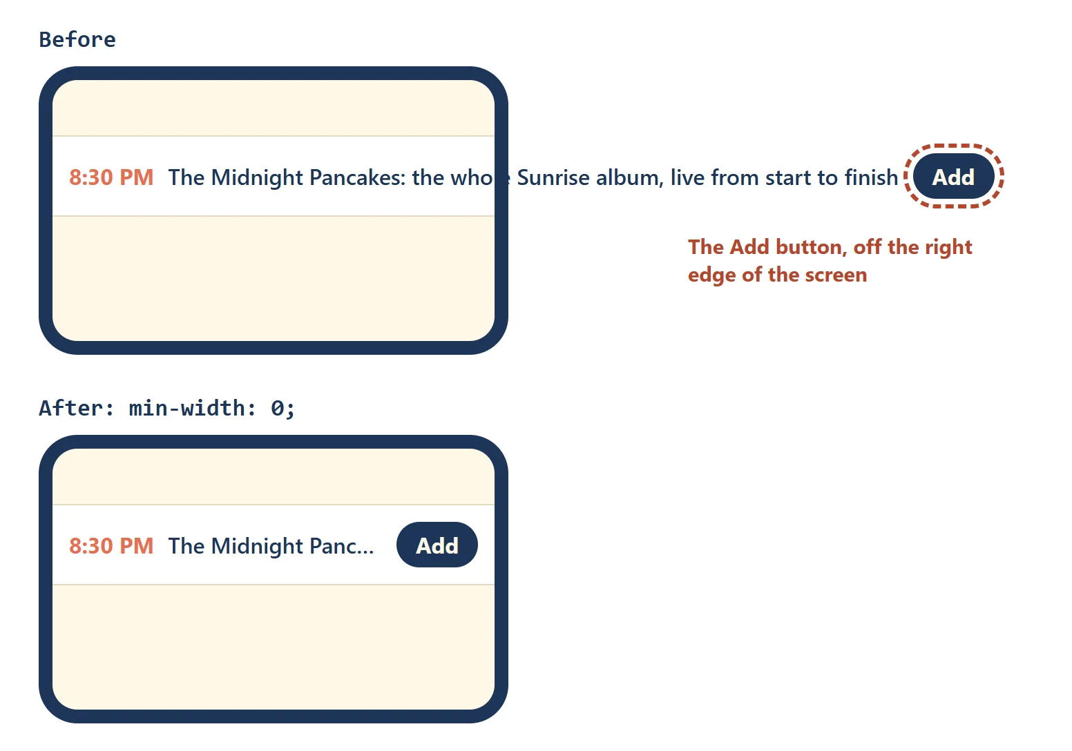
Try it. Build the schedule row with a long title and drag your browser window narrower: the button disappears off the edge. Add min-width: 0; to .set-info, save, and drag again.
Try it in Flex Freight
Flex Freight, puzzles 24 to 28: played right on the lesson page.
Some crates stretch. These puzzles practice flex-grow, flex-basis, flex-shrink and the flex shorthand on long crates that fill their painted spots.
Check yourself
3 questions to try on the lesson page.
So what
Splitting the space between items is what turns a row of boxes into a real layout: a search box that stretches, a sidebar that keeps its size, equal-width buttons and a title that cuts itself off on a phone. Work out the shares once by hand, and every flex layout you meet afterward is arithmetic you can check.