Flexbox Wrapping and gap
flex-wrap lets flex items move onto a new line when they run out of room, gap puts even space between them, align-content places the lines, flex: 1 1 15rem makes a card row that fits any screen, and order changes what the eye sees but not what the keyboard follows.
Journeyman · CSS · Updated
After this lesson you can
- Wrap flex items onto new lines with flex-wrap, and space them with gap and align-content
- Build a card row that wraps, with cards that share each line, such as flex: 1 1 15rem
- Change an item's place with order, and explain why it can confuse keyboard users
Key takeaways
- By default flex items stay on one line and squeeze. flex-wrap: wrap lets them move onto a new line when they run out of room, like words in a paragraph.
- gap sets the space between flex items, on every line and between the lines, and never adds space at the outside edges.
- A card row with flex-wrap: wrap and flex: 1 1 15rem on each card fits as many cards on a line as have room, and stretches them to fill it.
- align-content places the lines of a wrapping container when it's taller than they are. It does nothing when the items can't wrap.
- order moves an item on screen without moving it in the HTML. The keyboard and screen readers still follow the HTML, so use it with care.
Under each band's name, the Summer Sound festival site shows a few tags: indie, folk, family friendly, late night. Some bands have two tags and some have seven. Further down the page, the headliners sit in a row of cards: three across on a laptop, two on a tablet, one on a phone. Neither of those layouts knows in advance how much room it will get, and both are built the same way: flex items that move onto a new line when they run out of room. You'll use this for tag lists, photo strips, product grids and button groups, anywhere the number of things or the size of the screen can change.
The lesson uses words from the lessons before it: a flex container is the parent with display: flex, its children are flex items, the main axis is the direction they run in and the cross axis runs across it. flex: 1 1 15rem is the flex shorthand from Flexbox Sizing: flex-grow, flex-shrink and flex-basis: grow, shrink, and a starting size.
When items don't fit: flex-wrap
When you type a paragraph, the words don't run off the edge of the page: when a line is full, the next word starts a new line. Flex items don't do that on their own. By default every item stays on one line, and when there isn't room, they squeeze: each one shrinks until its content can't get any smaller (its longest word), and then the rest spills out past the edge of the container.
Here are a band's tags as a flex row:
<ul class="tags">
  <li>indie</li>
  <li>folk</li>
  <li>electronic</li>
  <li>hip-hop</li>
  <li>brass</li>
  <li>family friendly</li>
  <li>late night</li>
</ul>
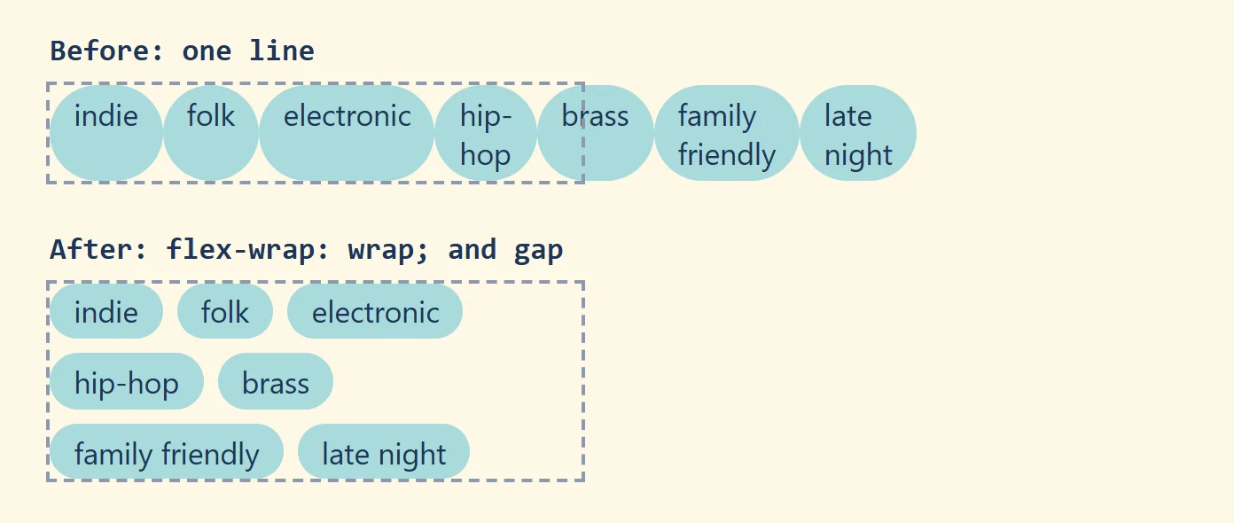
On a 300-pixel phone column, all seven tags try to share one line: family friendly breaks onto two lines inside its own pill, and the last tags poke out past the right edge. The property that fixes it is flex-wrap:
.tags {
  display: flex;
  flex-wrap: wrap;
  list-style: none;
  padding: 0;
}
flex-wrap: |
What happens when the items don't fit |
|---|---|
nowrap |
they stay on one line and squeeze, then spill out (the default) |
wrap |
the next item starts a new line, below the last one |
wrap-reverse |
the next item starts a new line above: rarely what you want |
With wrap, each tag keeps its natural size, and the tags that don't fit on a line move down to the next one, so the list grows taller instead of wider. On the 300-pixel column, the seven tags take three lines.
You may also see flex-flow, a shorthand for flex-direction and flex-wrap together: flex-flow: row wrap; is the same as the two lines.
Space between the items: gap
Tiles on a bathroom wall have the same thin line of grout between every pair, but none around the outside edge of the wall. gap is that grout for flex items:
.tags {
  display: flex;
  flex-wrap: wrap;
  gap: 0.5rem;
}
gapputs the space between items, both between the items on a line and between the lines.- It never adds space at the outside edges, so the first tag still starts flush with the left edge.
- Two values set the two directions separately:
gap: 1rem 0.5remis 1rem between the lines (the rows) and 0.5rem between items on a line (the columns). The long names arerow-gapandcolumn-gap.
Before gap worked in flexbox (every current browser has supported it since 2021), people spaced items with margins, and margins get in the way: a margin-right on every tag leaves an extra gap after the last tag on each line, so the lines never look centered. If you find margin-right on flex items in an older stylesheet, gap on the container is usually the cleaner fix. It also replaces the margin-right from the first flexbox lesson's nav links.
Try it. Make the tag list above in a summer-sound page, with a background color and some padding on each li so they look like pills. Narrow the window with flex-wrap off, then on, then add gap. Inspect the list: Chrome's and Edge's flex overlay shades the gaps.
A card row that wraps
Now the headliners. Each card shows a band's name, its genre and the day it plays:
<ul class="headliners">
  <li class="card">
    <h3>Neon Tide</h3>
    <p>Synth-pop</p>
    <p class="set-time">Friday, 9:30 PM</p>
  </li>
  <!-- five more cards like this one -->
</ul>
Three lines of CSS turn the list into a row that fits any screen:
.headliners {
  display: flex;
  flex-wrap: wrap;
  gap: 1.5rem;
}

.card {
  flex: 1 1 15rem;
}
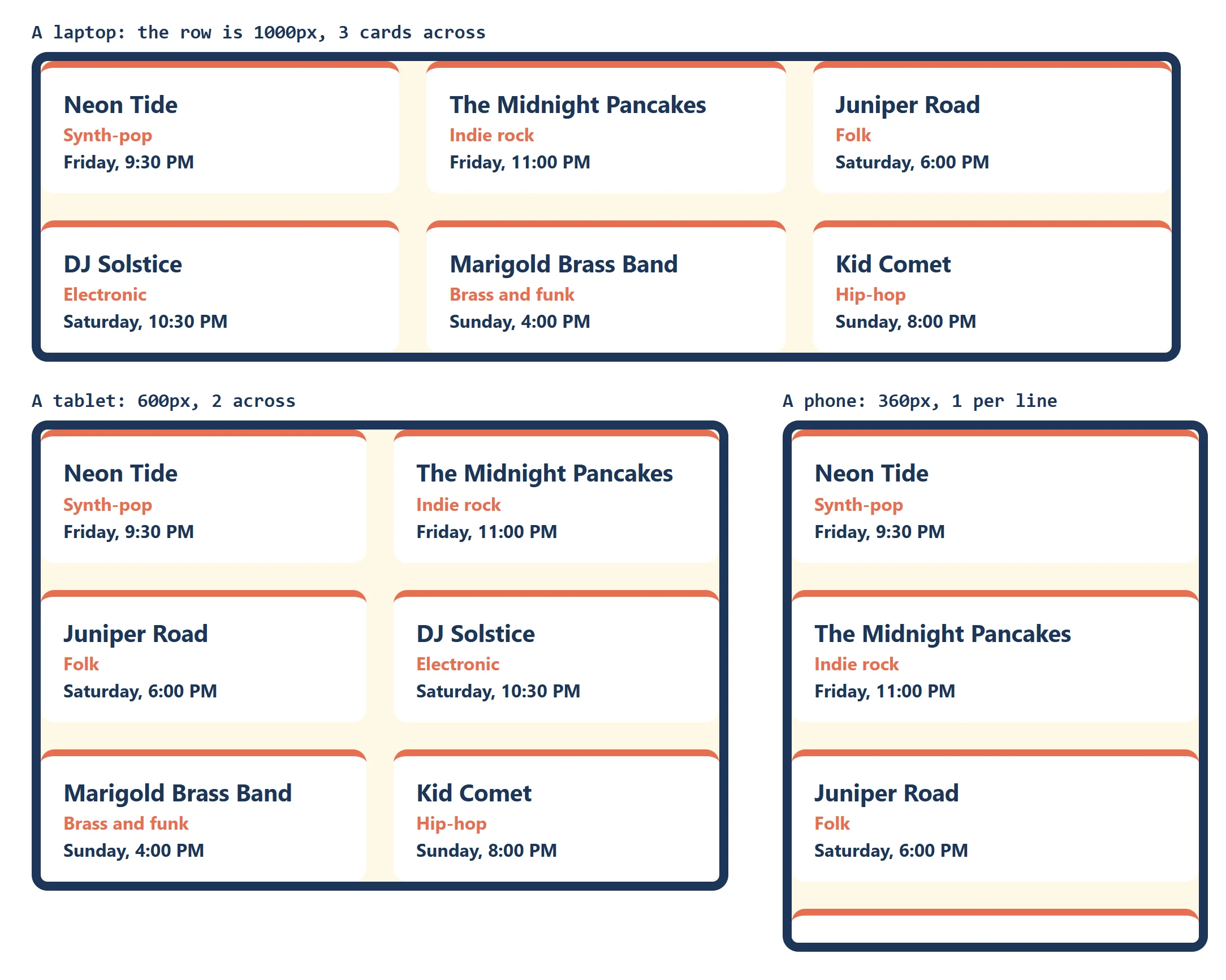
Read flex: 1 1 15rem as a sentence: "start at 15rem wide, may grow, may shrink". With the usual root font size, 15rem is 240 pixels. The browser fits as many 240-pixel cards on a line as there's room for, wraps the rest, and then the 1 for grow shares each line's leftover space, so the cards on a line stretch to fill it:
| Row width (gap 24px) | Cards per line | Each card |
|---|---|---|
| 1000px | 3 (four would need 4 × 240 + 3 × 24 = 1032) | about 317px |
| 600px | 2 | 288px |
| 360px (a phone) | 1 | 360px: grown to fill the line |
No media query, no counting cards: the layout works it out for each screen. Change 15rem to make the cards wider or narrower before they wrap.
One thing to know: each line shares its own space. Six cards on a 1000-pixel row make two full lines of three, but with five cards, the second line has only two, and they each grow to 488 pixels, wider than the cards above them. Sometimes that looks fine; when every card must stay the same width, CSS Grid is the better tool, and CSS Grid: Rows and Columns shows it.
Placing the lines: align-content
When a wrapping container is taller than its lines (a panel with a fixed height, say), there's leftover space on the cross axis, between and around the lines. align-content decides where it goes:
.photo-wall {
  display: flex;
  flex-wrap: wrap;
  height: 600px;
  align-content: flex-start;
}
It takes the values you know from justify-content (flex-start, center, flex-end, space-between, space-around, space-evenly) plus stretch. The default behaves like stretch: the lines share out the extra height, which is why a tall wrapping container sometimes shows big strange gaps between its lines. align-content: flex-start packs the lines at the top instead.
Two differences from its neighbors are worth keeping straight:
align-itemslines up the items inside each line.align-contentmoves the lines themselves.align-contentonly works on a container that can wrap. With the defaultflex-wrap: nowrapthere's one line and nothing for it to place, so the browser ignores it.
Changing the order: order
Every flex item has an order, a number that's 0 unless you change it. The browser shows the items from the lowest number to the highest, and items with the same number keep their HTML order. A negative number moves an item to the front:
.card.featured {
  order: -1;
}
The festival's HTML lists Neon Tide, The Midnight Pancakes and Juniper Road, in that order. If Juniper Road's card has the class featured, it now shows first.
But only to the eye. A screen reader still reads the cards in the HTML's order, and someone using the Tab key to move between the links on the page goes through them in the HTML's order too: Neon Tide's link, then The Midnight Pancakes', then back to the front of the row for Juniper Road's. The highlight that shows where they are jumps around the screen, and what's read aloud doesn't match what's shown. Accessibility guidelines (WCAG, the Web Content Accessibility Guidelines) call this keeping a meaningful sequence and a sensible focus order. The same goes for row-reverse and column-reverse.
So:
- When the order matters, change the HTML. Move Juniper Road's card to the top of the list, and the screen, the keyboard and the screen reader all agree.
- Use
orderonly for a change that doesn't affect meaning or interaction, such as moving a decorative picture below the text on a small screen.
A newer property, reading-flow, lets the keyboard follow the visual order of a flex container. As of October 2026 it works in Chrome and Edge but not yet in Firefox or Safari, so it isn't something to rely on yet.
Try it. Give one of your cards a link and order: -1, then click the address bar and press Tab repeatedly. Watch where the focus highlight goes, and in what order.
Try it in Flex Freight
Flex Freight, puzzles 18 to 23: played right on the lesson page.
Too many crates for one row? These puzzles practice flex-wrap, gap, align-content and order on the loading dock, until every crate sits on its spot.
Check yourself
3 questions to try on the lesson page.
So what
Wrapping is what makes a row of tags or cards fit a phone and a wide screen with the same CSS, and gap keeps it tidy. Keep the HTML in the order people should read it, and let the CSS decide how much fits on a line.