Lists Side by Side, by Hand
A menu across the top of a page and a row of tag pills are lists whose items sit side by side, and display inline-block does it by hand, with the gap the HTML's spaces add, vertical-align and text-align to line the row up, and wrapping that comes free.
Apprentice · CSS · Updated
After this lesson you can
- Put a list's items side by side with display: inline-block, and explain and handle the gap the HTML's whitespace adds
- Line up, center and wrap a row of inline-block items with vertical-align, text-align and margins
Key takeaways
- display: inline-block on each li puts the items side by side like words in a line, and each one keeps its padding, border and size.
- The spaces and line breaks between the li tags count as one space, so inline-block items get a small gap between them that you never wrote.
- Handle that gap honestly. Plan for it, or write the tags with no space between them. The next chapter's flexbox takes it away for good.
- vertical-align on the items lines up items of different heights (baseline, top, middle or bottom), and text-align on the list moves the whole row.
- Inline-block items wrap onto a new line when the row runs out of room, like words do. A margin below each one keeps the lines apart.
A menu across the top of a page. A row of small rounded tags under a product, such as Vegan and Gluten-free. A row of social-media icons in a footer. Each is a list whose items sit side by side instead of stacking. The next chapter's flexbox does this in a few lines, and you'll use it most of the time. This lesson does it by hand first, with what you already know about normal flow, because that shows exactly what flexbox fixes, and because you'll meet this way of doing it in older stylesheets for years.
On Paws & Whiskers' adoption page, the menu (Our pets, Visit us, How to adopt) should run across the top, and each pet's card gets a row of tag pills: small rounded labels such as Dog, Good with kids and Loves walks.
Inline or inline-block?
Here are Biscuit's tags, with the list stripped as Lists as Containers: Strip the Defaults, Style the Items showed:
<ul class="tags">
  <li>Dog</li>
  <li>Good with kids</li>
  <li>House-trained</li>
  <li>Loves walks</li>
</ul>
Each <li> is a block box, so the four tags stack, one per line. Normal Flow and the display Property showed the two ways to make boxes share a line, and both are worth trying.
The first try is display: inline; on each tag. The tags move into one line, like words. But give them the padding and rounded background a pill needs, and the padding above and below is drawn without pushing anything: the pills overlap the line above, and their margins above and below do nothing at all. Inline boxes flow like words, and words don't take a height.
The second try is display: inline-block;: in the line like a word, with a size, padding and margins like a brick.
.tags {
  list-style: none;
  padding: 0;
  margin: 0;
}

.tags li {
  display: inline-block;
  padding: 4px 12px;
  border-radius: 999px;
  background-color: #a8dadc;
  font-size: 0.875rem;
}
The tags now sit side by side as pills, and the padding pushes the lines around them away, as it should. border-radius: 999px asks for a corner rounder than the pill could ever be, so both ends come out fully round, however long the word.
One detail: an <li> gets a marker only while its display is list-item, so the bullets disappear as soon as the items are inline-block. The list's indent and margins stay, though, so keep the three lines on the list.
The menu works the same way: display: inline-block; on each <li> of the menu, and a link inside each one with display: block; and padding, so the whole button is the link.
The gap you didn't write
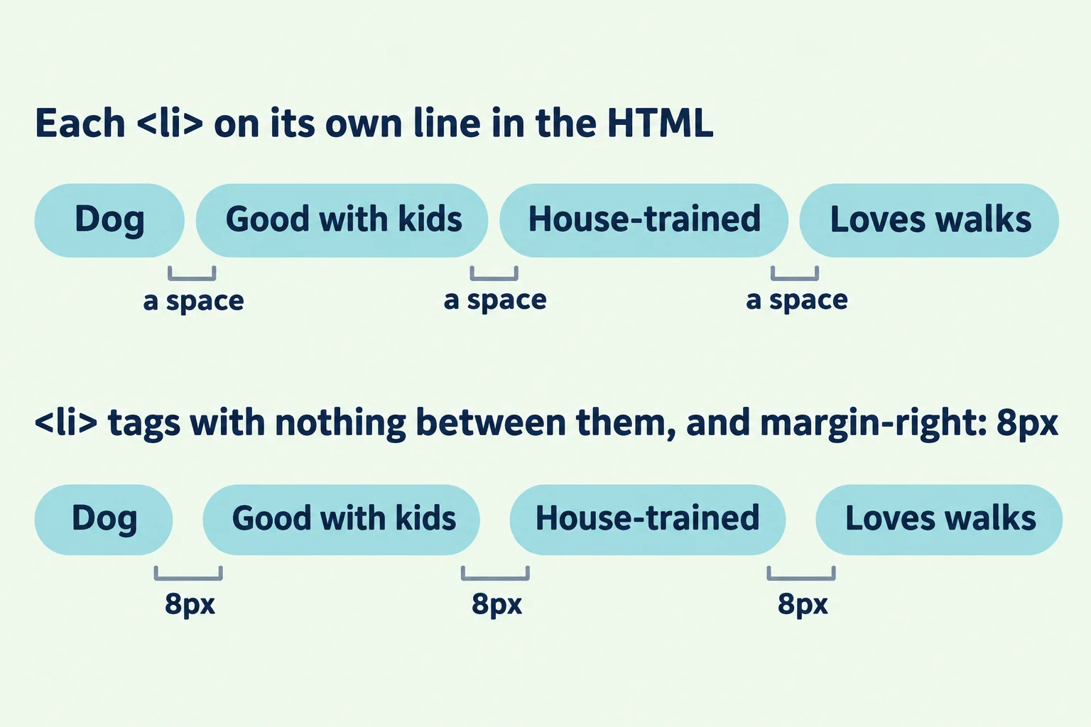
Look closely at the pills: there's a small gap between each pair, about 4 or 5 pixels, though no rule asked for one. It comes from the HTML. Every </li> is followed by a line break and a few spaces before the next <li>, and the browser treats a run of spaces and line breaks between inline boxes the way it treats the space between two words: as one space. The spaces and line breaks in a file are called whitespace. A space is about a quarter of the font size, so its width changes with the font and its size.
There are honest ways to deal with it:
Plan for it. It's a space, so count it. If you want more room between the pills, add
margin-right: 4px;and know that the gap is the margin plus the space. This is the simplest way, and it's fine for a row of tags.Write the items with no whitespace between them, so there's no space to show:
<ul class="tags">
  <li>Dog</li><li>Good with kids</li><li>House-trained</li><li>Loves walks</li>
</ul>
Now
margin-right: 8px;gives exactly 8 pixels. The cost is HTML that's harder to read, and the gap comes back the day someone tidies the file and puts each item on its own line.Wait for flexbox. In a flex container, the spaces between the items are ignored, and one property,
gap, sets the space exactly. That's the next chapter.
You may also find font-size: 0 on the list, with the size set back on each item, in older stylesheets. It makes the space zero pixels wide, but it brings new problems: any size inside the list written in em (from Units: px, rem, em, % and Viewport Units) is now worked out from zero. Recognize it when you see it, and pick one of the three above for your own pages.
Lining up the row: vertical-align
Inline-block boxes line up the way words do: on the baseline, the invisible line the letters sit on, like the lines on ruled paper. When every item is the same height, you never notice. When they aren't, you do.
The shelter once laid its pet cards out this way, side by side with display: inline-block;, and the cards had different amounts of text. On the baseline, each card lines up with the last line of its own text, so a card with a short description hangs lower than its neighbors, and the tops of the cards form a ragged line. The vertical-align property, set on the items, chooses another line to match:
.pet {
  display: inline-block;
  vertical-align: top;
  width: 220px;
  margin: 0 16px 16px 0;
}
vertical-align: |
The items line up by |
|---|---|
baseline |
the line their text sits on (the default) |
top |
their top edges |
middle |
their middles |
bottom |
their bottom edges |
Two things trip people up. vertical-align goes on the items, not on the list, because each item decides how it sits in the line. And it works only on inline and inline-block boxes (and table cells): it can't center a block inside its parent.
Centering the row, and letting it wrap
Inline-block items behave like words, so the property that moves words in a line moves them too: text-align on the list.
.site-menu {
  text-align: center;
}
The whole row of menu buttons moves to the middle of the header. text-align is inherited, so the text inside each item is centered too, which suits buttons and pills.
When a row runs out of room, the items do what words do: the next one moves down to a new line. Each item moves as a whole, so a pill such as Good with kids never breaks in the middle. Lines of pills touch, though, because nothing pushes them apart, so give each pill a margin below:
.tags li {
  margin: 0 4px 6px 0;
}
Now the pills keep a little room on their right (on top of the space from the HTML) and 6 pixels between the lines when they wrap. Try it: make the browser window narrow, and watch the tags move onto a second line, then a third.
Try it. In your adoption-list folder, make side-by-side.html with a page skeleton, a <style> element, Biscuit's tags and the menu (Our pets, Visit us, How to adopt). Make the tags pills with inline, then with inline-block, and look at the padding. Then put the four <li> tags on one line in the HTML and watch the gaps close.
What flexbox will make easier
You've now built a row by hand, and you've met its three rough edges: the gap from the HTML's whitespace, alignment set on every item instead of once on the row, and spacing made of margins that also land on the row's last item. The next chapter starts with Flexbox: Lining Things Up in a Row or a Column, which puts the same list in a row with one line on the list: the whitespace gap is gone, one property spaces the items exactly, and alignment is set once on the parent. The strip from Lists as Containers stays the same: a flex row of links is still a list.
Do it: put the menu across the header
Paws & Whiskers' menu (Our pets, Visit us, How to adopt) is a stack of bulleted links under the shelter's name. The designer wants it across the header instead, as orange buttons:
- The menu loses its list look: no bullets, no indent.
- The three items sit side by side in one row, each one a box that can take a size.
- Each link fills its button, with
8pxof room above and below its words and16pxat the sides. - The row of buttons sits in the middle of the header.
Practiced live on the lesson page: write the CSS right there and check it.
Check yourself
2 questions to try on the lesson page.
So what
A row of menu buttons or tag pills is a list whose items sit in a line like words. With inline-block, a plan for the space between them, and vertical-align and text-align, you can build one by hand and read the many older pages that do.