Normal Flow and the display Property
Before you move anything, the browser already lays out every page by the same rules, blocks stacking like bricks and inline boxes flowing like words, and the display and overflow properties let you change how a box takes part.
Apprentice · CSS · Updated
After this lesson you can
- Predict how block, inline and inline-block boxes line up in normal flow, and change a box's kind with display
- Hide an element with display: none or visibility: hidden, and say what happens to the space it used
- Choose an overflow value for content that doesn't fit its box
Key takeaways
- Normal flow is how the browser lays out a page on its own. Block boxes stack one under another, and inline boxes sit side by side in a line, like words.
- display picks a box's kind. block stacks, inline flows with the text and ignores width and height (pictures aside), and inline-block flows with the text but takes a size and padding that pushes.
- display: none removes an element and its space. visibility: hidden makes it invisible but keeps its space, like a reserved seat.
- When content doesn't fit its box, overflow decides what happens. visible lets it spill out, hidden cuts it off, scroll always adds scroll bars, and auto adds them only when needed.
- Every element starts with position: static, its place in normal flow, where top and left do nothing.
Every screen you build needs a layout: a nav bar across the top, a row of cards, a photo gallery, a dashboard. This module teaches the tools that do it (positioning in this chapter, then flexbox and grid), and by its end you can lay out a page that looks like the game dashboards and shopping sites you use every day. "Can you center this?" is a job you will be asked to do, and you will be able to say yes.
Before you move anything, though, the browser has already placed every element on its own. Menu links that should look like buttons, a "Sold out" note that should disappear, a long description that spills out of its card: each of those is fixed by knowing what the browser does first, and that's this lesson.
The running example for this chapter is Paws & Whiskers, a made-up pet adoption shelter, and its adoption list: a card for each pet, with a photo, a name and a few lines about them.
Bricks and words: normal flow
Think of two ways things line up in everyday life. Bricks in a wall stack one on top of another, each on its own row. Words in a paragraph sit side by side, and when a line runs out of room, the next word wraps onto a new line.
A browser lays out a page the same way, with two kinds of boxes. (Every element is a box: a rectangle with content, padding, border and margin. If that's new, The Box Model: Content, Padding, Border and Margin explains it.)
- A block box stacks like a brick. It starts on a new line and stretches across all the width it has. Headings,
<p>,<ul>,<li>,<section>,<article>and<div>are block boxes. - An inline box flows like a word. It sits inside a line of text and is only as wide as what it holds.
<a>,<strong>,<em>,<span>and<img>are inline. (Pictures are the exception: an<img>sits in the line like a word, but it does take a width and a height.)
The way the browser places boxes when you haven't told it anything else is called normal flow. Working out every box's size and place is called layout. Here's one pet card in normal flow:
<article class="pet-card">
  <h2>Biscuit</h2>
  <p>A <strong>3-year-old</strong> beagle who loves <a href="#walks">long walks</a>.</p>
  <p>Good with kids and other dogs.</p>
</article>
The <h2> and the two paragraphs stack, top to bottom, in the order they're written. Inside the first paragraph, the bold words and the link stay in the sentence, side by side with the other words.
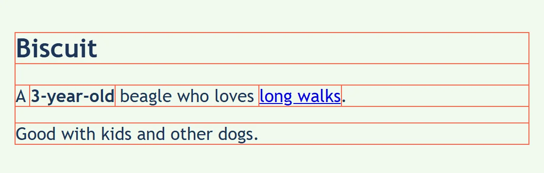
Try it. In your css-in-depth folder, make a folder named adoption-list. In it, make a file named flow.html with a page skeleton, and put the card above inside the <body> twice. Add a <style> element in the <head> with * { outline: 1px solid tomato; }, open the page with Live Server, and look at the boxes: which ones stack, and which sit in a line?
Changing a box's kind with display
The display property decides which kind of box an element makes. Every element has a starting value (block for a paragraph, inline for a link), and you can change it:
| Value | Sits | Width and height | Padding and margin above and below |
|---|---|---|---|
display: block; |
On its own line, full width | Used | Push the boxes around it away |
display: inline; |
In the line, with the words | Ignored (pictures excepted) | Padding is drawn but pushes nothing; margin does nothing |
display: inline-block; |
In the line, with the words | Used | Push the lines around it away |
inline-block is the in-between: it sits in the line like a word, but it takes a size like a brick. That's what you want for menu links that look like buttons:
.site-nav a {
  display: inline-block;
  padding: 8px 16px;
  margin-bottom: 8px;
  background-color: #f4a259;
  color: #1d3557;
}
The links stay side by side across the top of the page, and each one gets real padding, so it looks like a button and has room for a finger to tap it. With display: block; instead, each link would take a whole line of its own, stacked like bricks.
One surprise: the spaces and line breaks between your tags in the HTML count as a space between inline-block boxes, so the buttons have a small gap between them even with no margin. That's normal flow treating them like words.
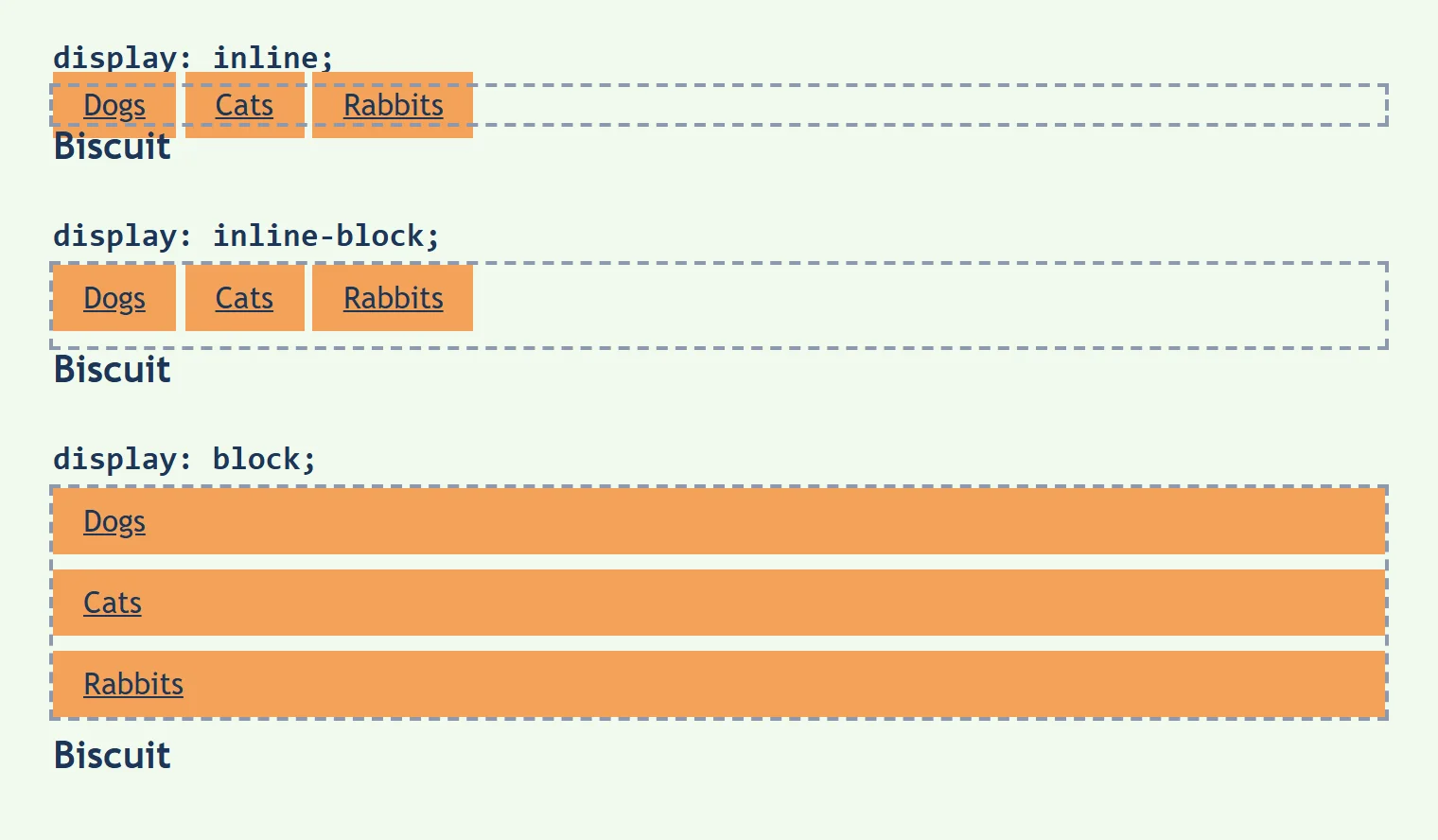
Try it. In flow.html, add a <nav class="site-nav"> with three links (Dogs, Cats, Rabbits) above the cards, and the rule above. Change inline-block to inline, then to block, and save after each change. Watch what happens to the padding.
Static: where every element starts
Every element also has a position, which says how it's placed. Its starting value is static: the element sits wherever normal flow puts it.
.pet-card {
  position: static;
  top: 40px;
}
This rule changes nothing you can see. A static element ignores top, right, bottom and left, because normal flow already decided where it goes. You'll rarely write position: static; yourself, since it's the default. The next lessons switch to other values, starting with Positioning: relative and absolute, and that's when top and left start to work.
Older sites used one more tool to put boxes side by side: float: left;. You'll still see it in old stylesheets. Today it's used to wrap text around a picture, and the side-by-side job belongs to flexbox and grid, later in this module.
Hiding things: display: none and visibility: hidden
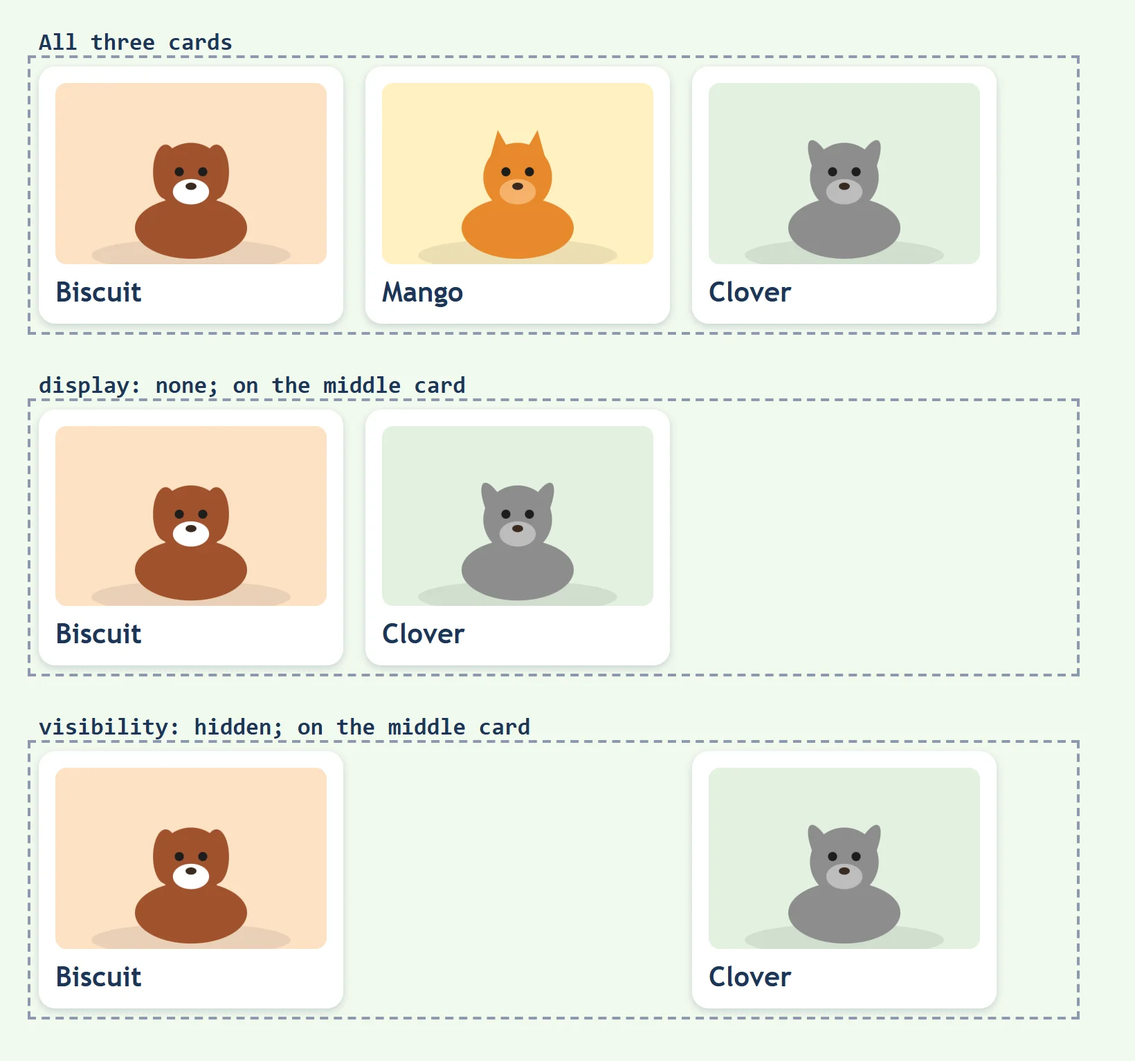
Picture a row of seats at a movie theater. You can take a seat out of the row completely, and everyone slides over to close the gap. Or you can leave the seat there with a "Reserved" sign on it: nobody sits there, but the gap stays.
CSS has both:
display: none;takes the element out, as if it weren't in the HTML. The boxes after it move up to fill its space.visibility: hidden;makes the element invisible, but it keeps its space, so there's an empty gap where it was.
.pet-card.adopted {
  display: none;
}

.pet-card .reserved-note {
  visibility: hidden;
}
The first rule hides every pet who has already gone home, and the cards after it close the gap, so the list has no holes in it. The second keeps a spot for a note that appears later (say, when someone books a visit), so the card doesn't jump in size when it shows up. The selector .pet-card.adopted, with no space, means an element with both classes.
With both, the hidden element can't be clicked, and screen readers (the programs that read a page aloud for people who can't see it) skip it. So never hide something with either one that a reader still needs.
When content doesn't fit: overflow
You can only stuff so much into a suitcase before the lid won't close, and the clothes stick out the sides. A box with a set height has the same problem when its content is longer than the box.
The overflow property says what happens to the part that doesn't fit:
| Value | What happens |
|---|---|
visible |
The starting value: the content spills out of the box, over whatever is below it |
hidden |
The extra is cut off, and nobody can see or scroll to it |
scroll |
The box always shows scroll bars, even when everything fits |
auto |
The box shows scroll bars only when the content doesn't fit |
.adoption-rules {
  height: 120px;
  overflow: auto;
  border: 2px solid #457b9d;
}
The shelter's adoption rules are long, so they sit in a box 120 pixels tall that scrolls when the text is longer than that. overflow-x and overflow-y set the sides separately: overflow-x for left and right, overflow-y for top and bottom.
Choose with care: hidden on text means some readers never see the end of it. It fits decoration, such as a photo cropped to a rounded card, better than words.
Try it. In flow.html, add a <div class="adoption-rules"> holding five paragraphs of rules (such as "Every adopter meets the pet first."), and the rule above. Try each of the four values and save after each one.
Check yourself
2 questions to try on the lesson page.
So what
Every layout you'll build starts from normal flow: the bricks and the words. Knowing what the browser does on its own tells you which boxes to change, and keeps you from fighting the page.