Mobile First: Start Small, Then Add Room
Mobile-first CSS writes the phone layout as the base styles and uses min-width media queries to add columns as the screen grows, which takes less CSS than shrinking a desktop layout down.
Journeyman · CSS · Web Development · Updated
After this lesson you can
- Write mobile-first CSS with base styles for a phone and min-width queries that add columns as the screen grows
- Explain why mobile-first CSS needs less code than desktop first, and spot a desktop-first stylesheet
Key takeaways
- Mobile first means the rules outside any media query are the phone layout, and min-width queries add to it on wider screens.
- Boxes already stack in one column by default, so a phone layout needs little CSS, and each breakpoint only adds what changes.
- Desktop first needs max-width queries that undo the wide layout for phones, which is more CSS to write and to keep in sync.
- Put min-width queries in order from smallest to largest, so a wider screen's rules come later and win.
More than half of the visits to most websites come from phones, and for a taco truck at lunchtime it's nearly all of them. So which layout should you write first? This lesson's answer, mobile first, is how most professional front-end teams write CSS today. It's what a job interviewer means by "mobile-first", and it's the shape of every stylesheet in the rest of this course.
Pack the carry-on first
Packing for a trip, you could fill a huge suitcase and then find out the airline only allows a carry-on: now you're pulling things out and deciding what to leave behind. Or you could pack the carry-on first, with what you really need, and add extras if a bigger bag turns out to fit.
CSS works the same way. Mobile-first design means you write the phone layout first, as the base, and then add to it as the screen grows. The opposite, desktop first, writes the wide layout first and then takes things away for phones.
The base styles are the phone layout
In a mobile-first stylesheet, the rules outside any media query are the phone's layout. Here's the start of Sol Taco Truck's page:
<section class="today">
  <div class="today-text">
    <h1>Sol Taco Truck</h1>
    <p class="location">Today: Riverside Park, by the boat launch</p>
    <p class="hours">Open 11 a.m. to 8 p.m.</p>
  </div>
  <img class="truck-photo" src="images/sol-taco-truck.jpg" alt="The Sol Taco Truck, painted sunset orange, parked under the trees by the river">
</section>
And its base styles:
.today {
  padding: 1rem;
}

.location {
  font-size: 1.25rem;
  font-weight: bold;
}

.truck-photo {
  max-width: 100%;
  height: auto;
}
There's no layout rule here at all, and none is needed. Block boxes such as <div>, <h1> and <p> already stack one under another, full width, and the picture after the <div> starts on a line of its own: a single column, which is exactly the phone layout. The base styles are colors, fonts and spacing. That's the first reason mobile first needs less CSS: the browser gives you the phone layout for free.
min-width queries add room
As the screen gets wider, min-width queries add only what changes. The menu gets two columns at 40rem, and at 64rem the hours move beside the photo:
.menu {
  display: grid;
  gap: 1rem;
}

@media (min-width: 40rem) {
  .menu {
    grid-template-columns: 1fr 1fr;
  }
}

@media (min-width: 64rem) {
  .today {
    display: grid;
    grid-template-columns: 1fr 1fr;
    align-items: center;
  }
}
Read it from the top as the screen grows. On a phone, the menu is a grid of one column, with a gap between the cards. At 40rem and wider, the first query adds a second column. At 64rem and wider, the second query also applies, and the top of the page becomes two columns: the text on the left, the photo on the right. Each query adds to what came before; nothing is undone.
Try it. Copy the CSS above into a page with a .today section and a .menu of four or more cards. Open device mode at 320 pixels and drag it wider. Watch the menu split into two columns at 640 pixels and the top of the page split at 1024.
Why desktop first takes more CSS
Here's the same page written desktop first. The base rules are the wide layout, and max-width queries take it apart for smaller screens:
.menu {
  display: grid;
  grid-template-columns: 1fr 1fr;
  gap: 1rem;
}

.today {
  display: grid;
  grid-template-columns: 1fr 1fr;
  align-items: center;
}

@media (max-width: 63.99rem) {
  .today {
    display: block;
  }
}

@media (max-width: 39.99rem) {
  .menu {
    grid-template-columns: 1fr;
  }
}
Every rule in the queries exists only to cancel a rule above it. That's more lines, and it's fragile: change the wide layout later, and you have to remember to change what undoes it too. And the screen most of the truck's customers use, a phone, gets the most tangled styles of all: the wide layout, plus the rules that cancel it.
You can spot a desktop-first stylesheet quickly: its media queries use max-width, and their rules set things back to block, none, auto or a single column. A mobile-first stylesheet's queries use min-width and add columns.
Smallest first: order matters
When two rules for the same element have the same specificity, the later one wins: that's the cascade. Mobile-first queries rely on it, so they go from the smallest breakpoint to the largest:
@media (min-width: 40rem) {
  .menu {
    grid-template-columns: 1fr 1fr;
  }
}

@media (min-width: 64rem) {
  .menu {
    grid-template-columns: repeat(4, 1fr);
  }
}
repeat(4, 1fr) is four equal columns. On a screen 80rem wide, both queries are true. The 64rem one comes later, so its four columns win. Swap their order, and the two-column rule would come later and win on every wide screen: the four columns would never appear.
A nav that becomes a row
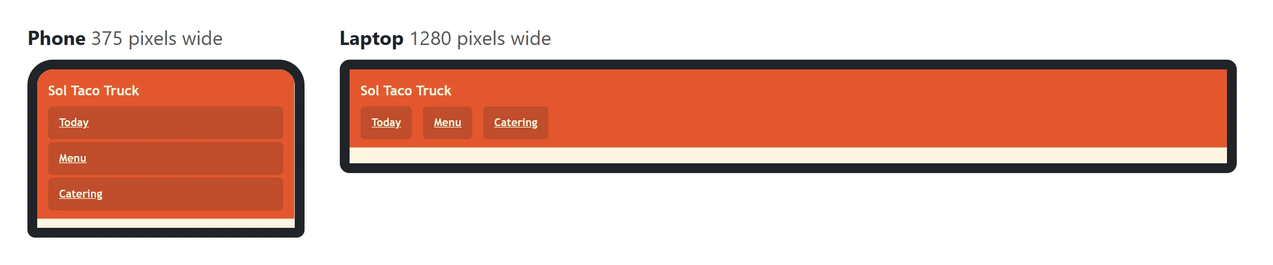
The site's navigation is a list of links. On a phone, links work best as big targets that a thumb can't miss, one under another; on a wider screen there's room for a row across the top:
.site-nav a {
  display: block;
  padding: 0.75rem 1rem;
}

@media (min-width: 40rem) {
  .site-nav ul {
    display: flex;
    gap: 1rem;
  }
}
The base rule makes each link a full-width block with padding, so it's a big target. At 40rem, display: flex puts the list's items side by side in a row, with a gap between them. (The list's bullets come off with list-style: none on the ul.) Same HTML, two layouts, and the phone's is the one written first.
Check yourself
2 questions to try on the lesson page.
So what
Start with the smallest screen, where the browser already gives you a single column, and let min-width queries add room as it appears. You write less CSS, and the most common screen gets the simplest styles.