Responsive Design and the Viewport
A responsive page fits whatever screen it's on, and it starts with one line in the head, the viewport line, plus knowing what breaks on a phone and how to see it with device mode.
Apprentice · CSS · Web Development · Updated
After this lesson you can
- Explain what each part of the viewport line does and why every page needs it
- Find what breaks a page on a phone, such as a fixed width, a wide picture or tiny text, and fix it
Key takeaways
- A responsive page is one page that rearranges itself to fit any screen, from a phone to a wide monitor.
- Without the viewport line, a phone lays the page out about 980 pixels wide and shrinks it, so the text is tiny.
- width=device-width makes the page as wide as the screen, and initial-scale=1 starts it at normal size. Never turn off zooming.
- Fixed widths, pictures wider than the screen and small text are what break most pages on a phone.
- Device mode in the developer tools shows a page at a phone's width, so you can find the problems on your own computer.
It's 12:15, you're hungry, and you look up the taco truck on your phone. The page loads, and it's a tiny copy of a desktop site: the hours are in 6-point type, the menu runs off the right edge, and you have to pinch and drag to find out where the truck is parked today. Most people meet your work exactly like this, on a phone, in a hurry. A class project that says "make it work on mobile", a job post that asks for "responsive", a bug report that says "I can't read it on my phone": they all start with this lesson.
Water takes the shape of its glass
Pour water into a tall glass, a wide bowl or a coffee mug, and it fills each one. It's the same water every time. A responsive page works the same way: one page, one set of HTML, that rearranges itself to fill whatever screen it's poured into. On a phone, Sol Taco Truck's site is a single column: where the truck is today, its hours, then the menu. On a laptop, the same page spreads out, with the menu in two columns and the truck's photo beside the hours.
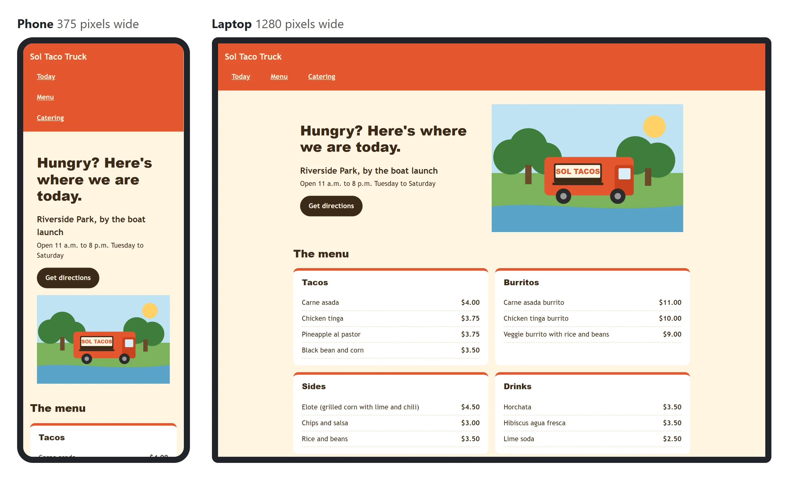
Responsive design is the name for building pages this way. It's not a separate phone site: it's one page whose CSS says how to lay it out at each size. This chapter teaches the tools, one at a time.
The viewport line, word by word
The viewport is the part of the browser window that shows the page. On a laptop it's the window minus the address bar and the tabs. On a phone, it's the screen.
Phones have a habit that comes from the early days of the mobile web, when almost every site was built for desktops. Unless a page says otherwise, a phone's browser pretends its screen is about 980 pixels wide, lays the page out at that width, and shrinks the whole thing to fit. That's why the taco truck's text was tiny: the page was drawn for a desktop and then shrunk to about 40% of its size.
One line in the <head> turns that habit off:
<meta name="viewport" content="width=device-width, initial-scale=1">
Read it piece by piece:
<meta>holds information about the page. It sits in the<head>and shows nothing on the page itself.name="viewport"says which information this is: instructions for the viewport.content="..."holds the instructions themselves, separated by a comma.width=device-widthmeans "make the viewport as wide as the screen really is". On many phones that's about 390 CSS pixels.initial-scale=1means "start at normal size, 100%, with no shrinking".
That's all it does, and every page you make needs it. In your textbook it may be called the viewport meta tag.
You'll sometimes see maximum-scale=1 or user-scalable=no added to the line. Leave them out: they stop people from zooming in, and someone with low vision who needs to zoom can't read the page.
A whole page, ready for phones
Here's the top of Sol Taco Truck's page with the viewport line where it belongs, in the head beside the character set and the title:
<!DOCTYPE html>
<html lang="en">
<head>
  <meta charset="utf-8">
  <meta name="viewport" content="width=device-width, initial-scale=1">
  <title>Sol Taco Truck</title>
  <link rel="stylesheet" href="styles.css">
</head>
<body>
  <h1>Sol Taco Truck</h1>
  <p>Today: Riverside Park, by the boat launch. Open 11 a.m. to 8 p.m.</p>
</body>
</html>
The viewport line goes in the head of every page of a site, not only the home page. VS Code's ! shortcut, which writes a page skeleton for you, includes it already.
Device mode: a phone inside your browser
You don't need a drawer of phones to test a page. The developer tools can show any page at a phone's size. Open them (F12, or Cmd+Option+I on a Mac), then:
- Chrome and Edge: click the Toggle device toolbar button, the small phone-and-tablet icon at the top left of the tools, or press Ctrl+Shift+M (Cmd+Shift+M on a Mac). This is called device mode.
- Firefox: choose Responsive Design Mode from the tools' menu, or press Ctrl+Shift+M (Cmd+Option+M on a Mac).
A bar appears above the page. Pick a phone from the list, or choose Responsive and type a width, such as 320 for a small phone. Better still, drag the page's edge and watch it get narrower and wider: anything that breaks shows itself.
Device mode is very close to a real phone, but not exactly the same. Before you call a site finished, open it on a real phone too.
Try it. Open any page you've made in this course and turn on device mode at 320 pixels wide. Then delete its viewport line, save, and look again: the page is drawn wide and shrunk, and the text gets tiny. Put the line back.
What breaks on a phone
With the viewport line in place, three things break most pages on a narrow screen.
- Fixed widths.
width: 960pxwas fine on a laptop. On a phone 390 pixels wide, the box is still 960, and the page scrolls sideways. Usemax-widthinstead: up to that size, and narrower when the screen is. - Wide pictures. A photo 1600 pixels wide shows at 1600 pixels unless something stops it, and it pushes the page wider than the screen.
max-width: 100%keeps every picture inside its box. Responsive Images: max-width, object-fit and srcset shows the rest. - Tiny text. A font size of
11pxwas hard to read on a big screen and is worse on a small one. Body text of1rem(16 pixels, unless the reader asked for bigger) reads well on a phone.
The truck's old desktop site had all three. Here's the fix:
main {
  max-width: 60rem;
  margin: 0 auto;
}

img {
  max-width: 100%;
  height: auto;
}

body {
  font-size: 1rem;
}
max-width: 60rem replaced width: 960px, so <main> is up to 60rem wide and shrinks on a phone. height: auto keeps a shrunk picture in proportion, so it isn't squashed.
Try it. In device mode at 320 pixels, look for a horizontal scroll bar or a page you can drag sideways. In the Elements panel, hover over elements until you find the one sticking out past the right edge, then look at its width in the Styles pane.
Check yourself
2 questions to try on the lesson page.
So what
One line in the head and three habits (no fixed widths, pictures that stay inside their box, readable text) make a page usable on any phone. Everything else in this chapter builds on that.