Pseudo-Classes: :hover, :focus-visible, :nth-child() and More
Pseudo-classes select elements by their state, such as hovered, focused, checked or disabled, or by their position, such as first, last or every other, and :not() leaves some out.
Apprentice · CSS · Updated
After this lesson you can
- Style an element's state with :hover, :focus-visible, :checked and :disabled, keeping a visible focus for keyboard users
- Pick elements by position with :first-child, :last-child and :nth-child(), and leave some out with :not()
Key takeaways
- A pseudo-class starts with a colon and adds a condition to a selector, such as
li:hover, read "li when hovered". :hover,:active,:focus,:checkedand:disabledmatch an element's state, which changes as people use the page.- People using a keyboard see where they are only by the focus outline. Never remove it without putting a clear
:focus-visiblestyle in its place. :first-child,:last-childand:nth-child()pick elements by position.:nth-child(odd)stripes rows, and:nth-child(3n)reaches every third.:not()leaves elements out, as inli:not(:last-child): every song but the last.
Think of any music app. A song lights up when your pointer moves over it, the rows alternate shades so your eye can follow them, the heart turns red when you like a song, and a button goes gray when it can't be used yet. None of that is written in the HTML: the HTML has no idea where your pointer is. Pseudo-classes let CSS react to what's happening on the page, and to where an element sits in a list. You'll use them on every site you ever style.
A colon means "when"
A pseudo-class is a word after a colon (:) that adds a condition to a selector. li:hover is read "li when hovered": a list item, but only while the pointer is over it. Pseudo means "not quite": it works like a class, but nobody wrote it into the HTML. The browser adds and removes it as things change.
Here are two songs from the Road Trip Mix page, the playlist this chapter styles, plus the Share button from its footer:
<ol>
<li>
<strong>Golden Hour Highway</strong>
<span>Juniper & the Jets</span>
<input type="checkbox" aria-label="Like Golden Hour Highway">
</li>
<li>
<strong>Windows Down</strong>
<span>Maple Avenue</span>
<input type="checkbox" aria-label="Like Windows Down" checked>
</li>
</ol>
<button disabled>Share this mix</button>
Two attributes may be new: checked starts a checkbox ticked, and disabled switches a button off. Each is written on its own, with no value.
The pointer: :hover and :active
:hovermatches while the pointer is over the element.:activematches while it's being pressed: the moment between the mouse button going down and coming up.
li:hover {
  background-color: #e0f2fe;
}

button:active {
  background-color: #1e3a8a;
}
The song under the pointer turns light blue, and the button goes a darker blue while it's pressed, so it feels pushed. Phones and tablets have no pointer to hover with, so never hide something people need behind :hover alone. Links have one more state, :visited, for a link the person has already opened. For privacy, browsers let it change only colors.
The keyboard: :focus and :focus-visible
Many people move through a page with the Tab key instead of a mouse: people who can't hold a mouse steady, people who are blind and use a screen reader, and plenty of fast typists. The element that Tab has landed on has focus, and browsers draw an outline around it. That outline is the only way a keyboard user knows where they are, like the cursor when you type.
:focusmatches the element that has focus, however it got there: Tab, a click or a tap.:focus-visiblematches it only when the browser thinks an outline helps, mainly when focus came from the keyboard. Clicking a button with a mouse doesn't trigger it, which is why designers like it.
input:focus-visible,
button:focus-visible {
  outline: 3px solid #1d4ed8;
  outline-offset: 2px;
}
outline-offset moves the outline 2 pixels out from the edge, so it doesn't touch the box. You'll find outline: none; in many stylesheets, written because someone disliked the default outline. Without a replacement, keyboard users are lost. If you change the outline, change it to something at least as clear, and check by pressing Tab through the page yourself. Accessibility guidelines (WCAG, as a class may call them) require a visible focus.
Try it. Open any site you use and press Tab a few times. Can you always see where you are? Then add the rule above to your road-trip.css and Tab through your playlist's checkboxes.
Forms: :checked and :disabled
:checkedmatches a checkbox or radio button that's ticked, and changes the moment someone clicks it.:disabledmatches a form control that's switched off.:enabledis its opposite.
input:checked {
  accent-color: #e63973;
}

button:disabled {
  opacity: 0.5;
  cursor: not-allowed;
}
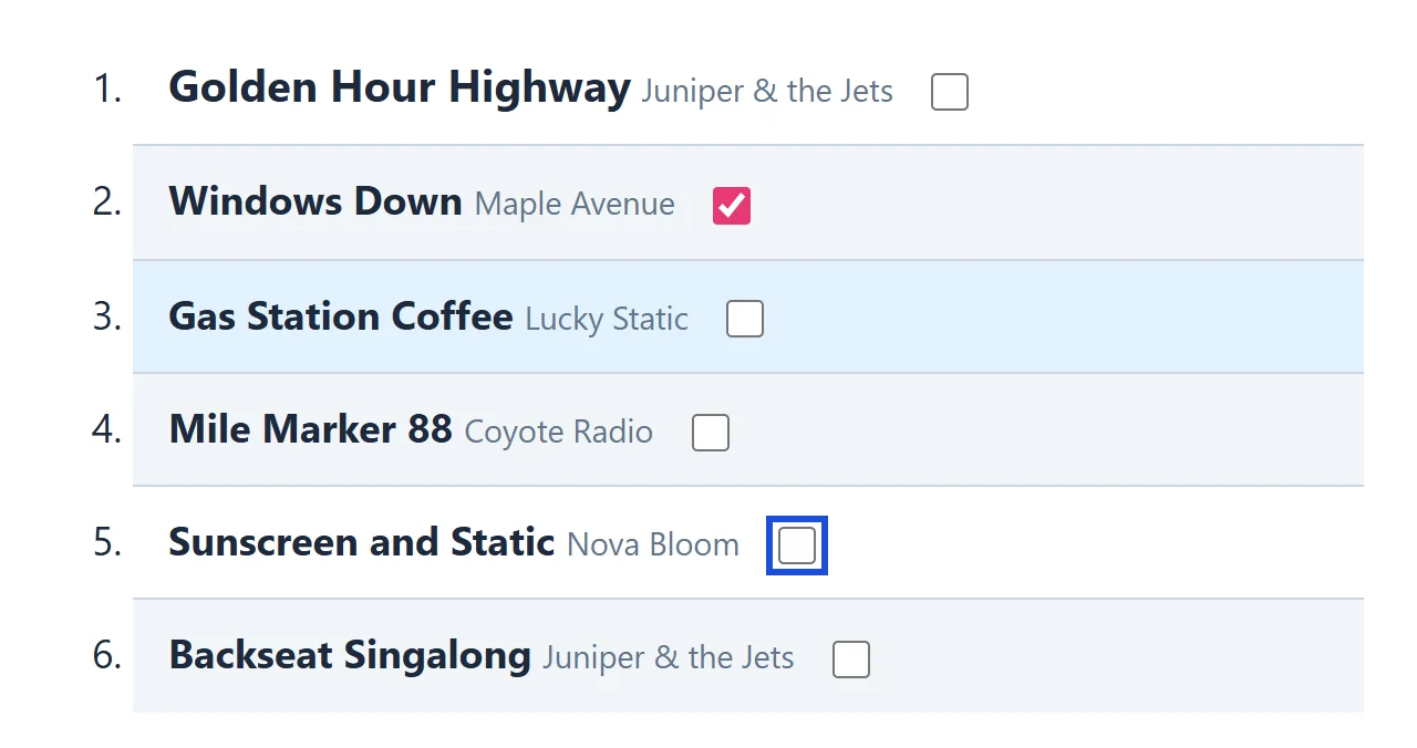
A liked song's checkbox turns pink (accent-color colors a checkbox's tick and box), and the Share button looks unavailable, with a "no" sign as the pointer. Pair :checked with the combinators from Combinators: Descendant, Child and Sibling and the click can change other elements: input:checked + span reaches the span right after a ticked box.
Position: :first-child, :last-child and :nth-child()
The next pseudo-classes don't change: they depend on where an element sits among its siblings.
:first-childand:last-childmatch the first and the last child of a parent.:nth-child(), read "nth child", matches by number. Inside the parentheses goodd(1, 3, 5…),even(2, 4, 6…), one number (:nth-child(4), the fourth), or a pattern such as3n(every third: 3, 6, 9, 12). In a pattern,ncounts 0, 1, 2, 3… so3ngives 0, 3, 6, 9…, and there is no zeroth child.2n+1is another way to writeodd.
li:nth-child(even) {
  background-color: #f1f5f9;
}

li:first-child strong {
  font-size: 1.25rem;
}
Every second song gets a light gray stripe, like the rows of a printed bank statement, and the first song's title is bigger. Add a song to the middle of the list and the stripes stay correct, since the browser counts again. One catch: :nth-child() counts every child, whatever its type. In a song, span:nth-child(2) is the artist, since the <strong> is child 1.
Leaving some out: :not()
:not(), read "not", matches everything its parentheses don't. li:not(:last-child) is "every song except the last":
li:not(:last-child) {
  border-bottom: 1px solid #cbd5e1;
}
That draws a line between songs, with no stray line under the last one. Without :not(), you'd write a border for every song, then a second rule to take it off the last one.
Check yourself
2 questions to try on the lesson page.
So what
Pseudo-classes make a page respond to the people using it, and they keep long lists readable without a class on every row. Keep the focus visible, and the page works for everyone who can't or doesn't use a mouse.