Exercise: A Photo Gallery Grid
Lay out Trail Photo Club's page with CSS Grid, from named page areas to a gallery that fits any width, a photo of the month that covers four cells and cards lined up with subgrid, and let the tests check each step.
Journeyman · CSS · Updated
Trail Photo Club has a page full of trail photos and no layout: the header, the list of upcoming hikes, eight photos and four members' picks all stack in one long column. The club wants it to look like a real photo site, with a sidebar, a gallery that fits any screen, the photo of the month shown big, and members' picks whose parts line up neatly. The page's HTML and its look (colors, fonts, the captions on the photos) are ready; the layout is yours, in four steps, with tests that check each one.
Before you start
You need VS Code with Live Server, a current Chrome, Edge or Firefox, and Node.js, set up as in Setup: VS Code, a Browser and Node.js. The steps use what this chapter taught: CSS Grid: Rows and Columns, Placing Items: Lines, Spans and Named Areas, Grids That Fill the Space: repeat(), minmax() and auto-fit and Subgrid: Lining Up Cards.
Get the exercise code
In the Exercise box beside the lesson, choose Get the starter on GitHub to open its GitHub repository. Click Code, then Download ZIP, and unzip it into your css-in-depth folder. The folder holds:
index.html: the club's page, with every class the steps need. Ready to use: don't change it.styles.css: the page's look is ready. The four layout steps at the bottom are yours to finish.images/: drawings of trails standing in for photos, free to use.page.test.jsandpackage.json: the checks, and what they need. You don't need to change these.
In VS Code, choose File > Open Folder and open the exercise folder: the one with package.json directly inside it. Right-click index.html and choose Open with Live Server.
What to do
The bottom of styles.css has an empty rule for each step, with a comment that says what it needs:
/* Step 1. The page: a header across the top, the sidebar and the main content side by side, a footer across the bottom. */
.page {
}

/* Step 2. The gallery: as many columns as fit, each at least 14rem wide, with a gap and rows of one height. */
.gallery {
}
- The page. Make
.pagea grid with a sidebar about 16rem wide and the main content taking the rest. Draw it withgrid-template-areas, using the namesheader,sidebar,mainandfooter: the header across the top row, the sidebar and main side by side, the footer across the bottom. Then put each part (.page > header,.page > aside,.page > main,.page > footer) in its area. - The gallery. Make
.galleryfit as many columns as there is room for, each at least 14rem wide and stretching to fill the row. Give it a gap, and give its rows one height (12rem looks good). - The photo of the month. Make
.featuredtwo columns wide and two rows tall. - The members' picks. Make
.picksa grid of columns at least 14rem wide, then make each.pickcard a subgrid, so the titles, captions and stats line up across each row of cards.
Two rules: no @media rules (the gallery fits the width by itself), and no fixed heights on the cards' titles or captions.
Check your work
Open VS Code's terminal (Terminal > New Terminal). The first time only, run npm install to download the checking tool. Then run the checks as often as you like:
npm test
At first 5 of the 7 checks fail. That's expected: each step you finish turns its check green. The two that pass from the start check that the page still links styles.css and that there's no @media rule. A failing check names its step and says what it found, for example Step 3: .featured covers 1 column(s) so far. Make it two columns wide.
The checks read your rules; they can't see how the page looks. So look too: drag the browser window narrower and wider, and turn on the grid overlay in the developer tools.
Hints
- Draw the page on paper first. Two columns, three rows: write an area name in each of the six cells, then copy the drawing into
grid-template-areas, one quoted string per row. Placing Items: Lines, Spans and Named Areas has the rules a drawing must follow. - Read the gallery's columns aloud. "As many as fit, each at least 14rem, at most one share." Each part of that sentence is one piece of the rule in Grids That Fill the Space: repeat(), minmax() and auto-fit.
- The gallery never says how many rows it has. Rows the browser adds are the implicit grid, and one property sizes them all.
- Count each card's parts. A pick holds a photo, a title, a caption and the stats. Subgrid: Lining Up Cards explains why that number matters.
- Use the overlay. Click the
gridbadge beside.page,.galleryor.picksin the Elements panel, and tick Show area names or Show line numbers in the Layout pane.
When you're done
Every check is green:
✔ the page still links styles.css
✔ step 1: the page is drawn with grid-template-areas: header, sidebar, main and footer
✔ step 2: the gallery fits as many columns as there is room for
✔ step 2: the gallery's rows all have one height
✔ step 3: the photo of the month is two columns wide and two rows tall
✔ step 4: the members' picks line up with subgrid
✔ no media queries: the grids fit the width by themselves
ℹ tests 7
ℹ pass 7
ℹ fail 0
The page has a green header across the top, the upcoming hikes in a sidebar on the left, the gallery beside it with Eagle Peak filling a big block in its corner, and four members' picks whose titles, captions and stats sit on the same lines, even though The Long Lake Loop and Waterfall Trail has the longest name and the most to say.
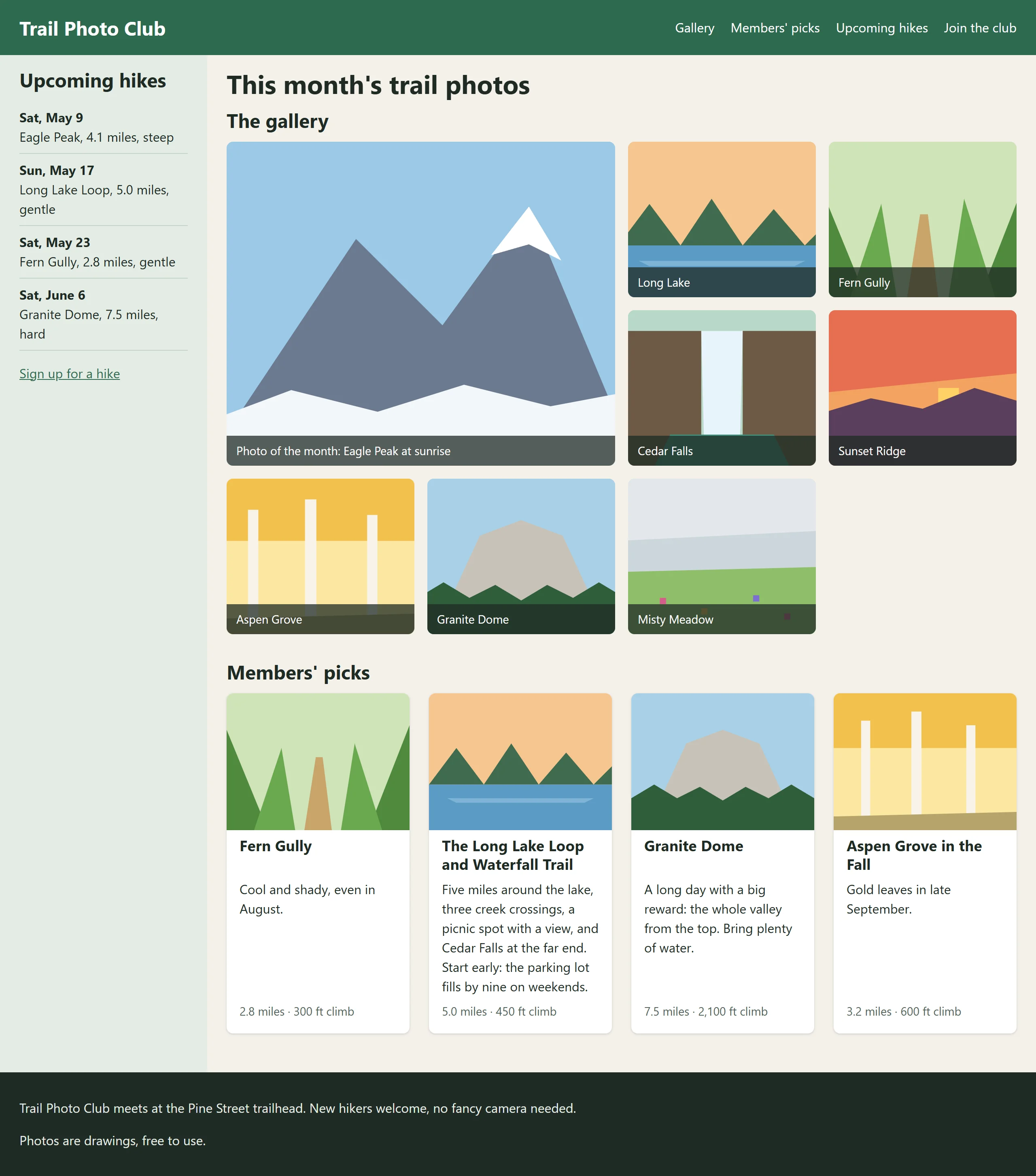
Now drag the window narrower. The gallery drops from four columns to three, then two. Keep going until there's room for only one, and the photo of the month, still two columns wide, pushes the page wider than the window. What would you want to happen on a phone instead?
More practice in Grid Town
Want more? Grid Town's last five puzzles, Town plan, mix everything in this chapter, from columns and roads to spans, maps and lots that fit any width: play them on the game's page. Your solves count there, just as they do in the lessons.
What Module 4 unlocks
That question is where the next module starts. Module 4, Responsive Design, makes every layout you've built work on a phone, a tablet and a wide screen: the sidebar moving under the gallery on a small screen, the photo of the month shrinking to fit, pictures that load the right size for each device. And it shows how to build parts, like a card, that rearrange themselves to fit whatever space they're given, wherever on the page you put them.
So what
You laid out a whole page with grid: drawn as areas, filled by a gallery that counts its own columns, with one photo given room to shine and cards that line up however long their text. That's the same toolkit behind real photo sites, online shops and dashboards.