Image Dimensions and Lazy Loading
Stop a page from jumping while its pictures load with width and height, let pictures further down wait with loading="lazy", and give the first picture priority.
Journeyman · HTML · Web Development · Updated
After this lesson you can
- Give every img its width and height so the page doesn't jump while pictures load
- Load pictures below the first screen lazily, and give the first picture priority instead
Key takeaways
- Give every img its width and height, in pixels with no px, so the browser saves the space before the file arrives.
- With width and height and the stylesheet's height auto rule, a picture still shrinks to fit and keeps its shape.
- loading="lazy" makes a picture further down the page wait until the reader scrolls near it.
- Never lazy-load the first picture people see. Give that one fetchpriority="high" instead.
You've done this: you go to tap a link on your phone, the page jumps as your finger lands, and you've tapped an ad instead. Something above the link (very often a picture) finished loading and pushed everything down. It's one of the most annoying things a page can do, and Google measures it as one of the things it weighs when it ranks pages. This lesson fixes it with two attributes, then makes your pages faster with two more: one that tells pictures further down to wait, and one that tells the most important picture to hurry.
Why the page jumps
The browser reads your HTML from the top and starts showing text right away. When it meets an <img>, it asks for the file, but it can't wait for it: the file might take a second to arrive. So it carries on with the text below, and until the file arrives, it doesn't know how much room the picture needs. It gives the picture almost none.
When the photo arrives, the browser finally knows its size, makes room, and everything below it moves down. That move is called a layout shift. Google's page-speed tools score it as Cumulative Layout Shift, CLS for short: the total of all the jumps while the page loads.
<!-- The browser doesn't know this picture's size until the file arrives -->
<img src="images/lighthouse-1600.jpg" alt="The white lighthouse with its red lantern room">
<p>The lighthouse keepers' cottage is a small museum now.</p>
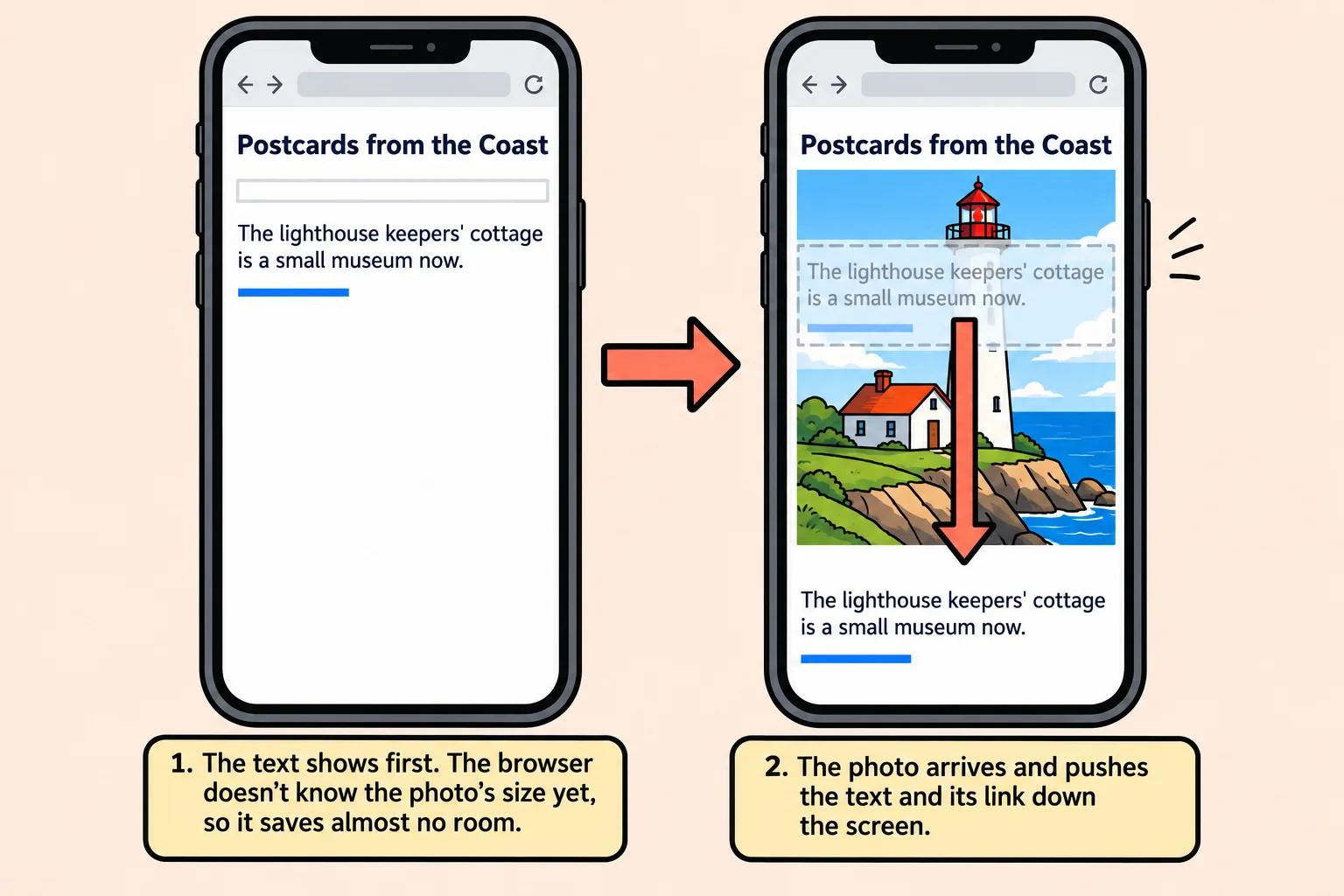
width and height save the space
At the movies, a friend arriving late can't sit with you unless someone saved them a seat. The width attribute and height attribute save the picture's seat: they tell the browser the picture's size before the file arrives, so it leaves exactly the right room.
<img src="images/lighthouse-1600.jpg" alt="The white lighthouse with its red lantern room"
     width="1600" height="1200">
- The values are pixels, written as plain whole numbers.
width="1600", neverwidth="1600px". - Use the file's own size. The lighthouse file is 1600 × 1200, so that's what goes in. (Any pair with the same shape works too, such as 800 and 600, but the file's own numbers are the easiest to get right.)
A 1600-pixel picture on a 400-pixel phone screen? It won't stick out. This course's starter stylesheets have this rule, and most sites have one like it:
img {
  max-width: 100%;
  height: auto;
}
It reads: a picture is never wider than the space it's in, and its height follows its width. With it, the browser uses your width and height for the picture's shape. A 1600 × 1200 picture is 4 wide for every 3 tall, so on a phone showing it 360 pixels wide, the browser saves a space 270 pixels tall.
Try it. Find a picture's size without opening it: in the browser, press F12 to open the developer tools, pick the Elements panel, and hold the mouse over an <img> tag's src. Chrome and Edge show its intrinsic size, the file's own width and height in pixels.
Lazy loading for pictures further down
A good restaurant doesn't cook your dessert when you sit down. It waits until you're nearly done with your main course, and if you leave before dessert, nothing was wasted.
Lazy loading does that for pictures. A picture with the loading attribute set to lazy waits to download until the reader scrolls close to it. Someone who reads only the top of the page never downloads the photos at the bottom.
<img src="images/sunset-1600.jpg" alt="The sun setting into the ocean, turning the wet sand orange"
     width="1600" height="1200" loading="lazy">
The browser starts fetching a lazy picture a little before it comes into view, so a reader scrolling at a normal speed doesn't see it pop in. Lazy pictures need their width and height even more: they arrive while the reader is looking at the page, so a picture without them jumps the text right under the reader's eyes.
Never lazy on the first picture people see
The big photo at the top of the travel blog is on screen the moment the page opens. With loading="lazy", the browser would wait to work out where the photo sits before asking for it, and the most important picture on the page would show up last.
loading has two values: lazy, and eager ("fetch it now"), which is what a picture gets when it has no loading attribute at all. So the rule is:
- The first screen (the logo, the big photo at the top, anything visible before the reader scrolls): leave
loadingoff. - Further down:
loading="lazy".
<!-- On screen when the page opens: no loading attribute -->
<img src="images/coast-1600.jpg" alt="The coast road curving along green cliffs above a sandy cove"
     width="1600" height="900">
Where the first screen ends depends on the device: a phone shows less than a laptop. When you're not sure whether a picture is above or below that line, leave it eager.
Priority for the most important picture
At the airport, the first boarding group gets on before everyone else. The fetchpriority attribute, read "fetch priority", puts one picture in that first group: fetchpriority="high" tells the browser to download it ahead of the other pictures and files it's waiting for.
<img src="images/coast-1600.jpg" alt="The coast road curving along green cliffs above a sandy cove"
     width="1600" height="900" fetchpriority="high">
Use it on one picture: the biggest one on the first screen, the one people are waiting to see. If every picture is high priority, none of them is. Every current browser understands it, and an older browser that doesn't ignores it.
You'll also meet a fourth attribute, decoding="async". Decoding is turning the packed-up file back into pixels, and async lets the browser keep drawing the page's text while it does. Current browsers make good choices about this on their own, so it's optional.
Putting it together
The top of the travel blog's post, with every picture's attributes in place:
<header>
  <a href="index.html">
    <img src="images/logo.svg" alt="Postcards from the Coast home" width="240" height="60">
  </a>
</header>
<main>
  <img src="images/coast-1600.jpg" alt="The coast road curving along green cliffs above a sandy cove"
       width="1600" height="900" fetchpriority="high">
  <h1>Three Days on the Coast Road</h1>
  <p>Three days, one small car and a list of places a friend swore by.</p>
  <h2>Day 1: Gull Point Lighthouse</h2>
  <p>We started early, with the fog still sitting on the water and the road all to ourselves.</p>
  <img src="images/lighthouse-1600.jpg" alt="The white lighthouse with its red lantern room"
       width="1600" height="1200" loading="lazy">
</main>
The logo and the big photo load right away, the big photo first; the lighthouse, further down the post, waits until the reader scrolls toward it; and nothing jumps, because every picture's seat is saved.
Try it. Open any page with several photos, press F12, and choose the Network panel, which lists every file the page downloads. Choose the Img filter and set the throttling menu (it says No throttling) to Slow 4G. Reload, then scroll slowly: lazy pictures appear in the list only as you get near them.
Check yourself
2 questions to try on the lesson page.
So what
Four attributes (width, height, loading and fetchpriority) make a page that opens with its main picture first, downloads the rest only when someone wants them, and never moves a link out from under a finger.
Key terms
- width attribute
- height attribute
- Cumulative Layout Shift
- Lazy loading
- loading attribute