Image Formats and File Size
Learn why a photo straight from your phone is far bigger than a page needs, and which file format fits each picture, from JPEG and PNG to SVG, WebP and AVIF.
Apprentice · HTML · Web Development · Updated
After this lesson you can
- Choose an image format for a picture: JPEG, PNG, SVG, WebP or AVIF
- Explain how a picture's size in pixels drives its file size, and pick a size that fits the page
Key takeaways
- A picture is a grid of pixels. A phone photo has about 12 million of them, many times what a page shows.
- Shrinking a photo to the size the page shows makes the file many times smaller, with no difference anyone can see.
- JPEG is for photos, PNG for screenshots and see-through parts, and SVG for logos and icons that stay sharp at any size.
- WebP and AVIF make the same photo smaller again, and every current browser shows them.
You take a great photo of a lighthouse on your phone, drop it into your page, and it looks perfect on your laptop. Then a friend opens the page on their phone, on one bar of signal, and stares at a blank space for ten seconds. Pictures are usually the heaviest thing on a page, and on a phone plan, every megabyte someone downloads can cost them money. The fix is mostly two choices you make before the picture reaches the page: how big it is, and which format it's saved in.
A picture is a grid of pixels
Look very closely at a mosaic, and you see it's made of small square tiles, each one a single color. Step back, and the tiles blend into a picture. A photo on a screen works the same way: it's a grid of tiny squares of color called pixels (short for "picture elements").
A photo's size is written as its width and height in pixels, with an × between them, read "by":
A phone photo:          4032 × 3024 pixels = 12,192,768 pixels (about 12 million)
A blog's photo column:   720 × 540 pixels  =    388,800 pixels
A page measures sizes in pixels too, written px in a stylesheet. A sharp phone or laptop screen draws each of those page pixels with 2 or 3 of its own, even tinier dots, which is why the lesson Responsive Images with srcset and sizes gives sharp screens bigger files.
Try it. Find the size of one of your own photos. On Windows, right-click it in File Explorer, choose Properties, then the Details tab. On a Mac, select it in Finder and press Cmd+I. Look for the dimensions, and the file size.
The img is a frame, and the file is the weight
An <img> element doesn't hold a picture. It's like an empty picture frame on the wall: the browser reads the HTML, sees the frame, then fetches the file named in src and puts it inside. An element whose content comes from outside the page like this is called a replaced element.
<img src="images/lighthouse.jpg" alt="The white Gull Point lighthouse with its red lantern room">
That line of HTML is under 100 bytes. The file it names can be millions. Here is one real photo of a lighthouse, saved as a JPEG at each size:
| Size in pixels | File size |
|---|---|
| 4032 × 3024, as it came off a phone | 2.5 MB |
| 1600 × 1200 | 180 KB |
| 960 × 720 | 80 KB |
| 480 × 360 | 27 KB |
A KB (kilobyte) is a thousand bytes and an MB (megabyte) is a thousand KB. So the 1600-pixel copy is about 14 times smaller than the original, and on a page that shows it 720 pixels wide, nobody can see a difference. (Windows counts a kilobyte as 1,024 bytes, so its numbers come out a little smaller.)
Exporting a resized copy has a bonus: phone photos carry hidden details, such as the place they were taken, and most tools leave those out of the copy.
JPEG for photos, PNG for screenshots
Shrinking is half of it. The other half is the format: how the file packs its pixels. Formats save space in one of two ways:
- Lossy formats throw away detail your eye is unlikely to notice, such as tiny changes of color in a sky. The file gets much smaller.
- Lossless formats keep every pixel exactly as it was. The file stays bigger, but nothing is lost.
JPEG (files ending .jpg or .jpeg, read "jay-peg") is lossy, and it's been the format for photos since the 1990s. PNG (.png, read "ping") is lossless, and it can have transparent parts, places where the page shows through, such as the corners around a round badge.
That makes PNG the better choice for a screenshot, a diagram or anything with sharp text, where JPEG's lost detail shows as smudges around the letters. For a photo, PNG is the wrong choice. The same lighthouse photo at 1600 × 1200:
lighthouse-1600.jpg   180 KB
lighthouse-1600.png   2.0 MB
SVG for logos and icons
A pixel picture is like a cross-stitch: blow it up, and you see the squares. An SVG (.svg, short for Scalable Vector Graphics) is more like the instructions for a drawing: "a circle here, this color; a wavy line there." The browser follows them at whatever size the page needs, so an SVG stays sharp on any screen, from a watch to a TV.
An SVG file is plain text you can open in VS Code. This is part of the travel blog's logo, an orange sun with a wave across it:
<svg xmlns="http://www.w3.org/2000/svg" width="240" height="60" viewBox="0 0 240 60">
  <circle cx="30" cy="30" r="22" fill="#f4a259"/>
  <path d="M6 38 q8 -8 16 0 t16 0 t16 0" fill="none" stroke="#1d6f8c" stroke-width="4"/>
</svg>
The whole logo, words and all, is a 509-byte file: half a kilobyte. You put it on the page with an <img> like any other picture. SVG fits logos, icons and simple illustrations: shapes and flat colors. A photo has millions of different colors and no shapes to describe, so a photo stays a JPEG (or one of the two formats below).
WebP and AVIF: the same photo, smaller
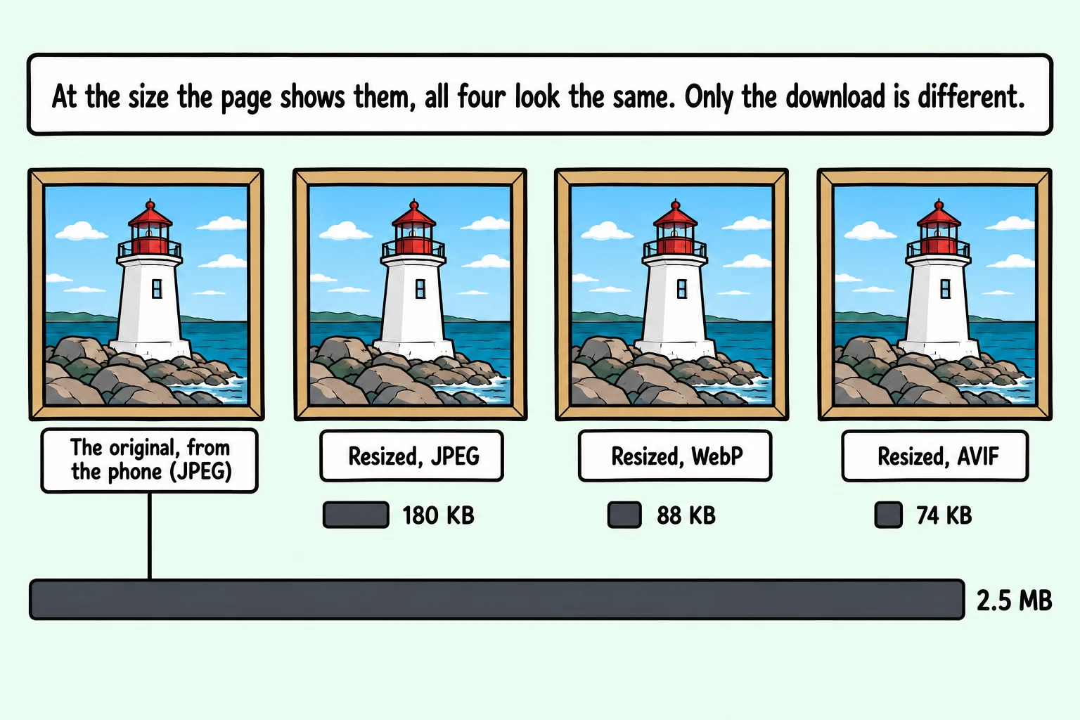
Two newer formats squeeze photos harder than JPEG can. WebP (Google, who made it, says "weppy"; plenty of people say "web-pee") came first; AVIF (read "ay-vif") is newer and usually smaller again. Both can be lossy or lossless, and both can have transparent parts. Here is the lighthouse at 1600 × 1200 once more, in every format:
lighthouse-1600.png    2.0 MB
lighthouse-1600.jpg    180 KB
lighthouse-1600.webp    88 KB
lighthouse-1600.avif    74 KB
The AVIF copy is less than half the JPEG's size, and at a normal viewing size, the two look the same. Every current browser (Chrome, Edge, Firefox and Safari) shows both formats. For the rare older browser that doesn't, The Picture Element shows how to offer a JPEG as a backup.
Free tools make these copies. Squoosh (squoosh.app, in the browser) lets you resize a photo, pick a format and see the file size before you save. The settings behind the numbers in this lesson were JPEG at quality 80, WebP at 75 and AVIF at a middle setting, which are close to where most tools start. Your own photos will give different numbers, but the same kind of difference.
Try it. Open one of your photos in Squoosh. Resize it to 1600 pixels wide, and compare the file size as MozJPEG, WebP and AVIF. Zoom in on the preview: can you see a difference?
Choosing a format
| The picture | The format |
|---|---|
| A photo | JPEG, or WebP or AVIF for a smaller file |
| A screenshot, or a diagram with text | PNG (or lossless WebP) |
| A picture with see-through parts | PNG, WebP or AVIF (not JPEG) |
| A logo, an icon, a simple drawing | SVG |
Then resize it to about the largest size the page shows it, before it goes anywhere near your HTML.
Check yourself
2 questions to try on the lesson page.
So what
The fastest picture is a small file in the right format: resize photos to the size the page shows them, pick the format by what's in the picture, and your pages load in a moment instead of making visitors wait.
Key terms
- Pixel
- JPEG
- PNG
- SVG
- WebP