The Picture Element
Use picture and source to offer smaller AVIF and WebP files with a JPEG backup, and to show phones a tighter crop of a photo than big screens get.
Journeyman · HTML · Web Development · Updated
After this lesson you can
- Offer modern formats with picture and source, with a JPEG img as the fallback
- Show a different crop of a picture on small screens with picture, source and media
Key takeaways
- A picture element holds source elements and one img. The browser uses the first source it can, or the img if none fits.
- type="image/avif" on a source offers a format only the browsers that show it will download; the JPEG img is the backup.
- media on a source offers a different crop for small screens. That's called art direction.
- The img inside a picture is required, and it carries the alt, width, height and loading attributes.
- Use img with srcset for the same picture in several sizes. Use picture for different formats or different crops.
An AVIF photo can be less than half the size of the same photo as a JPEG. But what about the reader whose browser is a few years old and can't show AVIF at all? And the big photo at the top of the travel blog, a wide view of the whole cove, looks great on a laptop, but on a phone the cove shrinks to a strip and nobody can tell what they're looking at. Both problems have the same answer: the <picture> element, which lets you offer the browser choices of format and of crop, with a safe backup for everyone else. Photo sites, online stores and news sites use it for the pictures that matter most.
picture holds the choices, img does the showing
Ordering coffee, you might say: "oat milk if you have it; if not, almond; if not, regular milk is fine." The barista goes down your list and stops at the first one they have.
The <picture> element is that list. Inside it go one or more <source> elements, the choices, in the order you prefer them, and then one <img>, the "regular milk is fine":
<picture>
  <source type="image/avif" srcset="images/coast-1600.avif">
  <source type="image/webp" srcset="images/coast-1600.webp">
  <img src="images/coast-1600.jpg" alt="The coast road curving along green cliffs above a sandy cove"
       width="1600" height="900">
</picture>
The browser reads the sources from the top and takes the first one it can use. Whatever it picks, the picture is shown by the <img>: the source only changes which file the <img> displays. That's why the <img> is required, and why it keeps the attributes that describe the picture: alt, width, height, loading and fetchpriority. A <source> never has alt.
type: a modern format with a backup
The type attribute names a file's kind as a MIME type: two words with a slash, the label browsers and servers use for kinds of files. image/avif is read "image slash avif".
| Format | Its type |
|---|---|
| AVIF | image/avif |
| WebP | image/webp |
| JPEG | image/jpeg |
| PNG | image/png |
A browser that can't show AVIF sees type="image/avif" and skips that source without downloading anything, so nobody downloads a file they can't use. Put the smallest format first:
- AVIF, the smallest;
- WebP, for browsers without AVIF;
- the JPEG
<img>, for everyone else.
Every current browser shows AVIF, so most readers get the first choice. The other two cost you nothing but two lines, and they keep the page working on an older phone or laptop.
Each source can offer several widths
A <source> takes a srcset with w descriptors and a sizes attribute, as an <img> does (Responsive Images with srcset and sizes explains both). So one <picture> can offer every format in every width. Here is the travel blog's big photo at the top, which fills the width of the window:
<picture>
  <source type="image/avif"
          srcset="images/coast-480.avif 480w, images/coast-960.avif 960w, images/coast-1600.avif 1600w"
          sizes="100vw">
  <source type="image/webp"
          srcset="images/coast-480.webp 480w, images/coast-960.webp 960w, images/coast-1600.webp 1600w"
          sizes="100vw">
  <img src="images/coast-960.jpg"
       srcset="images/coast-480.jpg 480w, images/coast-960.jpg 960w, images/coast-1600.jpg 1600w"
       sizes="100vw"
       alt="The coast road curving along green cliffs above a sandy cove"
       width="1600" height="900" fetchpriority="high">
</picture>
The browser picks the format first (the first source it can show), then the width from that source's list. A source always uses srcset, even for a single file: src belongs to the <img>.
Art direction: a different crop for phones
A newspaper's photo editor crops the same photo differently for the front page and for a narrow side column, so the important part stays big enough to see. Choosing a different crop of a picture for different screens is called art direction.
The media attribute on a <source> makes it a choice for some screens only. It takes a condition like the ones in sizes:
<picture>
  <source media="(max-width: 600px)" srcset="images/coast-square-800.jpg"
          width="800" height="800">
  <img src="images/coast-1600.jpg" alt="The coast road curving along green cliffs above a sandy cove"
       width="1600" height="900">
</picture>
On a screen at most 600 pixels wide, the browser uses the square crop, cut close around the cove; anywhere else, it uses the wide photo in the <img>. Because the two crops have different shapes, the <source> gets its own width and height, so the browser still saves the right space on a phone. The alt text fits both crops: they show the same scene.
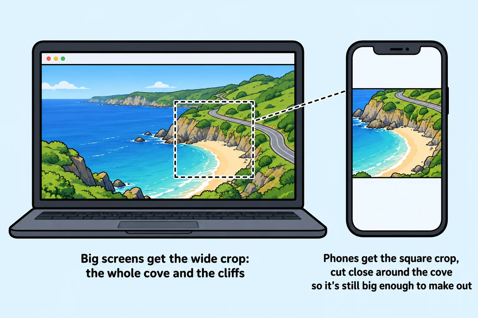
Try it. Copy the example into a page with two pictures of your own of different shapes. Open it, turn on the device toolbar (Ctrl+Shift+M, or Cmd+Shift+M on a Mac), and drag the width of the screen past 600 pixels: the picture switches crops as you cross it.
picture or img with srcset?
| The problem | The fix |
|---|---|
| The same picture should download smaller on small screens | <img> with srcset and sizes |
| You want smaller AVIF or WebP files, with a backup | <picture> with <source type> |
| Phones should see a different crop | <picture> with <source media> |
<picture> is for choosing which picture (a format or a crop). For "the same picture, smaller", an <img> with srcset is all you need, and the browser stays free to choose by screen and connection. With media, you decide; with srcset and sizes, the browser decides.
Mistakes to watch for
<picture>
  <img src="images/coast-1600.jpg" alt="The coast road curving along green cliffs above a sandy cove"
       width="1600" height="900">
  <source type="image/avif" srcset="images/coast-1600.avif">
</picture>
This one never shows the AVIF file: the browser stops at the <img>, so every <source> must come before it. The other mistakes people make most:
- No
<img>at all. Then nothing shows. A<picture>with only sources is an empty frame. alton the<source>. It does nothing there. The<img>carries the alt text.srcon a<source>. A source usessrcset, even for one file.
Check yourself
2 questions to try on the lesson page.
So what
<picture> gives you control when you need it: the smallest format each browser can show, and a crop that works on every screen, with an <img> inside that keeps the picture working for everyone.