5 CSS features that replace the old hacks
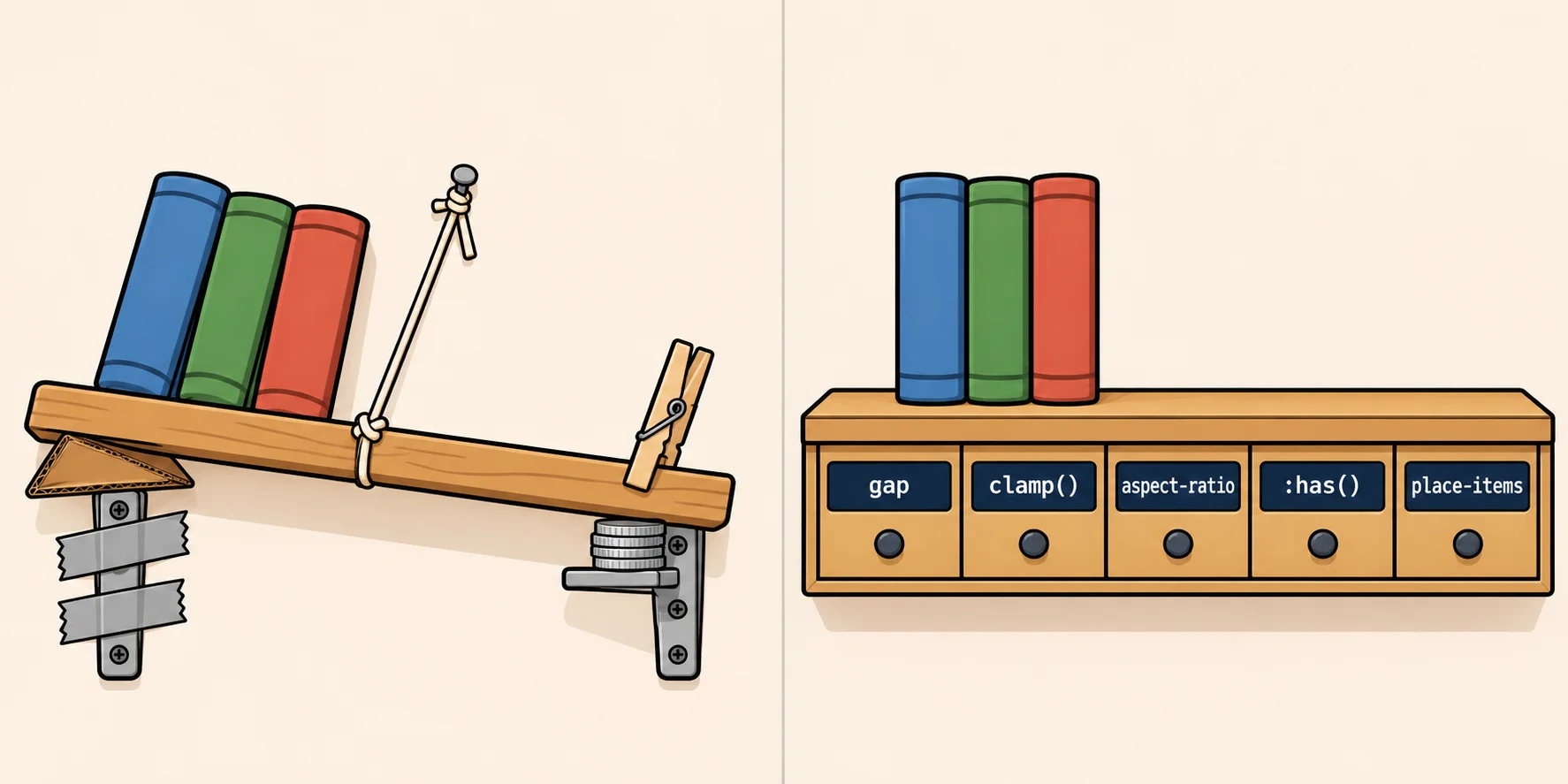
Negative margins, a stack of media queries, the 56.25% padding trick, a script that adds a class, and top 50% left 50%. Five CSS features do each of those jobs in a line or two.
By Gregor Dzierzon ·
Search for "how do I center a div" and you'll find answers from 2012 that still work. They're also six lines long, and
nobody can tell you why the -50% is there.
Those answers are hacks: tricks that get the result by using a property for something it wasn't made for. They were the only way at the time. CSS has since added a feature for each job, and you'll still meet the old trick in tutorials, in answers online and in the code at your first job. Here are five of them, each shown as the hack and then the feature that replaces it.
Every example styles the same page, a store's list of products. Each product is a card with a photo, a name and a price, and a product that has run out gets one more line:
<ul class="products">
  <li class="product">
    <img src="chai.jpg" alt="A cup of chai">
    <h2>Chai</h2>
    <p>$18.00</p>
  </li>
  <li class="product">
    <img src="gumbo-mix.jpg" alt="A jar of gumbo mix">
    <h2>Chef Anton's Gumbo Mix</h2>
    <p>$21.35</p>
    <p class="sold-out">Sold out</p>
  </li>
  <!-- six more products -->
</ul>
1. Space between the cards: gap
Before: a margin on every card, and a negative margin to take half of it back.
.products {
  display: flex;
  flex-wrap: wrap;
  margin: -0.5rem;   /* pull the outside edges back in */
}

.product {
  margin: 0.5rem;    /* half the space, on every side */
}
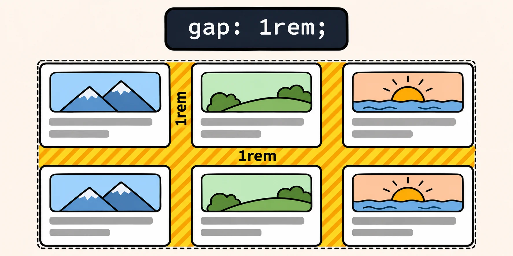
You want 1rem between the cards, so each card gets half of that on every side, and two neighbors add up to the full
1rem. But the cards at the edges now sit 0.5rem in from the edge of the list, so the list gets a negative margin to
cancel it. Change the spacing later and you have two numbers to change, and one of them is negative.
After:
.products {
  display: flex;
  flex-wrap: wrap;
  gap: 1rem;
}
gap sets the space between the items, across and down, and puts none at the outside edges. It works the same way in
flexbox, in grid and in multi-column layouts
(gap). Give it two values, such as
gap: 2rem 1rem, and the first is the space between rows and the second the space between columns.
2. A heading that fits every screen: clamp()
Before: one size for phones, then a media query for each larger screen.
h1 {
  font-size: 1.5rem;
}

@media (min-width: 600px) {
  h1 { font-size: 2.25rem; }
}

@media (min-width: 1000px) {
  h1 { font-size: 3rem; }
}
The heading jumps in size at 600 and at 1000 pixels and stays the same everywhere in between, so it's a little too small just before each jump.
After:
h1 {
  font-size: clamp(1.5rem, 1rem + 3vw, 3rem);
}
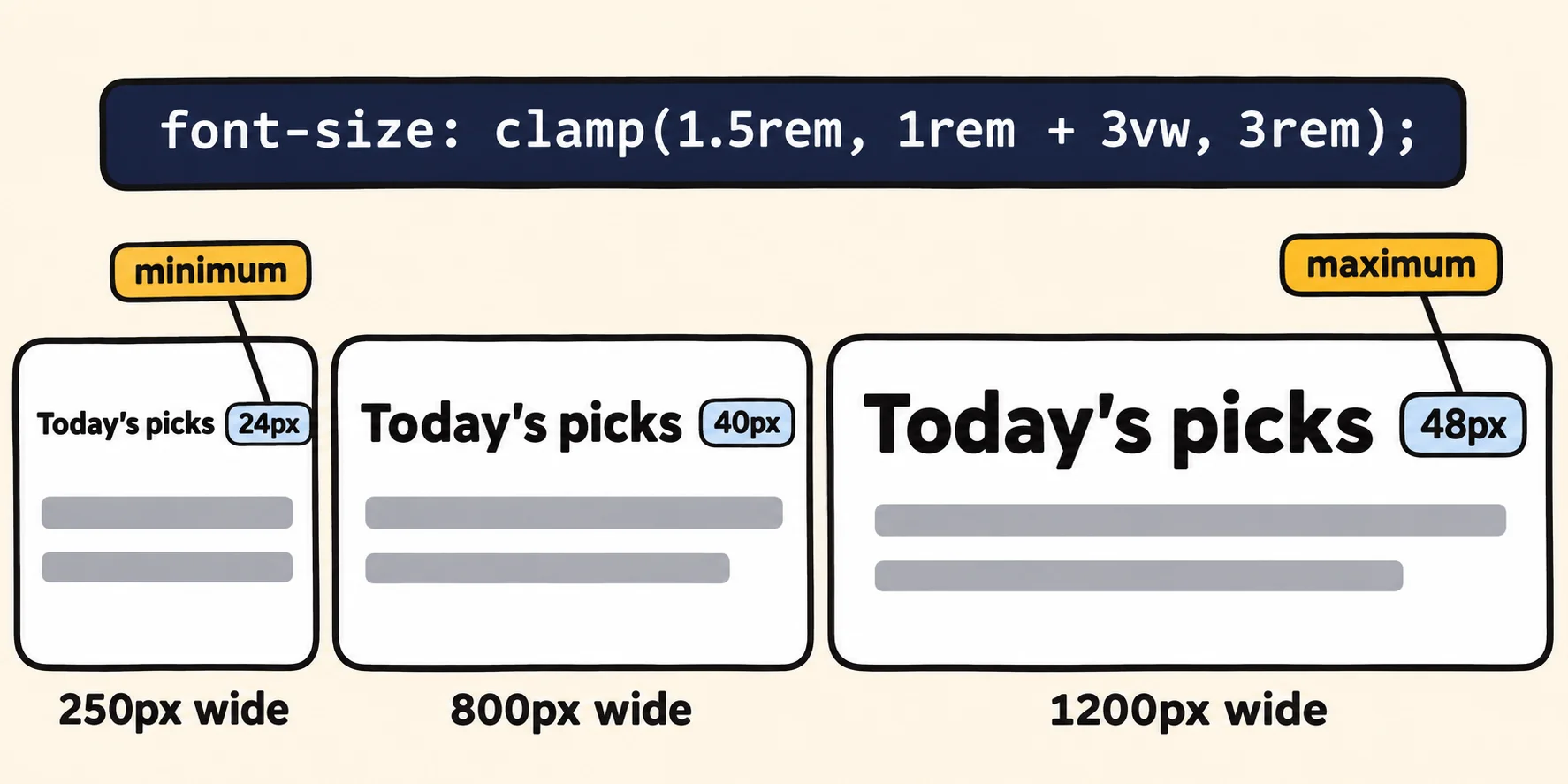
clamp() takes three values: a minimum, a preferred size and a maximum. It uses the preferred size, but never less
than the minimum and never more than the maximum
(clamp()). Here the preferred size is
1rem + 3vw. One vw is 1% of the window's width, so the heading grows as the window does. With the usual 1rem of
16 pixels:
| Window width | 1rem + 3vw |
The heading is |
|---|---|---|
| 250px | 23.5px | 24px (the minimum, 1.5rem) |
| 800px | 40px | 40px |
| 1200px | 52px | 48px (the maximum, 3rem) |
Keep the 1rem in the preferred size. It's the part that still grows when a reader makes the text larger in their
browser's settings.
3. A photo box that keeps its shape: aspect-ratio
Before: an extra div around the photo, and padding that pretends to be a height.
.photo-box {
  position: relative;
  padding-top: 56.25%;   /* 9 ÷ 16 */
}

.photo-box img {
  position: absolute;
  top: 0;
  left: 0;
  width: 100%;
  height: 100%;
  object-fit: cover;
}
This works because padding written as a percentage is measured against the width, even the padding at the top
(padding-top). So 56.25% makes
the box 9 parts tall for every 16 parts wide, and the photo is then stretched over it. It needs the extra div in the
HTML, and nothing in the CSS says "16 by 9".
After:
.product img {
  width: 100%;
  aspect-ratio: 16 / 9;
  object-fit: cover;
}
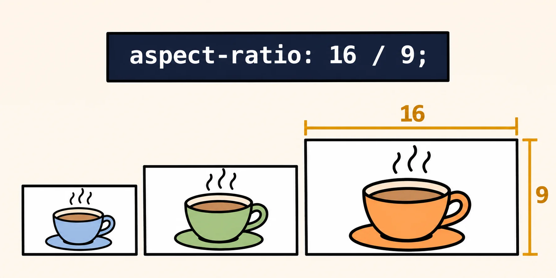
aspect-ratio gives the box its shape: for every 16 parts of width, 9 of height. When the width changes, the browser
works out the height to keep that shape
(aspect-ratio). object-fit: cover
fills the box by cropping the photo, so no photo is squashed. For square photos, write aspect-ratio: 1 / 1. The extra
div can go.
4. Style a card by what's inside it: :has()
Before: CSS selectors could only look down, from a parent to what's inside it. To change a card because it contains a "Sold out" line, you needed JavaScript to find those cards and mark them:
document.querySelectorAll(".product").forEach(product => {
  if (product.querySelector(".sold-out")) {
    product.classList.add("is-sold-out");
  }
});
.product.is-sold-out img {
  filter: grayscale(1);
}
And the script has to run again every time a product sells out or comes back.
After:
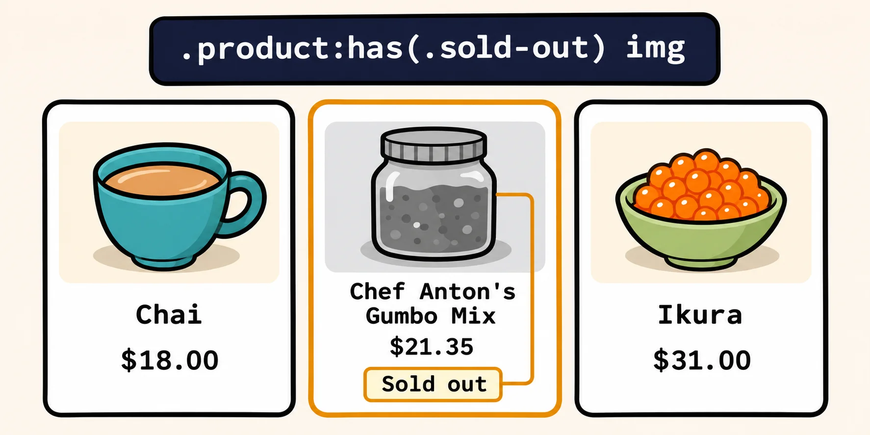
.product:has(.sold-out) img {
  filter: grayscale(1);
}
Read it as "the photo in a product that has a sold-out element inside it". :has() selects an element by what it
contains, which is why it's often called the parent selector
(:has()). No script, no extra class, and
when the "Sold out" line appears or goes away, the browser updates the photo.
5. Center one thing in a box: place-items
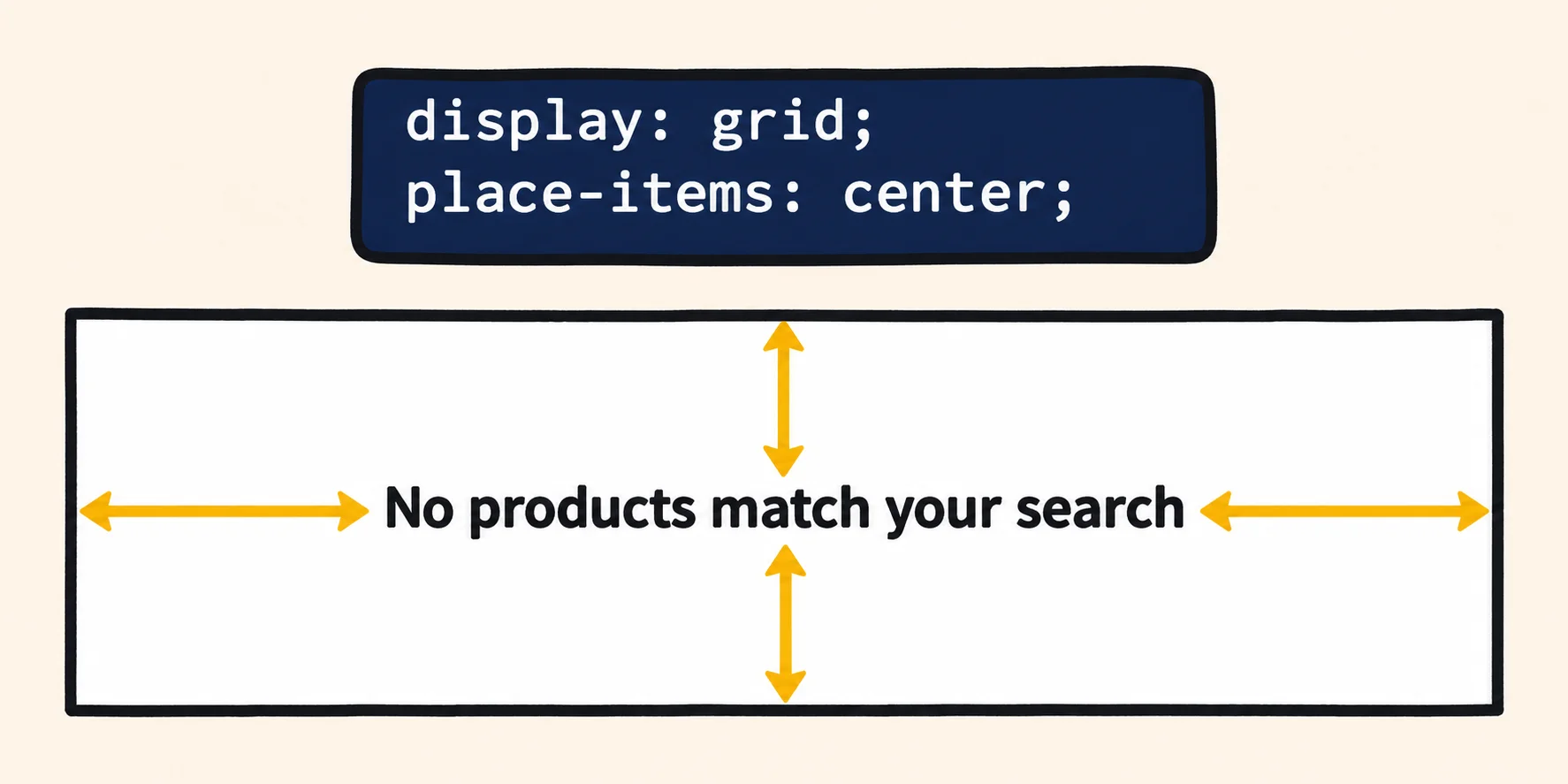
Before: when a search finds no products, the page shows one line, "No products match your search", in the middle of an empty box.
.no-results {
  position: relative;
  height: 20rem;
}

.no-results p {
  position: absolute;
  top: 50%;
  left: 50%;
  transform: translate(-50%, -50%);
}
top: 50% and left: 50% put the top left corner of the line at the middle of the box. The transform then moves
the line back by half its own width and half its own height. That's what the -50% is for.
After:
.no-results {
  display: grid;
  place-items: center;
  height: 20rem;
}
place-items is two properties in one: align-items, which places things up and down, and justify-items, which
places them across
(place-items). With center, the
line sits in the middle both ways, and the rule is on the box, not on the thing inside it.
Can you use all five today?
Yes. MDN marks each of the five as Baseline Widely available, its label for a feature that has worked in the major
browsers for at least two and a half years
(Baseline). The newest of them is :has(),
which has been in every major browser since December 2023.
.products { gap: 1rem; }
h1 { font-size: clamp(1.5rem, 1rem + 3vw, 3rem); }
.product img { aspect-ratio: 16 / 9; }
.product:has(.sold-out) img { filter: grayscale(1); }
.no-results { display: grid; place-items: center; }
The rest, in the lessons
Each of the five has a lesson in CSS in Depth that goes further:
- Flexbox Wrapping and gap builds a row of cards that wraps to fit any screen.
- Fluid Type and Spacing with clamp() shows how to work out the
size at any window width, and uses
clamp()for spacing too. - Responsive Images covers
aspect-ratioandobject-fit, and how to send a phone a smaller picture. - Modern Selectors: :is(), :where() and :has() makes a page react to a ticked checkbox with no JavaScript.
- Flexbox or Grid? gives three questions that tell you which one fits each part of a page, centering included.
Next time an answer online hands you a negative margin or a -50%, check whether CSS has a property for the job now.
Sources
- MDN, gap, the CSS reference: sets the gaps between rows and columns in multi-column, flex and grid containers.
- MDN, clamp(), the CSS reference: clamps a value between a minimum and a maximum.
- MDN, padding-top, the CSS reference: a percentage refers to the width of the containing block.
- MDN, aspect-ratio, the CSS reference: the browser adjusts the element's dimensions to keep the width-to-height ratio.
- MDN, :has(), the CSS reference: a way of selecting a parent element; available across browsers since December 2023.
- MDN, place-items, the CSS reference: a shorthand for
align-itemsandjustify-items. - MDN, Baseline, the glossary: what Widely available means.