box-sizing: Making Width Mean What You Think
By default a box's width leaves out its padding and border, so it comes out wider than you asked; box-sizing border-box makes the width you write the width you get.
Apprentice · CSS · Web Development · Updated
After this lesson you can
- Work out a box's full width with content-box and with border-box
- Make every element use border-box with the universal box-sizing rule
Key takeaways
- By default (content-box), width is the content only. Padding and border are added on top, so the box comes out wider.
- With border-box, width is the whole box from border to border. The padding and border fit inside it, and the content gets what's left.
- Margin is never part of the width, whichever box-sizing you use.
- Put the border-box rule for every element at the top of your stylesheet, and every width you write means what you think.
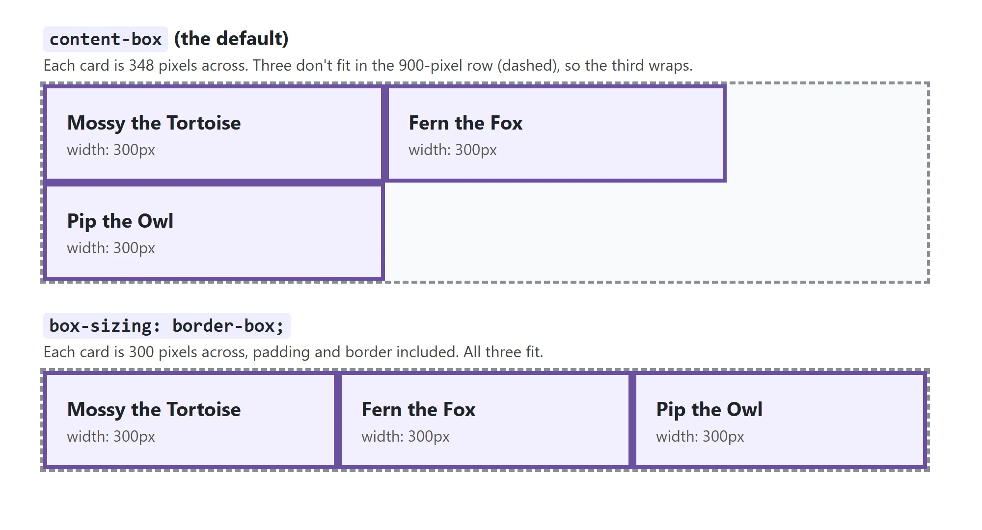
You make a card 300 pixels wide, so three of them fit in a 900-pixel row. Then you give each card some padding and a border, and suddenly the third card drops onto the next line. Or a search box set to width: 100% sticks out past the edge of its form. Nothing is broken: CSS is measuring the width differently from the way you are. This lesson shows you both ways of measuring, and the one line that makes width mean what you think.
Width measures the content, by default
Buy a frame for an 8-by-10-inch photo, and the frame itself is bigger than 8 by 10: the size on the label is the photo's, and the mat and the wood are added around it. CSS does the same by default. Here's Pip the Owl's card:
.card {
  width: 300px;
  padding: 20px;
  border: 4px solid #6b4f9e;
}
width: 300px sets the size of the content only. The padding and the border are added outside it, on both sides:
- 300 pixels of content
- + 20 pixels of padding on the left and 20 on the right
- + 4 pixels of border on the left and 4 on the right
- = 348 pixels across, from border to border
This way of measuring is called content-box, and it's what every browser does unless you say otherwise. It's why the third card dropped: three 348-pixel cards don't fit in 900 pixels. The same adding-up happens to height.
Try it. In your forest-friends folder, give a card the rule above, then right-click it and choose Inspect. The box model diagram shows 300 in the middle, padding 20 and border 4 around it. Hold the mouse over the card in the Elements panel: the label that pops up on the page says it's 348 pixels wide.
border-box: width means the whole box
A moving company sells a box as "60 centimeters wide", and that's the outside: it fits in a 60-centimeter gap in your car. Any padding you put inside the box takes room from what you can pack. That's border-box:
.card {
  box-sizing: border-box;
  width: 300px;
  padding: 20px;
  border: 4px solid #6b4f9e;
}
Now width: 300px is the whole card, from the outside of the left border to the outside of the right one. The padding and the border fit inside the 300 pixels, and the content gets what's left:
- 300 pixels across, from border to border
- − 20 pixels of padding on each side, and 4 pixels of border on each side
- = 252 pixels for the content
The property is called box-sizing, and it has two values: content-box, the default, and border-box. With border-box, three 300-pixel cards fit in 900 pixels, however much padding you give them.
Margin stays outside
Neither way of measuring counts the margin. Margin is the wall space between frames, not part of the frame, so it's always added outside the width:
.card {
  box-sizing: border-box;
  width: 300px;
  padding: 20px;
  border: 4px solid #6b4f9e;
  margin: 0 16px;
}
The card is 300 pixels from border to border, and it takes up 332 pixels of its row: 16 pixels of margin on each side.
| The rule says | content-box: border to border | border-box: border to border | border-box: the content |
|---|---|---|---|
width: 300px; padding: 20px; border: 4px solid; |
348px | 300px | 252px |
width: 200px; padding: 10px; border: 2px solid; |
224px | 200px | 176px |
width: 250px; padding: 0 25px; (no border) |
300px | 250px | 200px |
Try it. Work out the last row yourself: two 25-pixel paddings, no border. Then check it in the box model diagram.
The habit: border-box for every element
Most developers don't want to do the adding-up, so they make every element use border-box with one rule at the very top of the stylesheet:
*,
*::before,
*::after {
  box-sizing: border-box;
}
Piece by piece:
*(read "star") is the universal selector: it picks every element on the page, so every box is measured border to border.- The commas make it a selector list, as in Type, Class and ID Selectors: the rule applies to all three selectors.
*::beforeand*::after(read "star, colon colon, before" and "star, colon colon, after") pick something you haven't met yet: pseudo-elements, small pieces of decoration that CSS can add before or after an element's content, such as an icon or a quotation mark. Module 2's Pseudo-Elements: ::before, ::after and ::marker teaches them. They're in the rule now so that, when you start using them, they follow the same math as everything else.
You'll find this rule, or one very like it, at the top of most stylesheets you open, and in most of the small "reset" stylesheets that sites start from (Module 2's Browser Defaults and a Small Reset builds one).
Why isn't border-box the default? The first version of CSS, in 1996, measured the content, and browsers can't change it now without breaking millions of old pages. So every new stylesheet opts in.
Try it. Put the rule above at the top of your styles.css and save. Inspect a card again: the label now says 300 pixels wide, and the box model diagram's middle number has shrunk to make room for the padding and border.
Check yourself
2 questions to try on the lesson page.
So what
With border-box, the width you write is the width you get, so cards line up, form fields stay inside their forms, and you can change the padding without redoing the math. Start every stylesheet with it.