Common Layout Bugs and How to Fix Them
The seven layout bugs almost everyone meets, from a page that scrolls sideways to a z-index that won't work, each with its symptom, its cause and the fix that removes the cause instead of hiding it.
Journeyman · CSS · Web Development · Updated
After this lesson you can
- Find and fix the element that makes a page scroll sideways, and keep pictures inside their boxes
- Recognize margin collapsing, a flex item that won't shrink and 100vh on phones, and fix each one
- Explain why a sticky header won't stick or a z-index won't work, and fix it at its cause
Key takeaways
- A page that scrolls sideways has one element wider than the screen. Find it and limit its width, instead of hiding the scroll with overflow-x hidden.
- img { max-width: 100%; height: auto; } keeps a picture inside its box and keeps its shape.
- A flex item won't shrink below its content until you give it min-width: 0.
- On phones, 100vh is the height with the address bar hidden. 100dvh follows the screen as the bar comes and goes.
- A sticky header needs a top value and no ancestor with overflow hidden, auto or scroll. A z-index loses when the group it sits in, its stacking context, is lower.
Search the web for "CSS not working", and the same handful of problems come up again and again: the page slides sideways on a phone, a photo hangs out of its card, the sticky header scrolls away, the menu opens behind the big picture under it. They look like seven different mysteries, and each one has a cause you can name and a fix of a line or two. Learn them once, and the next time a page breaks, at work, in a class project or on your own site, you'll recognize it on sight.
All seven are on Weekend Kitchen's Slow Sunday Shakshuka post. For each, here's the symptom, the cause, how to see it with the developer tools, and the fix.
A page that scrolls sideways
The symptom: on a phone, the whole page slides left and right, and there's empty space down the right side.
The cause: one element is wider than the screen. It's usually a fixed width (width: 640px), a picture, width: 100vw (which counts the scrollbar on a computer that shows one, so it's a little too wide), or a long link with no spaces to break at. The outline trick from Debugging Layouts with Developer Tools finds it: the box whose red line runs past the edge.
On the shakshuka post, it's the shopping list. You won't see that page slide, though: someone hid the sideways scroll (see the sticky header below), so what's left is a shopping list cut off at the right edge. The fix is the same:
.shopping-list {
  max-width: 640px;
}

.post-source a {
  overflow-wrap: break-word;
}
It said width: 640px. max-width lets it be 640 pixels on a wide screen and narrower on a phone. overflow-wrap: break-word lets a long link break onto the next line.
A common quick fix is overflow-x: hidden on the body or a wrapper. It hides the scroll, but the wide element is still too wide: its edge is cut off, and on a wrapper it stops a sticky header from sticking (below). Fix the element instead. If you ever do need to cut off something wider than the page, overflow-x: clip hides it without those side effects.
Pictures that spill out
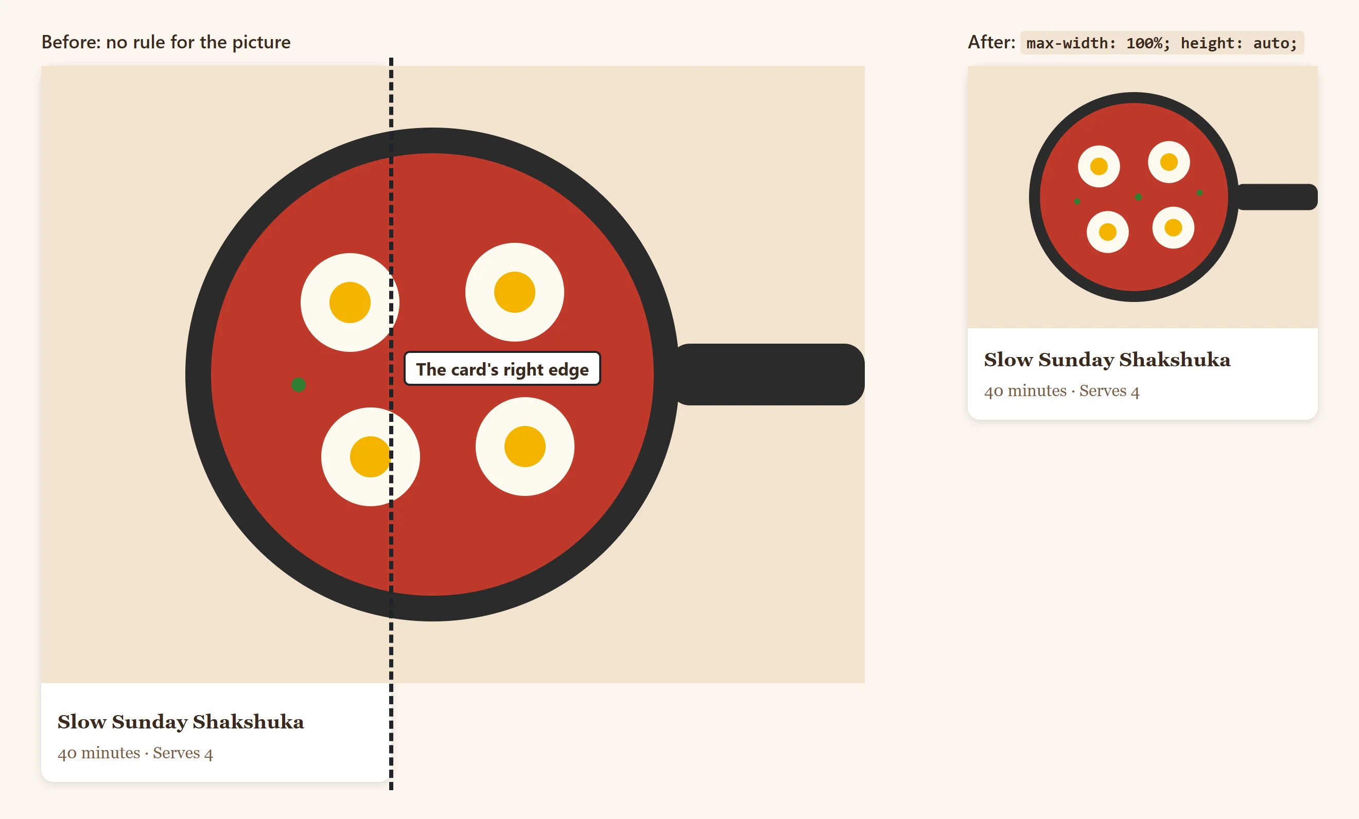
The symptom: a photo hangs out past the edge of its card or column.
The cause: a picture shows at its own size unless CSS says otherwise. A photo 1200 pixels wide is 1200 pixels wide, inside a card of 340.
img {
  max-width: 100%;
  height: auto;
  display: block;
}
max-width: 100% says "never wider than your box". height: auto keeps the photo's shape: without it, a picture with a height attribute in its HTML keeps that height and gets squashed. display: block removes the thin gap that appears under a picture, which is there because a picture sits on a line of text, like a letter, by default. Many stylesheets start with this rule for every picture.
Margins that collapse
The symptom: a gap is smaller than you added up, or a heading's top margin pokes out above the box it's in, so the box's background starts below a strip of empty space.
The cause: margin collapsing. When two top and bottom margins touch, the browser keeps only the larger one. A heading's top margin can also pass through the top of its parent and collapse with the parent's own margin, when nothing (no padding, no border) separates them. Margin, Padding and Border in Practice first showed this.
The post's Cook's tip box has a pale yellow background, but its heading's margin sits above it:
.cooks-tip {
  background-color: #fdf3d0;
  padding: 1rem;
}
Padding on the box puts something between the heading's margin and the box's edge, so the margin stays inside. display: flow-root on the box does the same without adding padding. In a flex or grid container, margins never collapse, which is one more reason to space items with gap. In the box model diagram, a margin that collapses shows its full size, so compare it with the space you see.
A flex item that won't shrink
The symptom: in a row laid out with flexbox, a long title pushes a button out of its box, even though the title is meant to be cut off with "…".
The cause: a flex item won't shrink below the size of its content, unless you tell it it may. A line of text that isn't allowed to wrap is as wide as the whole line. Here, the text sits in a <div> that is the flex item:
.recipe-bar__text {
  min-width: 0;
}

.recipe-bar__title {
  white-space: nowrap;
  overflow: hidden;
  text-overflow: ellipsis;
}
min-width: 0 lets the flex item shrink as small as the row needs, so the title is cut off with "…" and the Print button comes back. Flexbox Sizing: flex-grow, flex-shrink and flex-basis explains why. The same thing happens to grid items in a 1fr column; the same fix works there.
100vh on phones
The symptom: a section meant to fill the phone's screen is a little too tall. Its bottom edge, and the Scroll for the recipe arrow on it, sit hidden behind the browser's toolbar.
The cause: on a phone, the address bar and toolbar slide away as you scroll, so the screen's height changes. 100vh means the height with the bars hidden, the tallest the screen gets. When the bars are showing, the section is taller than what you can see.
.post-hero {
  min-height: 100vh;
  min-height: 100dvh;
}
dvh is the dynamic viewport height: 100dvh follows the visible screen as the bars come and go. (svh is the height with the bars showing, and lvh with them hidden.) The 100vh line comes first, for older browsers: one that doesn't understand dvh skips that line and keeps 100vh. The next lesson, Will It Work Everywhere? Browser Support and @supports, explains that kind of fallback.
A sticky header that won't stick
The symptom: the header has position: sticky, and it scrolls away with the page anyway.
The cause: one of three things. Check them in order:
- No
topvalue. Sticky needs to know where to stick:top: 0. - An ancestor with
overflowset tohidden,autoorscroll. That ancestor becomes the box the header sticks inside, and it doesn't scroll, so the header never moves. Inspect each element around the header and look foroverflowin the Computed pane. - A parent no taller than the header. A sticky element sticks only while its parent is on screen. If the header is wrapped in a
<div>of its own, there's no room to stick.
Weekend Kitchen had the second cause. Someone hid the sideways scroll with a rule on the .page wrapper, which holds the whole page, header included:
/* This hid the sideways scroll, and stopped the header from sticking */
.page {
  overflow-x: hidden;
}
Once the shopping list fits the screen (above), delete that rule, and the header's own position: sticky; top: 0; works as written. Nothing was wrong with the header at all: the cause was two levels up, which is why checking each ancestor in the Computed pane pays off.
A z-index that won't work
The symptom: the Recipes menu opens behind the big photo at the top of the post, the hero. Its z-index is 9999, and it still loses.
The cause: one of two things:
- The element isn't positioned.
z-indexdoes nothing on an element withposition: static, unless it's a flex or grid item. The developer tools show thez-indexdimmed, with an i that says so. - It's trapped in a stacking context. A stacking context is a group whose layers stack together, like papers in a folder: a z-index only competes inside its own folder. The sticky header starts one (any sticky element does), with
z-index: 1. The hero hasz-index: 2. The menu's 9999 only puts it on top of the other things inside the header; the whole header, menu included, is still under the hero.
The fix is at the level of the folders, not the menu:
.site-header {
  position: sticky;
  top: 0;
  z-index: 10;
}
Now the header's folder is above the hero's, and the menu inside it comes along. The menu's 9999 can go back to a small number. Stacking: z-index and What Sits on Top lists everything that starts a stacking context, including opacity below 1 and transform.
Try it. Build a sticky header with a menu inside it, and a hero after it with position: relative and z-index: 2. Open the menu, watch it hide, then raise the header's z-index.
Check yourself
2 questions to try on the lesson page.
So what
Each of these bugs looks mysterious until you know its name. Fix the cause, not the symptom: a hidden scroll or a z-index of 9999 is a sign that the real problem is still there.