Responsive Images: max-width, object-fit and srcset
Make pictures fit any screen with max-width, aspect-ratio and object-fit in CSS, and send each screen a picture of the right size and crop with srcset, sizes, picture and lazy loading in the HTML.
Journeyman · CSS · Web Development · Updated
After this lesson you can
- Make a picture fill its box with max-width, aspect-ratio, object-fit and object-position
- Use srcset, sizes, a picture element and lazy loading so each screen downloads the right picture when it's needed
- Choose the right tool for a responsive problem, from the viewport line and media queries to object-fit and srcset
Key takeaways
- max-width 100% with height auto keeps a picture inside its box and in proportion.
- aspect-ratio gives a box a shape, object-fit cover fills it by cropping the picture, and object-position chooses which part stays in view.
- srcset lists the same picture at several widths, and sizes tells the browser how wide it shows, so a phone downloads a smaller file.
- A picture element swaps in a different crop of the photo at a breakpoint. Its img is required and holds the alt text.
- loading="lazy" waits to download a picture until the reader scrolls near it. Never use it on the first picture on the page.
Photos are usually the biggest part of a page, and they cause most of its phone problems: a picture that pokes out past the edge of the screen, a photo squashed out of shape, a phone on a slow connection downloading a picture big enough for a cinema screen. Every site you'll build has pictures: product photos in a shop, a hero photo on a landing page, team photos on an "About us" page. This lesson makes them fit, look right and load fast. It's CSS first, then the HTML attributes that go with it, taught here from the start.
Pictures that stay inside their box
A picture shows at its own size unless something stops it. Sol Taco Truck's photo is 1600 pixels wide, so on a phone it pushes the page sideways. One rule, usually written for every picture on the site, fixes it:
img {
  max-width: 100%;
  height: auto;
}
max-width: 100% means "never wider than the box I'm in": a big photo shrinks to fit, and a small one keeps its own size. height: auto lets the height follow the width, so the shrunk photo keeps its proportions instead of being squashed.
Give each <img> its real width and height attributes in the HTML too, such as width="1600" height="1067". The browser uses them to save the right amount of space while the picture downloads, so the text under it doesn't jump down when it arrives. With the rule above, the picture still shrinks to fit.
A box of the right shape: aspect-ratio and object-fit
Think of a picture frame and a photo print. When the print's shape doesn't match the frame, you either trim the print so it fills the frame, or you leave a border around it.
On the taco truck's page, the photo should be a wide strip on a phone, 16 by 9, whatever shape the photo file is. Two properties do it:
.truck-photo {
  width: 100%;
  aspect-ratio: 16 / 9;
  object-fit: cover;
  object-position: center 70%;
}
aspect-ratio: 16 / 9(read "16 by 9", or "16 to 9") gives the box its shape: for every 16 parts of width, 9 of height. An aspect ratio is the proportion of width to height.1 / 1is a square, and4 / 3an old TV.object-fit: coverfills the box with the picture, keeping its proportions and trimming whatever doesn't fit, like trimming the print.object-fit: containshows the whole picture inside the box, with empty space around it, like the border. The default,fill, stretches the picture to the box and distorts it.object-position: center 70%chooses which part stays in view whencovertrims: across, the middle; down, 70% of the way toward the bottom, where the truck's serving window is. Keywords work too:center bottom,left top.
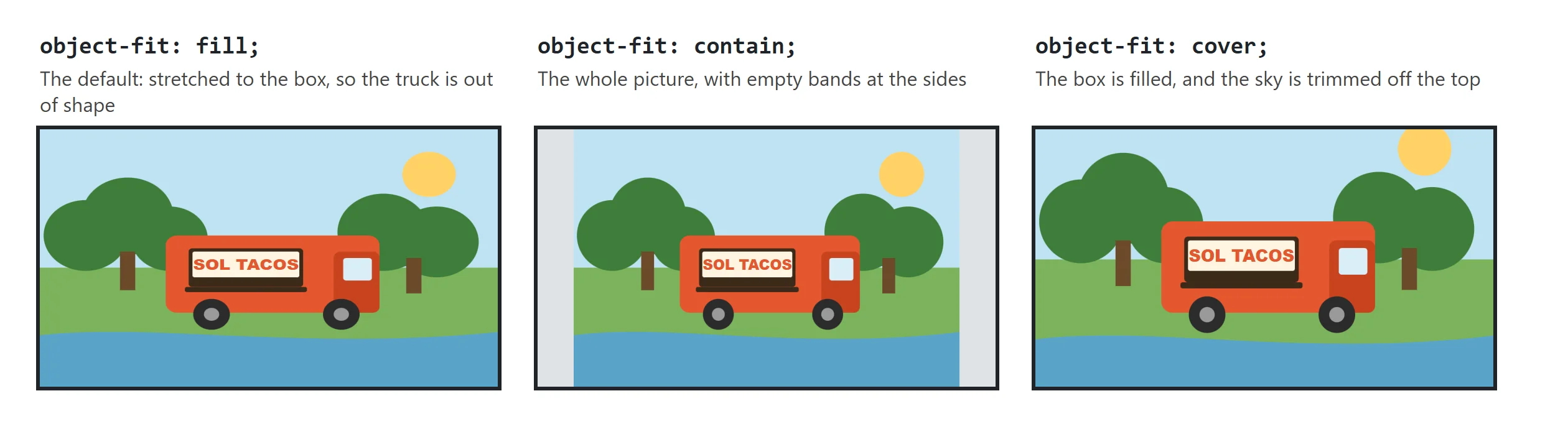
Try it. Put any photo on a page with the .truck-photo rule, and change aspect-ratio to 1 / 1, then 4 / 3. Then try object-fit: contain and fill, and move object-position from center top to center bottom to see which part of the photo stays.
The right file for each screen: srcset and sizes
A phone showing a photo 390 pixels wide doesn't need a file 1920 pixels wide. That's several times the download, on a phone connection, for nothing. The HTML can offer the same photo in several sizes and let the browser choose. That's what makes it a responsive image:
<img src="images/truck-1280.jpg"
     srcset="images/truck-640.jpg 640w,
             images/truck-1280.jpg 1280w,
             images/truck-1920.jpg 1920w"
     sizes="(min-width: 64rem) 50vw, 100vw"
     alt="The Sol Taco Truck, painted sunset orange, parked under the trees by the river"
     width="1920" height="1280">
srcset(read "source set") lists the files, separated by commas. After each one, its real width:640wis read "640 w", and means "this file is 640 pixels wide".sizestells the browser how wide the picture will show, because it decides before the CSS has loaded. Read this one as: "on a screen at least 64rem wide, the picture is half the window (50vw); otherwise, it's the whole width (100vw)". It uses the same media conditions as a media query.srcis the file for browsers too old to understandsrcset. It's usually one of the srcset files, here the 1280 one.
The browser does the math. A phone 390 pixels wide with a sharp screen (3 dots for every CSS pixel) needs about 1170 pixels, so it takes the 1280 file; an older phone with a 2x screen needs 780 and also takes 1280; a small, plain screen takes the 640. You list the files, and the browser chooses for each screen.
For a picture that always shows at the same size, such as a logo, there's a shorter form, with x for screen sharpness: srcset="images/logo.png 1x, images/logo-2x.png 2x".
A different crop on a phone: the picture element
Sometimes a phone needs a different photo, not a smaller one. On a wide screen, the whole truck under the trees by the river looks great. On a phone, the truck becomes a tiny orange speck. Better to show a close-up of the serving window. The <picture> element swaps in a different file at a breakpoint:
<picture>
  <source media="(min-width: 40rem)" srcset="images/truck-wide.jpg">
  <img src="images/truck-window.jpg" alt="The Sol Taco Truck's serving window, with the menu board beside it" width="800" height="1000">
</picture>
The browser reads the <source> lines from the top and uses the first one whose media is true. If none is, it uses the <img>. So the <img> is the phone's photo, and it's required: without it, nothing shows. The alt text and your CSS go on the <img>, the same as for any picture. Choosing a different crop for each screen is called art direction.
Lazy loading: pictures further down can wait
The taco truck's page ends with photos of the food: the elote, the horchata, the al pastor tacos. Someone checking the hours may never scroll that far, so why download them right away?
<img src="images/elote.jpg" alt="Grilled corn on the cob with lime and chili" width="800" height="600" loading="lazy">
loading="lazy" tells the browser to wait until the reader scrolls close to the picture before downloading it. The page opens faster, especially on a phone. Two rules go with it:
- Never lazy-load the first picture people see, such as the truck's photo at the top. It should start downloading right away.
- Keep the
widthandheightattributes, so the browser saves the right space before the picture arrives.
Which tool, when
This chapter has given you a toolbox. Here's which tool fixes which problem:
| The problem | The tool |
|---|---|
| The whole page is tiny on a phone | The viewport line in the <head> |
| A box is wider than a phone's screen | max-width instead of width |
| A picture pokes out past the screen | max-width: 100% and height: auto |
| The layout should change when there's more room | A min-width media query, at the width where the content breaks |
| Dark colors for readers who chose a dark theme | @media (prefers-color-scheme: dark) |
| Photos of different shapes should fill same-shaped boxes | aspect-ratio and object-fit: cover |
| Phones download a picture far bigger than they show | srcset and sizes |
| A phone needs a different crop of the photo | <picture> with a <source> |
| Pictures far down the page slow down the first view | loading="lazy" |
Check yourself
2 questions to try on the lesson page.
So what
The CSS makes a picture fit its box and look right; the HTML makes sure each screen downloads only the picture it needs. Together they give you a page that looks good and opens fast on the phone of someone who's hungry right now.