Transforms: Move, Turn and Grow
Transforms slide, turn and resize an element with translate, rotate and scale without moving anything around it, which makes them the tool for a button that lifts, a card that tilts or a badge that grows.
Apprentice · CSS · Updated
After this lesson you can
- Move, turn and grow an element with translate, rotate and scale, as their own properties or inside transform
- Set transform-origin to choose the point an element turns or grows around
- Make a button lift on hover and focus with translate, and explain why the elements around it don't move
Key takeaways
- translate slides an element, rotate turns it and scale makes it bigger or smaller. Each is its own property, or a function inside transform.
- translate: 0 -4px moves an element 4 pixels up, rotate: 10deg turns it clockwise, and scale: 1.1 makes it 110% of its size.
- A second transform declaration replaces the first one whole. The separate translate, rotate and scale properties add up instead.
- transform-origin is the point an element turns or grows around. It starts at the center, and top left or bottom center move it.
- A transform doesn't push the elements around it. The browser keeps the element's original space, so its neighbors stay put and it may overlap them.
Pick up a playing card from a table. You can slide it a little, turn it, or bring it closer so it looks bigger, and the other cards stay exactly where they are. Its spot on the table is still saved for when you put it down. Transforms do that to elements on a page. The Start button that lifts when you point at it, the "New high score!" badge tilted at an angle, the planet that grows when you choose it, and the arrow that turns when a menu opens are all transforms. Next to transitions, they're the motion you'll write most.
Move it: translate
Translate slides an element from where it sits. Give it how far to go across, then how far to go down:
.tilted-badge {
  translate: 12px -8px;
}
That reads "translate 12 pixels across and minus 8 pixels down": 12 pixels to the right, and 8 pixels up. On a screen, the numbers going down are positive, so a negative second value moves up. With one value, translate: 12px, it moves across only.
A percentage is a share of the element's own size, so translate: -50% 0 moves it left by half its own width, whatever that is.
Turn it and grow it: rotate and scale
Rotate turns an element, and scale makes it look bigger or smaller:
.tilted-badge {
  rotate: -8deg;
}

.planet:hover {
  scale: 1.2;
}
degis degrees, sorotate: -8degis read "rotate minus 8 degrees". A positive angle turns clockwise and a negative one turns counterclockwise.rotate: 0.25turnis a quarter turn, the same as90deg.scale: 1.2is 120% of the normal size,scale: 0.5is half size, andscale: 1is the normal size. Two values scale across and down separately:scale: 2 1is twice as wide and the same height.
The transform property
Before translate, rotate and scale had properties of their own (in every current browser since 2022), they were written as functions inside one property, transform. You'll see it in nearly all existing code:
.tilted-badge {
  transform: translate(12px, -8px) rotate(-8deg);
}
The functions are translate(), translateX() (across only), translateY() (down only), rotate() and scale(), separated by spaces. Two things to know:
- The order inside
transformmatters.rotate(90deg) translateX(40px)turns first, so the slide goes in the turned direction, straight down.translateX(40px) rotate(90deg)slides right first, then turns in place. - A second
transformreplaces the first one whole. If the badge hastransform: rotate(-8deg)and its hover rule saystransform: scale(1.2), the badge stops being tilted when it grows. The separate properties don't have that problem:rotate: -8degon the badge andscale: 1.2on hover add up, so it stays tilted and grows.
That's why this course uses the separate properties for new code, and transform where you need a set order.
The point it turns around: transform-origin
A door turns on its hinges, not around its middle. A clock's hands turn around their bottom ends. The point an element turns or grows around is its transform origin, and it starts at the center:
.menu-arrow {
  transform-origin: center;
}

.door {
  transform-origin: top left;
}

.clock-hand {
  transform-origin: bottom center;
}
transform-origin takes keywords (top, bottom, left, right, center), lengths or percentages: top left is the top left corner, and bottom center is the middle of the bottom edge. Turned with top left, the door swings around its top left corner; turned with bottom center, the clock hand tips over around the middle of its bottom edge. A badge scaled with transform-origin: top left grows down and to the right, while its top left corner stays pinned in place.
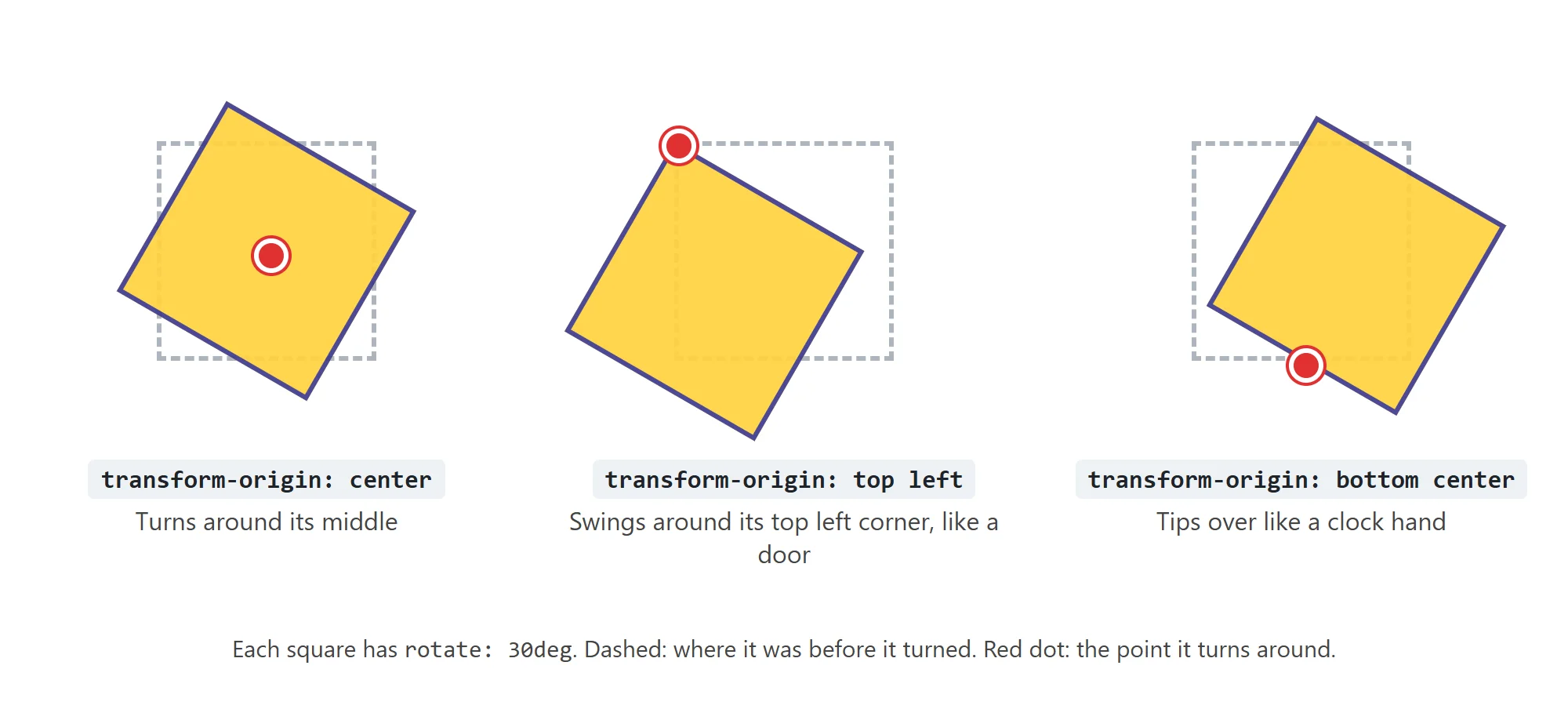
Try it. Give any box on a page rotate: 20deg, then try transform-origin: top left and transform-origin: bottom right. Watch which corner stays put each time.
A transform doesn't push anything
Here is the thing that makes transforms special. The browser lays out the page first, and gives every element its space. A transform is applied after that, to how the element is drawn. Its space in the layout stays exactly where it was, so the elements around it don't move. (A transformed element can overlap its neighbors; that's the price.)
Compare a button that lifts with margin-top with one that lifts with translate. A negative margin changes the layout, so the buttons below it move up too. A translate changes only the drawing, so only that button lifts:
.menu-button {
  box-shadow: 0 2px 4px rgb(0 0 0 / 0.3);
  transition: translate 150ms ease-out, box-shadow 150ms ease-out;
}

.menu-button:hover,
.menu-button:focus-visible {
  translate: 0 -4px;
  box-shadow: 0 8px 16px rgb(0 0 0 / 0.35);
}
The button rises 4 pixels and its shadow grows, as if it's lifting toward you, and the buttons below it stay still. The transition (from Transitions: Smooth Changes) makes the lift smooth, both up and back down. Notice it transitions translate, the property that changes.
Try it. Put three buttons one under another and give the first margin-top: -20px. The other two move up with it. Change it to translate: 0 -20px, and only the first one moves.
Check yourself
2 questions to try on the lesson page.
So what
Moving, turning and growing are how a page says "this is what you're pointing at" and "something changed here". Because a transform leaves the layout alone, you can add that motion without anything else on the page jumping around.