Transitions: Smooth Changes
A transition makes a change in CSS happen smoothly over a short time instead of in one jump, so a button that changes color on hover or focus eases into its new look.
Apprentice · CSS · Updated
After this lesson you can
- Write a transition with a property, a duration and a timing function, such as background-color 200ms ease
- Choose a duration and a timing function that fit a change, and tell which properties can change smoothly
- Put a transition on the element's own rule so it runs on hover, on keyboard focus and on the way back
Key takeaways
- A transition makes a property change smoothly over time instead of jumping, the way a dimmer brings a light up gently where a switch snaps it on.
- Write the property, how long it takes and how its speed changes: transition: background-color 200ms ease. 1000ms (milliseconds) is 1s.
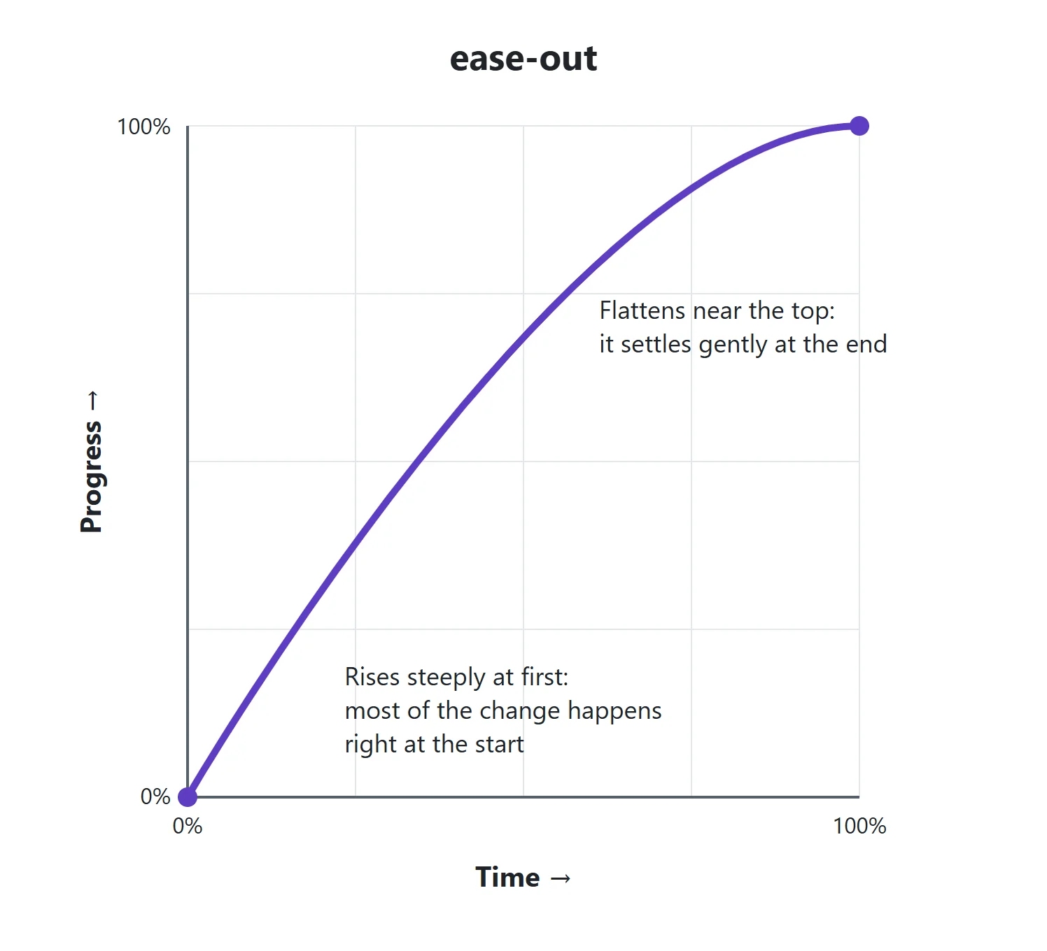
- A timing function shapes the speed. ease-out starts fast and settles gently, which suits a button answering the reader. Small changes take about 100 to 300ms.
- Colors, sizes, opacity, shadows and transforms change smoothly. Properties with no in-between values, such as display or font-family, jump.
- Put the transition on the element's own rule and style :hover and :focus-visible together, so the change runs both ways and for keyboard users too.
Star Hopper is a made-up space game, and its start screen has three buttons: Start, How to play and High scores. Point at Start and the button turns from deep indigo to bright cyan in a single flash. It works, but it feels rough, like a light switched on in a dark room. Almost every polished site you visit softens changes like this: links that ease into a new color, buttons that glow, menus that fade in. You'll use a transition every time something on a page changes because of what the reader does, and it takes one line of CSS.
A light switch and a dimmer
A light switch has two settings, off and on, and it jumps between them. A dimmer gets to the same place, but it brings the light up gently, so your eyes can follow.
CSS changes are light switches by default: the moment the mouse is over the button, the new color is there. A transition turns the change into a dimmer. It tells the browser "when this property changes, take this long to get there":
.menu-button {
  background-color: #3d3a8c;
  transition: background-color 200ms ease;
}

.menu-button:hover {
  background-color: #2ec4d6;
}
Read the transition line as "transition the background color over 200 milliseconds, with ease". ms is short for milliseconds, thousandths of a second: 200ms is a fifth of a second, and 1000ms is the same as 1s. Point at the button now, and the indigo blends into cyan instead of snapping.
The parts of a transition
A transition has up to four parts, written with spaces between them:
.menu-button {
  transition: background-color 200ms ease-out 0s;
}
- The property to watch, here
background-color. This part is called the transition property. - How long the change takes, here
200ms. This is the transition duration, and without it the transition lasts 0 seconds, which is no transition at all. - How the speed changes along the way, here
ease-out. This is the timing function, and it'seaseif you leave it out. - A delay before it starts, here
0s. The first time in the line is always the duration, and the second is the delay.
To transition more than one property, separate them with commas: transition: background-color 200ms ease-out, color 200ms ease-out;. You'll also see transition: all 200ms, which transitions every property that changes. It's handy for a quick test, but it can animate things you didn't mean to, so name the properties in real code.
Each part has its own property too, for when you want to change one part only: transition-property, transition-duration, transition-timing-function and transition-delay.
Timing functions: how the speed changes
Think of a car. Pulling away from a stoplight, it starts slowly and speeds up. Pulling into a parking spot, it arrives quickly and slows down at the end. A timing function is that speed curve for a change on the page:
| Timing function | The speed | Good for |
|---|---|---|
linear |
The same from start to end | A spinner going around and around |
ease |
A gentle start, quick in the middle, a gentle end | The default, and fine for most things |
ease-in |
Starts slowly, ends fast | Something leaving the screen |
ease-out |
Starts fast, slows down at the end | A button or menu answering the reader |
ease-in-out |
Slow at both ends | Something moving from one spot to another |
ease-out feels fast because the reader sees the change start at once. You'll also meet cubic-bezier(...), which lets you draw your own curve (the developer tools have an editor for it), and steps(4), which jumps in four steps like a ticking clock.
How long? For a button, a link or a small menu, 100 to 300ms feels quick and smooth. Much longer and the page feels slow to answer; much shorter and the reader barely sees it.
What can change smoothly
A dimmer works because there are in-between brightnesses. A transition works the same way: it can only blend a property that has values in between.
- These change smoothly: colors (
color,background-color,border-color), sizes and spacing (width,padding,margin),opacity,box-shadow,border-radius, and transforms, which the next lesson teaches. - These jump: properties with no in-between, such as
display(there's nothing halfway betweennoneandblock) andfont-family. A size going to or fromauto, such asheight: auto, also jumps in most browsers.
A property the browser can blend is called animatable. If a transition does nothing, check that its property is one of them, and that it's spelled the same in the transition and in the rule that changes it.
Hover, keyboard focus and the way back
Where you put the transition matters. Put it on the element's own rule, not on the :hover rule:
.menu-button {
  background-color: #3d3a8c;
  color: #ffffff;
  transition: background-color 200ms ease-out, color 200ms ease-out;
}

.menu-button:hover,
.menu-button:focus-visible {
  background-color: #2ec4d6;
  color: #10122b;
}
On the button's own rule, the transition is there the whole time, so the color eases in when the mouse arrives and eases back out when it leaves. If you put it only on :hover, the change eases in, but on the way back the hover rule (and its transition) is gone, so the color snaps.
The second rule lists :hover and :focus-visible (read "focus visible") with a comma. Someone using the Tab key to move around never hovers, so :focus-visible gives them the same feedback when the button has keyboard focus. Pseudo-Classes: :hover, :focus-visible, :nth-child() and More covers both.
Try it. In any page with a link or a button (or a new index.html with a <button class="menu-button">), add the two rules above. Point at the button, then press Tab until it has focus. Then open the developer tools: in the Styles pane, the :hov button lets you switch :hover and :focus-visible on and off without the mouse. In the menu at the top right, More tools > Animations opens a panel that records each change, and you can replay it at 10% speed and watch the color blend. Then move the transition line into the :hover rule and watch the way back snap.
Check yourself
2 questions to try on the lesson page.
So what
A transition is one line that makes a page feel like it's answering the reader instead of flickering at them. Name the property, keep it short, put it on the element's own rule, and give keyboard focus the same care as hover.