Exercise: Themeable Buttons and Cards
Rebuild The Daily Grind's buttons, menu card and sign-up field on design tokens defined on :root, then give them a dark theme that changes only the tokens, and let the tests check both themes.
Journeyman · CSS · Updated
The Daily Grind's designer has made a brand kit page: the shop's buttons, a menu card for the Maple Oat Latte, and the email sign-up field, all in coffee brown, cream and a teal accent. It looks right. But open its stylesheet and you'll find 29 colors typed out by hand, the coffee brown alone six times, and the owner has one more request: a dark theme for customers who browse at night. You'll rebuild the styles on design tokens, then add the dark theme by changing only the tokens. Tests check every step, and they measure the text contrast in both themes.
The HTML is written and ready, so all of your time goes into the stylesheet.
Get the exercise code
In the Exercise box beside the lesson, choose Get the starter on GitHub to open its GitHub repository. Click Code, then Download ZIP, and unzip it into your css-in-depth folder.
The folder holds:
index.html: the brand kit page. Ready to use; you don't need to change it.styles.css: the page's styles, working but written with raw colors, sizes and corners. A comment at the top lists the steps and The Daily Grind's dark colors. This is where your work goes.page.test.jsandpackage.json: the tests and what they need. You don't need to change these.README.md: the steps and rules, the same as below.
Open the folder in VS Code, right-click index.html and choose Open with Live Server.
What to do
Here are the parts of the page your rules style, as they are in index.html:
<div class="button-row">
  <button class="btn btn-primary" type="button">Order ahead</button>
  <button class="btn btn-secondary" type="button">See the menu</button>
  <button class="btn btn-primary" type="button" disabled>Sold out</button>
</div>

<article class="menu-card">
  <p class="badge">Seasonal</p>
  <h3>Maple Oat Latte</h3>
  <p class="description">Espresso, steamed oat milk and a spoonful of real maple syrup.</p>
  <p class="price">$5.25</p>
  <button class="btn btn-secondary" type="button">Add to order</button>
</article>
And here is one rule from the starter's styles.css, as it is now:
.btn-primary {
  background-color: #6f4e37;
  color: #fffaf2;
}
- Tokens. At the top of
styles.css, add a:rootrule with a token for each color the page uses (at least six), named by its job:--color-bg,--color-text,--color-brand, not--creamor--dark-brown. Add tokens for spacing (such as--space-2and--space-4) and corners (such as--radius-md) too. - Colors from tokens. Replace every color in the component rules with
var()and a token. When you're done, no color is written by hand outside:root.transparentandcurrentColorare fine. - Spacing and corners from tokens. The
paddingandborder-radiusof the buttons, the menu card and the email field use your tokens. - Tell the browser. Add
color-scheme: light dark;to your:rootrule. - The dark theme. After the
:rootrule, add@media (prefers-color-scheme: dark)with a:rootrule inside that gives your color tokens their dark values. Change only tokens there: the components follow on their own. The dark colors in the comment at the top ofstyles.csspass every test, or choose your own.
Extras, if you like: add a theme switch with no JavaScript: a checkbox with the id dark-mode in index.html, and a :root:has(#dark-mode:checked) rule with the dark tokens. Or register --color-brand with @property, so a value that isn't a color can't break the buttons.
Check your work
In VS Code, open a terminal (Terminal > New Terminal) in the exercise folder, and run this once, to download what the tests need:
npm install
Then run the tests, as often as you like:
npm test
At first, nine of the ten tests fail: that's expected. The one that passes checks that index.html links styles.css, which the starter already does. Each step you finish turns its tests green. When a test fails, its message says what it checked and what to change, for example: The color of the page text (body) is written by hand: rgb(43, 29, 20). Use a token instead, such as var(--color-text). The tests report every color the way the browser does, as rgb(): rgb(43, 29, 20) is the starter's #2b1d14.
To look at the dark theme yourself, open the developer tools. In Chrome or Edge, press Ctrl+Shift+P (Cmd+Shift+P on a Mac) and choose Emulate CSS prefers-color-scheme: dark; in Firefox, use the moon button at the top of the Inspector's Rules view.
Hints
- List the jobs first. Before you write a token, go through
styles.cssand note what each color does: the page, the card, the text, the quieter text, the brand, the text on the brand, the accent, the border, the disabled button. Each job is one token. Design Tokens: a Small Design System shows a set like this. - Nothing should change in light. After steps 1 to 4, the page looks exactly as it did. If something changed color or lost its background, look for a misspelled name: Custom Properties: Variables in CSS explains what a
var()with a typo does. - An outline in its own color. The secondary button's border is the same color as its text.
currentColorkeeps them together with no extra token. - The dark brand isn't the light brand. Coffee brown nearly disappears on a dark page. Light and Dark Themes with prefers-color-scheme explains why the dark theme needs a lighter brand color, and how to check its contrast in the developer tools.
- Where the dark block goes. Put the media query after your light
:rootrule. Both rules use the same selector, so the one that comes later wins.
When you're done
Every test is green:
✔ the page links styles.css
✔ step 1: color tokens are defined on :root
✔ step 1: tokens are named by their job, not their color
✔ step 2: every component color comes from a token
✔ step 2: no raw colors outside the token block
✔ step 3: spacing and corners come from tokens
✔ step 4: :root says the page supports light and dark (color-scheme)
✔ step 5: the dark theme redefines only the tokens, inside prefers-color-scheme: dark
✔ step 5: in the dark theme the page is dark, and every component follows
✔ both themes: every piece of text has a contrast of at least 4.5 to 1
ℹ tests 10
ℹ pass 10
ℹ fail 0
And the brand kit works both ways: in light, the coffee-brown buttons and the white menu card on cream, the same as before; in dark, latte-colored buttons and a dark brown card on a nearly black page, with the teal accent still clear to read.
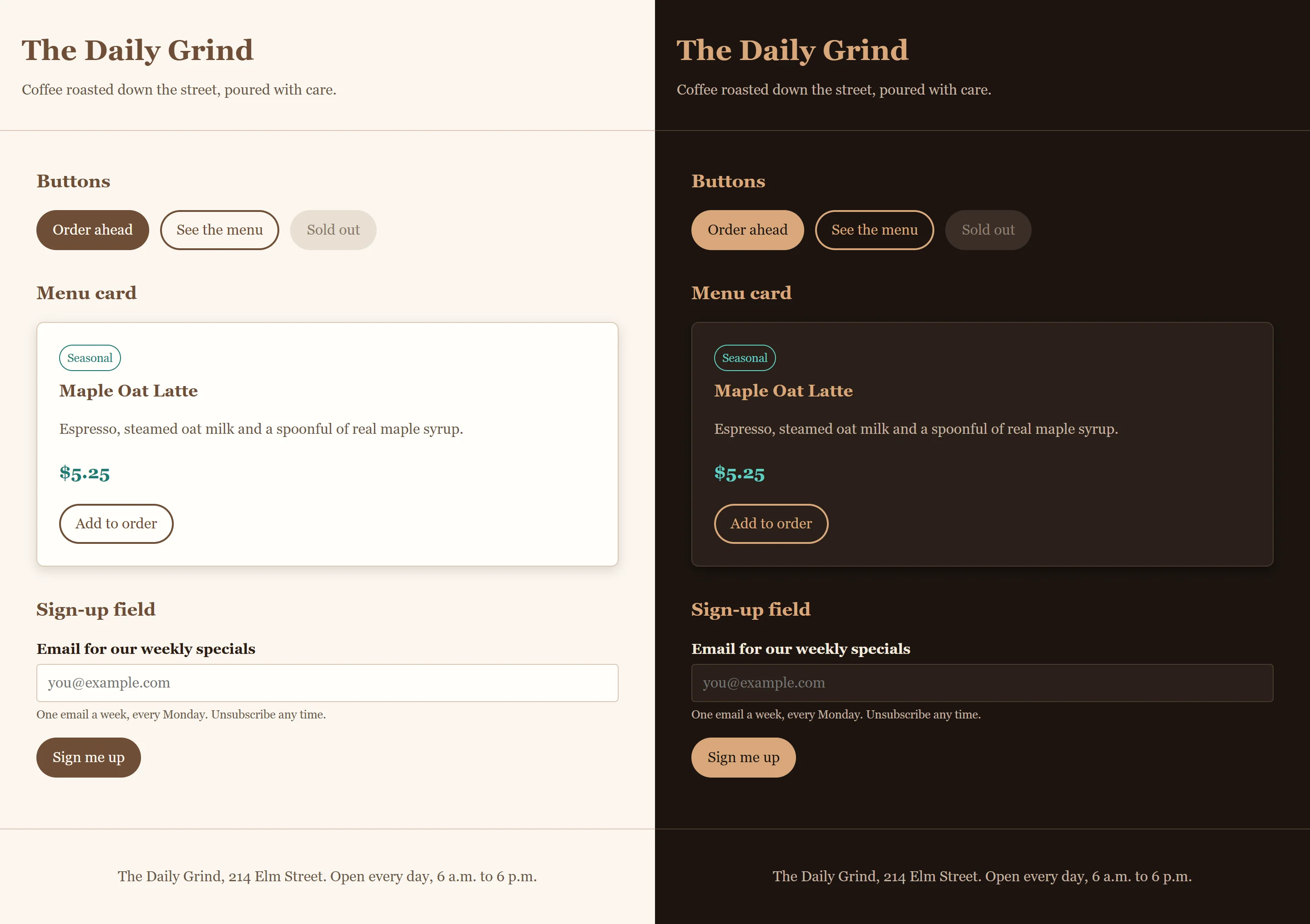
Now try the payoff. Change --color-accent to a rust orange such as #b4532a (and a lighter one, #f0a57c, in the dark theme), and save. How many lines of your stylesheet changed? If the badge's border didn't follow, look for a color that isn't reading a token.
So what
You've done what design systems at big companies do, on a small scale: decisions named once, components that read only the names, and a second theme that's nothing but new values. Every component you add to this page from now on comes in light and dark without one extra rule.