Finishing Touches: Rounded Corners, Shadows and Gradients
border-radius rounds corners, a soft layered box-shadow lifts a card off the page, linear-gradient() and radial-gradient() blend colors in a background, and opacity fades a whole element, and each looks best used sparingly.
Apprentice · CSS · Web Development · Updated
After this lesson you can
- Round corners with border-radius and add a soft, layered box-shadow
- Fill a background with linear-gradient() or radial-gradient(), and fade an element with opacity
Key takeaways
- border-radius rounds an element's corners. 50% on a square makes a circle, and a very large value, such as 999px, makes a pill.
- A box-shadow takes a sideways offset, a downward offset, a blur and a color. Soft shadows use a see-through color and plenty of blur.
- Two shadows separated by a comma, a small sharp one and a big faint one, look more like real light than one dark shadow.
- linear-gradient() blends colors along a line and radial-gradient() outward from a point. Both are background images.
- opacity fades a whole element, its text and everything inside it. Check that faded text still passes contrast.
Look at the apps on your phone: the cards in a music app, the buttons in a banking app, the photo of a recipe on a cooking site. Their corners are a little rounded, the cards seem to float a hair above the page, and some backgrounds fade from one color into another. These are the finishing touches, and they're what make a page feel modern and made with care. You'll reach for them on product cards, buttons, profile pictures, a site's header, and the vendor cards on the farmers market's page. They're also the first thing in design that people overdo, so this lesson ends with when to stop.
border-radius: softer corners
A credit card, a phone and a sticky note all have rounded corners. They feel friendlier in the hand, and on a screen they feel the same way. border-radius rounds an element's corners. Read it "border radius": the radius is how big the circle is that each corner follows.
.vendor {
  border-radius: 12px;
}

.vendor-photo {
  width: 4rem;
  height: 4rem;
  border-radius: 50%;
}

.badge {
  border-radius: 999px;
}
12pxgives each vendor card gently rounded corners. Values from about 4 to 16 pixels suit cards and buttons.50%on a square makes a circle: each corner's curve reaches halfway along each side. It's how profile pictures become round.999px, a value bigger than the element could ever be, makes a pill: the short ends are fully round. It's a favorite for badges and tags such as "Organic".
The rounding shows on the element's background and border, and on a picture (<img>) it rounds the picture itself. A picture inside a rounded card still has square corners, which poke out unless the card also has overflow: hidden. On a box with no background or border, there's nothing to see the rounding on.
Try it. In the farmers-market page (or any page with a box that has a background color), give the box border-radius: 0, then 12px, then 40px. Where does it stop looking like a card and start looking like a bubble?
box-shadow: lifting a card off the page
Lay a sheet of paper on a desk and lift one edge a little. A soft, faint shadow appears under it: blurry at the edges, a bit darker close to the paper, and a little below it, because the light is above. That shadow is what tells your eye "this is on top". box-shadow draws one:
.vendor {
  box-shadow: 0 4px 12px rgb(0 0 0 / 0.12);
}
Read the values in order:
| Value | What it is | Here |
|---|---|---|
0 |
how far right the shadow moves (negative is left) | not at all |
4px |
how far down it moves (negative is up) | a little, as if lit from above |
12px |
the blur: how soft its edge is | quite soft |
rgb(0 0 0 / 0.12) |
its color | black at 12% strength |
A fourth length before the color, the spread, makes the shadow bigger or smaller than the box; you can leave it out. The color is what makes a shadow soft or harsh. Solid black (black, or rgb(0 0 0)) looks like a cut-out stuck on a page. A see-through black, written with a slash and an alpha value from 0 to 1 (read the slash "slash"), lets the background show through, as real shadows do.
Layered shadows: closer to real light
Real light makes two shadows at once: a small, darker one where the paper nearly touches the desk, and a big, faint one spread out around it. box-shadow takes as many shadows as you like, separated by commas, so you can draw both:
.vendor {
  border-radius: 12px;
  box-shadow:
    0 1px 2px rgb(0 0 0 / 0.08),
    0 4px 12px rgb(0 0 0 / 0.08);
}
The first shadow is tight and close; the second is wide and soft. Together they look like a card resting a few millimeters above the page, where a single dark shadow looks like a sticker. The shadow follows the rounded corners, so the two belong together.
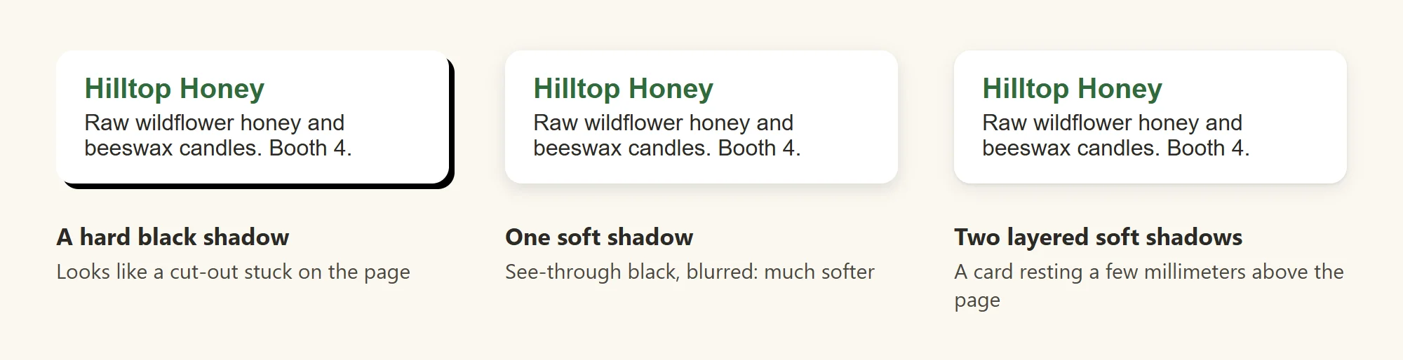
Try it. Give a card on your page box-shadow: 4px 4px 0 black, the hard shadow of an old website. Then replace it with the two layered shadows above. Then raise both alpha values to 0.4. Which looks like paper, and which looks like a sticker?
Gradients: colors that blend
A sky at sunrise goes from deep blue at the top to orange at the horizon with no line between them. A gradient is a background that blends from one color into another like that. CSS has two common shapes:
linear-gradient()blends along a straight line, top to bottom unless you give it a direction, such asto rightor an angle such as135deg(read "135 degrees").radial-gradient()blends outward from a point, in a circle or an oval, like the glow around the sun.
header {
  background-image: linear-gradient(to bottom, #fdeccf, #fbf8f1);
}

.notice {
  background-image: radial-gradient(circle at top left, #f7d98a, #f2c14e);
}
The header fades from a warm wheat color at the top into the page's cream, like morning light. The bag notice glows a little brighter in its top-left corner. Each color in the list is a color stop; you can add more, and give each a position, as in linear-gradient(#2f6b3a 0%, #4f8a55 60%, #fbf8f1 100%).
A gradient is a background image, not a color: a picture the browser draws for you instead of loading from a file. So it goes where picture files go, in background-image (or the shorthand background), as in Pictures from CSS: Background Images, never in background-color. background-size, background-position and background-repeat work on a gradient as they do on a photo. When text sits on a gradient, check its contrast against both ends: the text must pass on the lightest part and the darkest part.
opacity: fading the whole thing
Hold a sheet of tracing paper over a picture: everything under it fades together. opacity does that to an element. It takes a number from 0 (invisible) to 1 (solid, the normal), read as a fraction: 0.6 is 60% visible.
.sold-out {
  opacity: 0.7;
}
A vendor that has sold out fades back, so shoppers' eyes go to the vendors who still have something to sell. opacity fades everything in the element: its background, its border, its text, its pictures and every element inside it. When you want only the background see-through and the text solid, use a color with an alpha value instead, such as background-color: rgb(47 107 58 / 0.15).
Fading text lowers its contrast. Check faded text in the developer tools' color picker, as in Color That Works: Palettes and Contrast, and don't use a fade as the only sign that something has changed: the sold-out card also says "Sold out for today" in words.
Try it. Give one vendor card opacity: 0.7, then 0.3. Inspect its text: at what opacity can you no longer read it comfortably?
When less is more
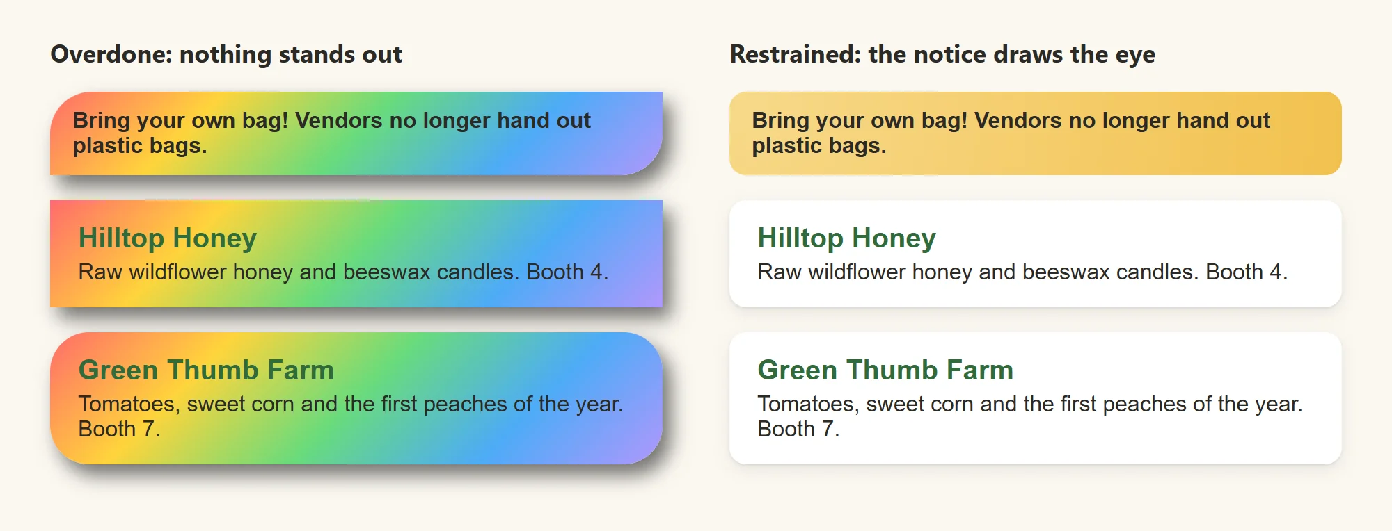
A sign painter learns this early: if everything is decorated, nothing stands out. Finishing touches work best as a quiet, consistent system:
- One corner radius for the whole site, such as 12 pixels for cards and 8 for buttons, and a pill for badges. A page where every box is rounded differently looks unplanned.
- One or two shadow recipes, used the same way everywhere: a soft one for cards, maybe a stronger one for something that floats above the page, such as a menu.
- Gradients that whisper. Two colors close together, such as wheat to cream, look rich. A rainbow looks dated, and it makes text hard to read.
- A reason for every touch. A shadow says "this is a card you can pick". If nothing on the card can be picked or read on its own, it may not need one.
Check yourself
2 questions to try on the lesson page.
So what
A few rounded corners, a soft shadow and a gentle gradient, used the same way everywhere, are what make a plain page feel finished. In Design Tokens: a Small Design System you'll name each one once, so a whole site uses the same radius and the same shadow.