Exercise: The Taco Truck Menu
Give Sol Taco Truck's ready-made menu page its look (a color palette, a web font for the headings, readable body text, prices and labels that stand out, and a chalkboard behind the truck's name), and let the tests check each step.
Novice · CSS · Updated
Sol Taco Truck parks by the river five days a week, and its owner finally has a menu page online. The words are all there: today's special, the tacos, the burritos, the drinks and their prices. But it looks like every page with no CSS: black text in the browser's default font on plain white, with nothing to say that the truck's sign is sunset orange, that its menu is chalked on a blackboard, or that the chicken tinga is spicy. You'll give it the truck's look, using everything this chapter taught, and tests will tell you when each step is done.
The HTML is written and ready, so all of your time goes into the stylesheet.
Get the exercise code
In the Exercise box beside the lesson, choose Get the starter on GitHub to open its GitHub repository. Click Code, then Download ZIP, and unzip it into your css-in-depth folder.
The folder holds:
index.html: the menu page. Ready to use. The only change it may need is a few link lines for a Google font, and a comment in its<head>marks the spot.styles.css: empty except for a comment listing the steps and the truck's brand colors. This is where your work goes.images/chalkboard.webp: a chalkboard picture for the header, in step 8.page.test.jsandpackage.json: the tests and what they need. You don't need to change these.README.md: the steps and rules, the same as below.
Open the folder in VS Code, right-click index.html and choose Open with Live Server.
What to do
Here are the parts of the page your selectors will use, as they are in index.html:
<section id="todays-special">
  <h2>Today's Special</h2>
  <p>Pineapple al pastor tacos, three for <span class="price">$10.00</span> <span class="label new">New</span></p>
</section>

<section>
  <h2>Tacos</h2>
  <ul>
    <li>Carne asada <span class="price">$4.00</span></li>
    <li>Chicken tinga <span class="price">$3.75</span> <span class="label spicy">Spicy</span></li>
  </ul>
</section>
- The page's colors. Give
bodya text color and a background color. Write your palette in hex codes orhsl(): at least three of the colors in your file. The truck's brand colors are in the comment at the top ofstyles.css, or choose your own. - Readable body text. In the same
bodyrule, set afont-familywith fallbacks that ends in a generic family; afont-sizeinrem, between1remand1.375rem; and aline-heightwith no unit, between1.3and1.8. - A web font for the headings. Choose a font on Google Fonts and put its link lines in the
<head>ofindex.html, above thestyles.cssline, or load a.woff2file with@font-face. Use it as the firstfont-familyofh1andh2, with a fallback after it. - Section headings. Give
h2a color of its own, with a type selector. - Prices. Make every price bold, with the class selector
.price. - The spicy label. Give
.spicya background color and a text color, so the label stands out. - Today's special. Give
#todays-speciala background color of its own. - The truck's chalkboard. Put
images/chalkboard.webpbehind theheaderwithbackground-imageandurl(), over a darkbackground-colorclose to the board's, such as#2b2f2e. Then giveheadera light textcolor, such as the cream#fff4e0, so the tagline reads on the board. If the truck's name is hard to read there, giveh1a lighter color.
Extras, if you like: style the .new labels, cross out the old price on the chicken tinga burrito (it has the class old-price), and try text-transform, letter-spacing and text-align on the headings. Try background-size: 200px on the header, to make the chalk smudges smaller.
Check your work
In VS Code, open a terminal (Terminal > New Terminal) in the exercise folder, and run this once, to download what the tests need:
npm install
Then run the tests, as often as you like:
npm test
At first, ten of the eleven tests fail: that's expected, since the stylesheet is empty. The one that passes checks that index.html links styles.css, which the starter already does. Each step you finish turns its test green. When a test fails, its message says what it checked and what to change, for example: Give the body rule a font-size in rem, such as 1.125rem.
Hints
- One step at a time. Write one rule, save, and look at the page before you run the tests. Seeing the change is half the fun.
- Dot or hash? A class selector starts with a dot and an id selector with a hash, and the name after it matches the HTML exactly, capital letters included. Type, Class and ID Selectors has the details.
- Shades that belong together. Keep the hue of the brand orange and change only its lightness in
hsl()for a darker heading color, as Color: Names, Hex, rgb() and hsl() shows. - The font's name, everywhere the same. The name in the Google Fonts link (with
+for spaces) or in@font-facemust match the first name in yourfont-family. Web Fonts: Using Any Font You Like walks through both ways. - A chalkboard that doesn't show. The path in
url()starts from the folderstyles.cssis in, so it'surl("images/chalkboard.webp"). The Console in the developer tools shows a red 404 (Not Found) line with the path the browser tried, as Pictures from CSS: Background Images shows. Your darkbackground-coloris why the words are still readable meanwhile. - No quotes on generic families.
sans-serifworks;"sans-serif"looks for a font with that name. - Something didn't change? Open the developer tools (F12, or Cmd+Option+I on a Mac) and find the rule in the Styles pane. A crossed-out or flagged declaration is one the browser skipped or another rule replaced.
When you're done
Every test is green:
✔ the page links styles.css
✔ step 1: the page has a text color and a background color
✔ step 1: the palette is written in hex or hsl()
✔ step 2: body text has a font stack that ends in a generic family
✔ step 2: body text is sized in rem, with a line-height that has no unit
✔ step 3: the h1 and h2 headings use a web font, with a fallback
✔ step 4: the section headings have a color of their own, set with a type selector
✔ step 5: every price is bold, styled by its class
✔ step 6: the spicy label stands out, styled by its class
✔ step 7: today's special has a background of its own, styled by its id
✔ step 8: the header is a chalkboard: a picture over a dark color, with words you can read
ℹ tests 11
ℹ pass 11
ℹ fail 0
And the page looks like the truck's own: the name in a chunky heading font on the chalkboard, the menu in warm colors on cream, bold prices, and labels you can spot from across the page. Your colors and fonts can be completely different from anyone else's, and the tests still pass.
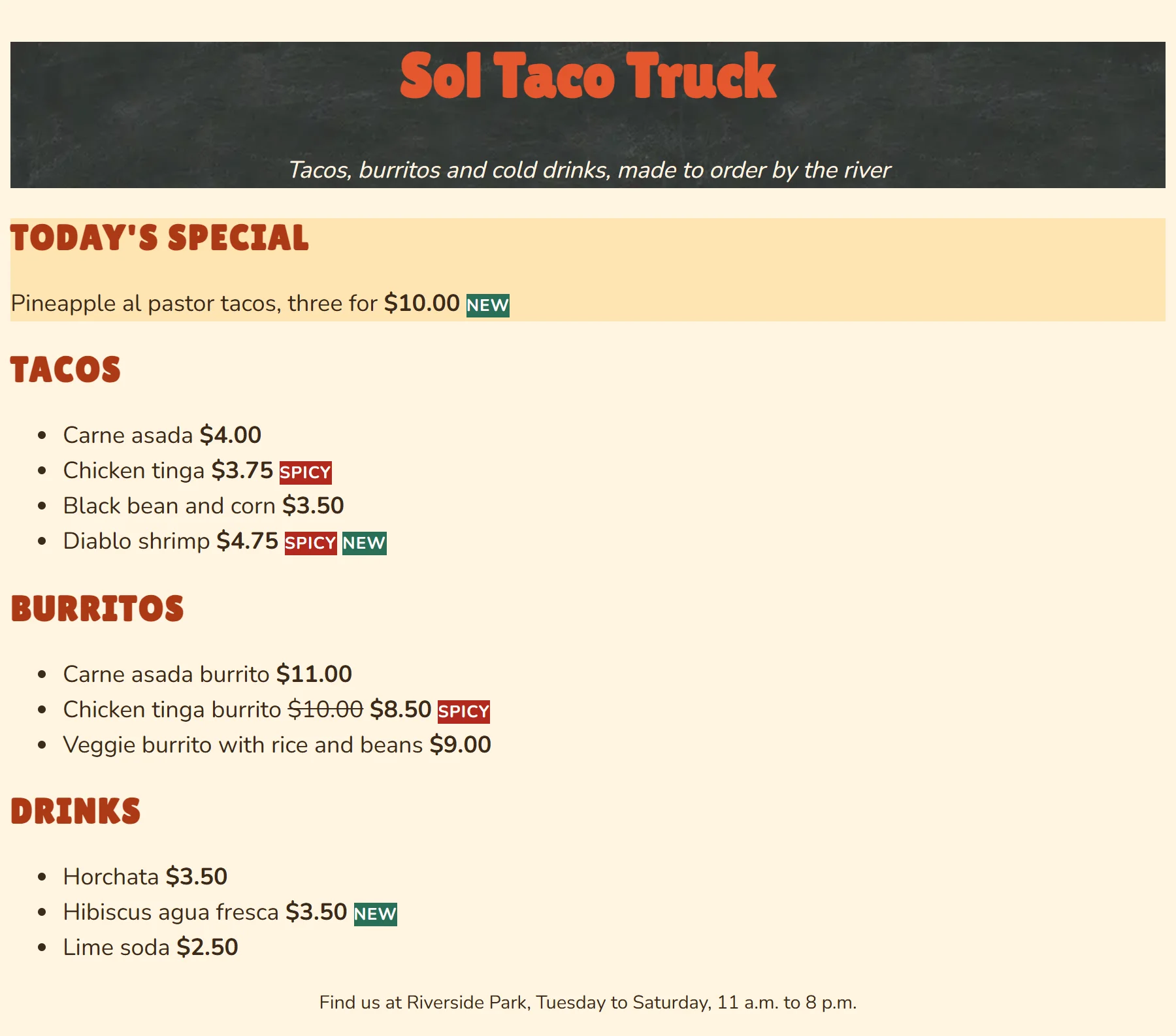
Look at your labels: the words sit right against the edges of their colored backgrounds, and the tagline against the bottom of the chalkboard. That's because they have no padding yet, the space inside a box. The next chapter, The Box Model and Units, gives every element room to breathe.
Then look back at your stylesheet: which rules use a class, and which use an id? If the owner adds a second special tomorrow, which of your rules would still work, and which would need a change?
So what
You've taken a plain page and given it a brand: a palette, a font that matches the sign, a chalkboard like the truck's own, and text people can read at a glance. That's the first thing anyone asks of CSS, whether it's a food truck's menu, a club's event page or a class project.